Fox takes risks again with abstract rebrand

Fox Entertainment has taken some big gambles in its time. After all, this is the brand that brought viewers groundbreaking shows like The Simpsons, The X-Files and American Idol. And for its latest leap, Fox has unveiled a risky new rebrand that repositions the network in the constantly changing entertainment landscape.
Created in collaboration between Fox Entertainment and Trollbäck+Company, the new look was unveiled during the 71st Emmy Awards. It comes off the back of Disney acquiring 20th Century Fox back in March, and Fox Broadcasting breaking away to become the independent network, Fox Entertainment.
Our guide to logo design looks at when a company should rebrand, and it looks like Fox Entertainment chose its moment well. The new identity will appear across the entertainment company's 17 stations, as well as more than 100 affiliate stations.

In a statement, Fox Entertainment's head of marketing Darren Schillace said: "We needed to break down our brand in order to reimagine it. Trollbäck+Company worked with us on a focused and ownable strategy that looked to our past to reimagine our future, and their design-forward aesthetic brought us a smart and flexible design that is unlike anything else we've seen."
Meanwhile, Trollbäck+Company's executive creative director Elliott Chaffer added: "The way the industry is today, the middle of the road is the best place to get run over. We needed to bring back and champion the brand's ability to take big swings and bigger risks."

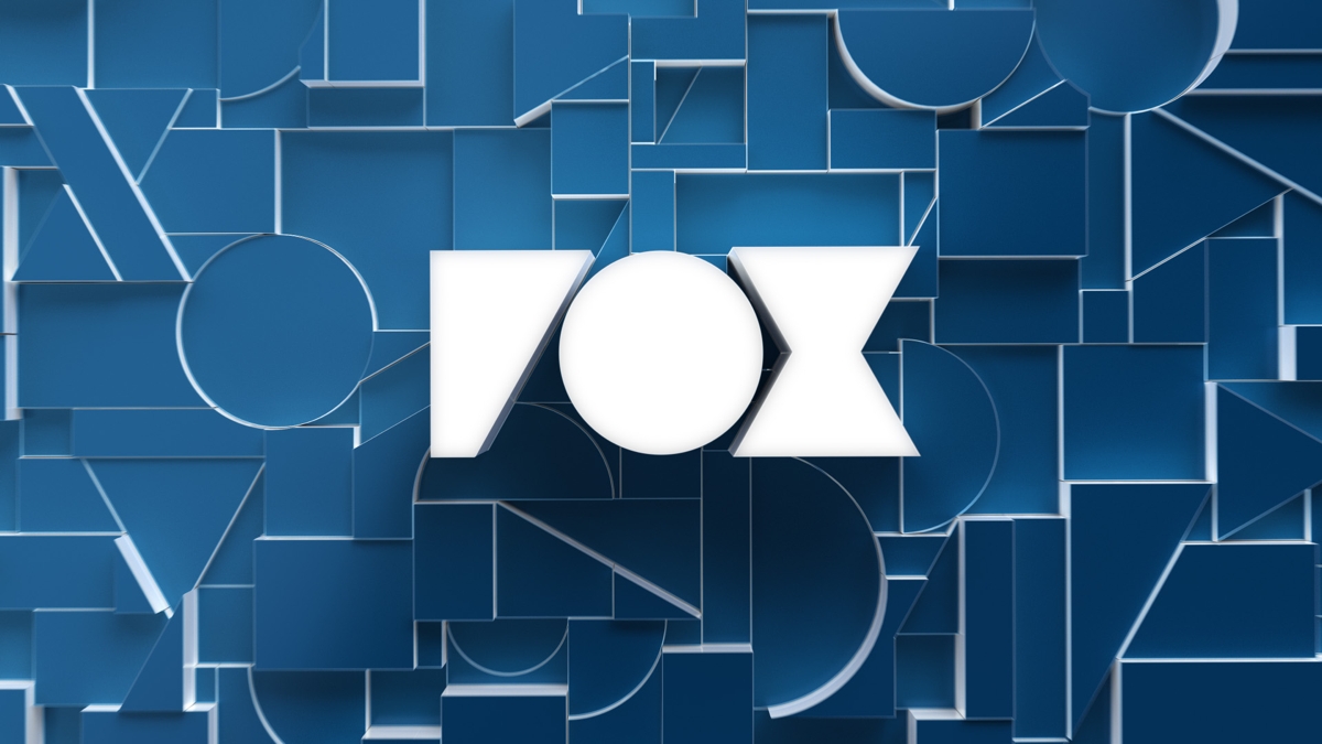
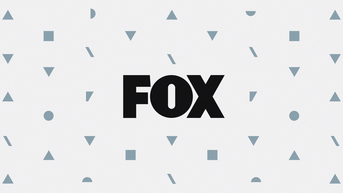
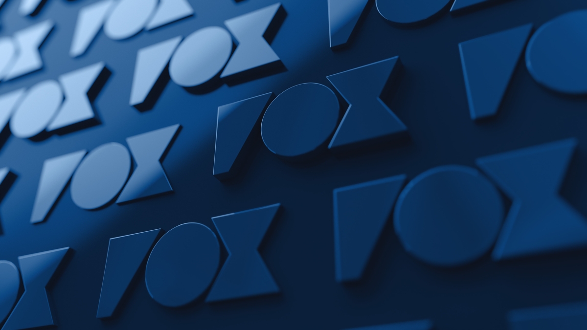
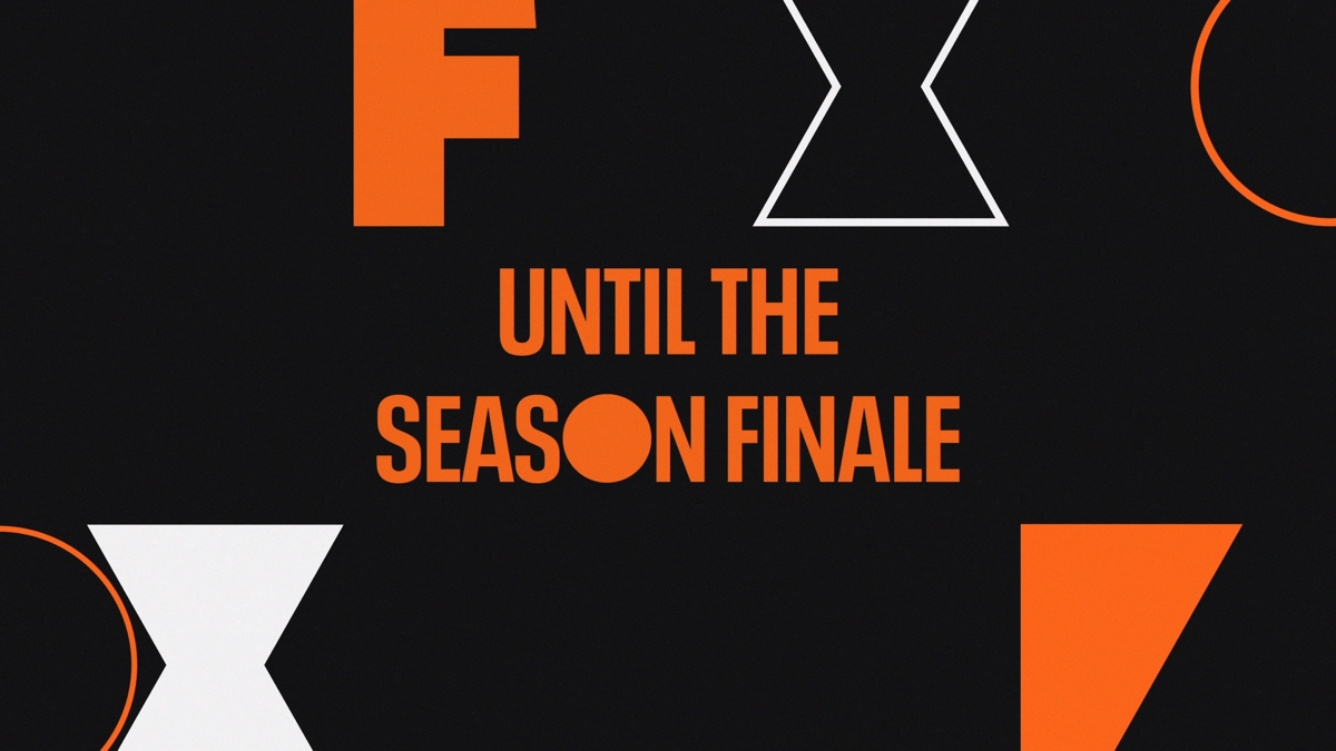
This all sounds very impressive, but how does it translate into reality? Perhaps the most noticeable bit of design work is a geometric version of the Fox logo. Its chunky letterforms form the basis of a background pattern, which sees their shapes broken down and sprinkled around the network's name.
If we were to be picky though, we'd say that the lettering is easy to misread. The 'F' in particular has become so angular and streamlined that you'd be mistaken for thinking the network was called 'Vox' Entertainment.
Daily design news, reviews, how-tos and more, as picked by the editors.
In promotional videos for upcoming programmes though, it looks like the geometric logo transitions into a more recognisable Fox identity. In fact the abstract design appears so briefly, we wonder why it was made at all. Perhaps, like many recent rebrands, it was done with a digital presence in mind.

Either way, the patterns and pieces are a smart way to give the Fox brand some cohesion. Viewers can expect to see the new look on billboards, social media posts, and large-scale environmental settings.
Related articles:

Dom Carter is a freelance writer who specialises in art and design. Formerly a staff writer for Creative Bloq, his work has also appeared on Creative Boom and in the pages of ImagineFX, Computer Arts, 3D World, and .net. He has been a D&AD New Blood judge, and has a particular interest in picture books.
