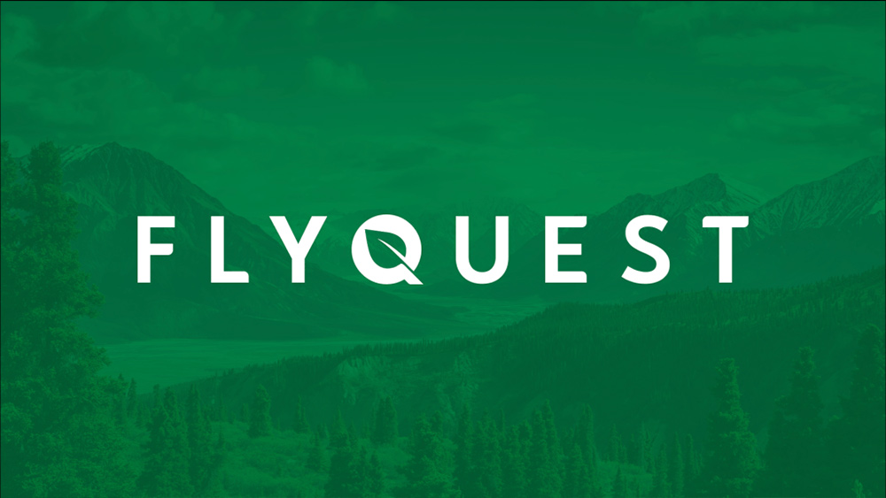
Rebrands tend to generate a mixed response, but here's one that's been immediately hailed as an improvement by almost everyone. The esports team FlyQuest has revealed its new identity, and it looks a lot better.
Founded in 2017, FlyQuest competes in the League of Legends Championship Series. But it's an esports team with a difference. Since launching a Go Green initiative in 2020 after Tricia Sugita stepped up as CEO, it's started focusing on social and environmental awareness. That's seen the team run campaigns to plant trees and to raise awareness of the plight of the world's bee population.
Until now that focus has been something you might not deduce from the team's logo, but a rebranding unveiled this week has changed all that – and it's created a much sharper look in the process (for top tips on rebranding, see our guide to logo design).
Announcing the rebranding, Sugita said FlyQuest had struggled to stand out and communicate what it stood for but has now found its way. The new look, created with designer Clara Nguyen, reinforces the team's green ambitions both in the colour palette and the design of the logo.
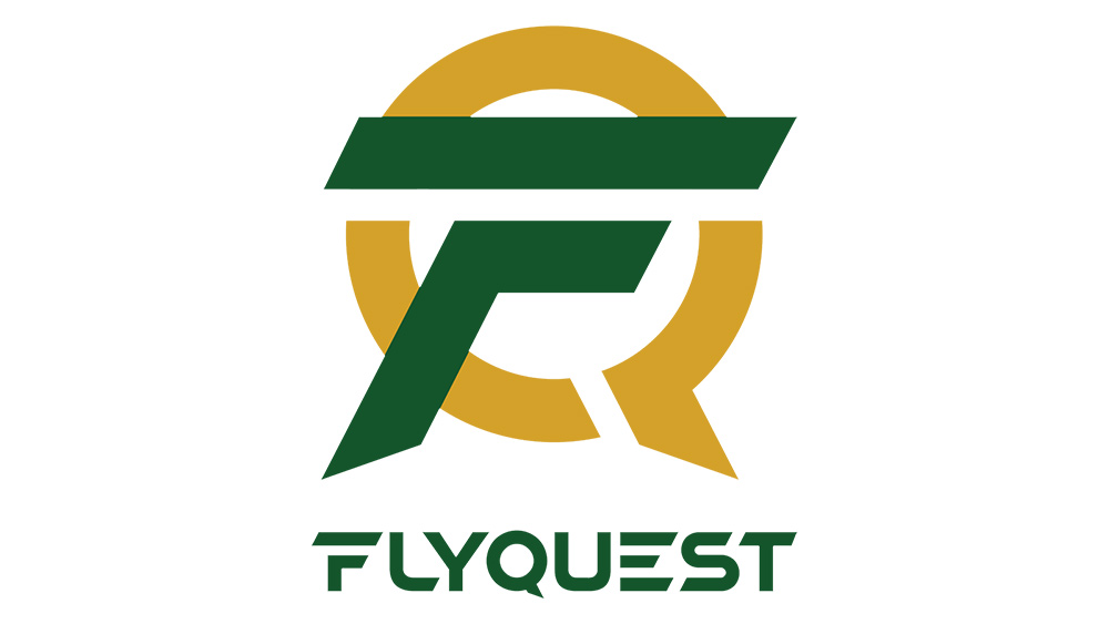
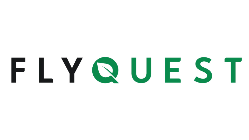
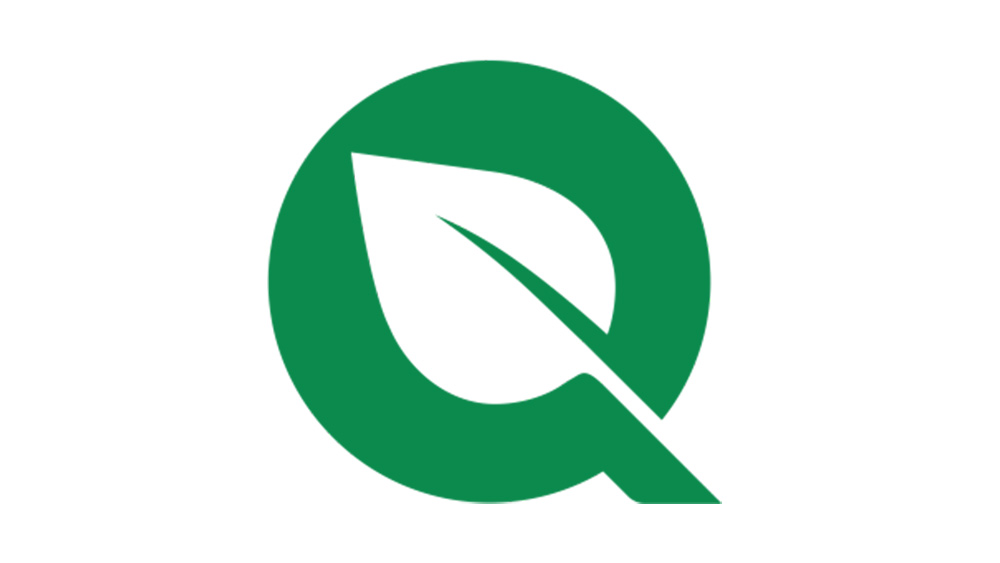
While the almost militaristic sci-fi feel of the previous logo with its straight lines and hard edges did little to communicate the brand's green credentials, FlyQuest's rebranding has put them centre stage. A simple leaf shape appears in the blank space in the Q in the brand's name, which also stands alone as a logomark. The colour palette has been simplified with a more vibrant green replacing the previous green and gold, and a simpler typeface creates a cleaner look.
Nguyen says she set out to "rebrand the FlyQuest logo into a mark that encapsulated their mission of environmental initiatives, the dynamic nature of esports, and their inclusive and wholesome community."
The rebranding seems to have been welcomed by fans, avoiding the controversy that often dogs changes to team logos. @TheEsportsLook tweeted: "#LCS team FlyQuest have updated their visual identity, with a new logo, refreshed colour palette and a cleaner typeface. Their style, combined with their social initiatives, continues to be like nothing else in esports. It's beautiful"
Get the Creative Bloq Newsletter
Daily design news, reviews, how-tos and more, as picked by the editors.
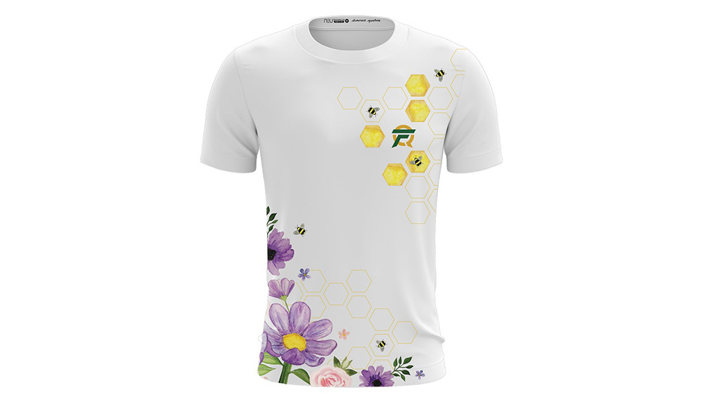
It may have helped that some changes had already been introduced, with green added as the predominant colour in the team's branding last year. The team has also experimented with jersey designs that feature jellyfish and honeycomb patterns to communicate its green credentials. And while the Q in the new logomark has been reimagined, it still retains a trace of the previous design.
Art director and creative strategist Lauren Gaba Flanagan (@lgflanagan) also liked the change. She tweeted: "An esports rebrand I’m truly delighted by. Building a brand around social good was the first of its kind in esports, and the visual identity now wholly reflects their mission."
Read more:
- 10 unmissable logo design trends for 2021
- The 10 best logos of all time
- Logo design: all you need to know

Thank you for reading 5 articles this month* Join now for unlimited access
Enjoy your first month for just £1 / $1 / €1
*Read 5 free articles per month without a subscription

Join now for unlimited access
Try first month for just £1 / $1 / €1

Joe is a regular freelance journalist and editor at Creative Bloq. He writes news, features and buying guides and keeps track of the best equipment and software for creatives, from video editing programs to monitors and accessories. A veteran news writer and photographer, he now works as a project manager at the London and Buenos Aires-based design, production and branding agency Hermana Creatives. There he manages a team of designers, photographers and video editors who specialise in producing visual content and design assets for the hospitality sector. He also dances Argentine tango.
