Apple set to open its first floating store (and it looks... interesting)
Straight out of the future.
Sign up to Creative Bloq's daily newsletter, which brings you the latest news and inspiration from the worlds of art, design and technology.
You are now subscribed
Your newsletter sign-up was successful
Want to add more newsletters?

Five times a week
CreativeBloq
Sign up to Creative Bloq's daily newsletter, which brings you the latest news and inspiration from the worlds of art, design and technology.

Once a week
By Design
Sign up to Creative Bloq's daily newsletter, which brings you the latest news and inspiration from the worlds of art, design and technology.

Once a week
State of the Art
Sign up to Creative Bloq's daily newsletter, which brings you the latest news and inspiration from the worlds of art, design and technology.

Seasonal (around events)
Brand Impact Awards
Sign up to Creative Bloq's daily newsletter, which brings you the latest news and inspiration from the worlds of art, design and technology.
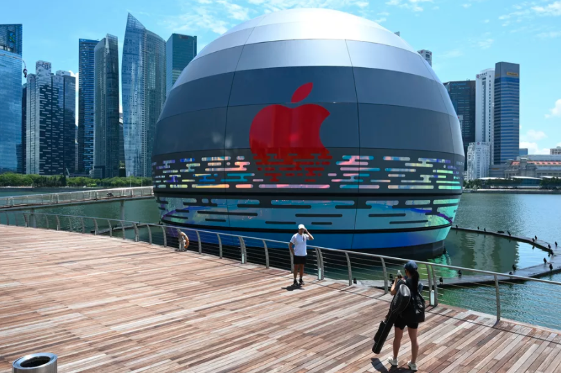
Just like its products, Apple's retail stores are known for their appealingly clean and contemporary design. But while Apple's current design philosophy might seem a little utilitarian compared with its more colourful early years, the tech giant's latest retail store is certainly outlandish. In short, it's a huge, glowing orb that floats on water. Because, well, why not?
Apple Marina Bay Sands is located in Singapore's waterfront resort of the same name. It isn't open to the public yet so we don't know what wonders await inside, but we've been given a good look at the exterior both during the day at at night. Whether it looks thoroughly utopian or dystopian is up to you, but it certainly looks like something straight out of a sci-fi film (check out these 35 incredible famous buildings for more inspiring examples).

By day, the store (above) looks futuristic enough. Like some kind of recently landed extra-terrestrial vehicle, building sits atop the water in all its almost-spherical glory. But at night, the building truly enters 'Blade Runner' territory. With its neon blue and red lights, the store is clearly designed to command attention in the dark.
The rumours are indeed true! Apple Marina Bay Sands, the first Apple store in the world that floats on the water, is opening soon in Singapore.#AppleMarinaBaySands #Singapore #SingapoRediscovers #cityscape #architecture @Apple @marinabaysands @AP_Magazine @GettyImages pic.twitter.com/Awbgzo2qtOAugust 24, 2020
9to5Mac has published what appear to be official marketing materials including some delightful artistic impressions (below) of the store, as well as copy detailing Apple's vision for the store.
"Apple Marina Bay Sands is a gleaming orb resting on the waters of Singapore’s bayfront," the marketing copy reads. "During the day, the store’s glass panels reflect the towering skyline of the Downtown Core and motion of the rippling water. At night, the sphere glows with a gentle warmth evoking the design of traditional lanterns carried during Singapore’s Mid-Autumn Festival."
While we can't help but think the store resembles a giant inflatable zorb ball (is zorbing still a thing?), there's no denying that the extravagant design is pretty eye-catching. It's also fun to see Apple reconnect with its fun and outlandish side, reminding us of the days of the bubbly iMac G3. For a trip down memory lane, check out the 10 most beautiful Apple designs (and the 5 ugliest). And if you're looking for a deal direct from Apple itself, head over to the Apple Back to School sale.
Read more:
Sign up to Creative Bloq's daily newsletter, which brings you the latest news and inspiration from the worlds of art, design and technology.

Daniel John is Design Editor at Creative Bloq. He reports on the worlds of design, branding and lifestyle tech, and has covered several industry events including Milan Design Week, OFFF Barcelona and Adobe Max in Los Angeles. He has interviewed leaders and designers at brands including Apple, Microsoft and Adobe. Daniel's debut book of short stories and poems was published in 2018, and his comedy newsletter is a Substack Bestseller.
