Fisher-Price’s new logo puts the fun back in branding
Pentagram gives kids' toy company a joyful brand refresh.

Much-loved toy brand Fisher-Price has had a rebrand courtesy of Pentagram. This new iteration feels more fun and playful, and covers everything from a refreshed logo down to bright animations, a new custom typeface that draws on the brand's heritage as well as messaging and merchandise.
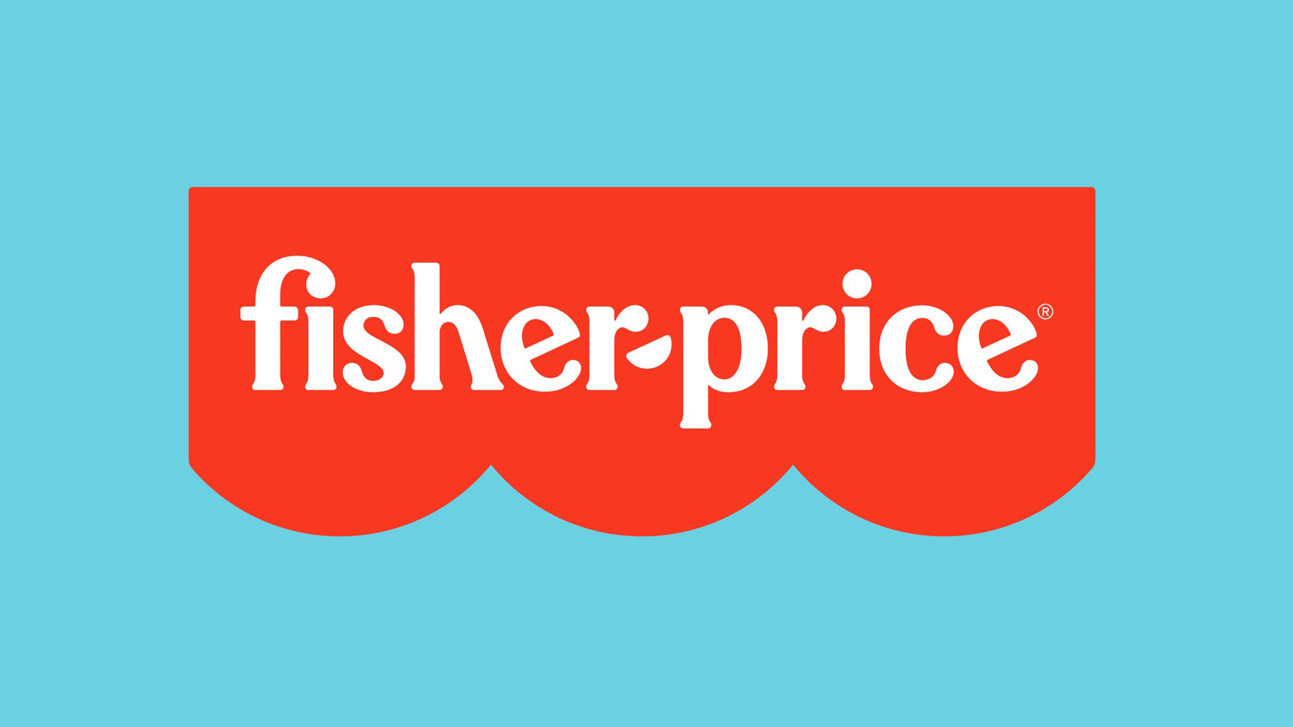
Headed up by Emily Oberman, Pentgram has tweaked Fisher-Price's existing logo, retaining the brand's classic colours, and changing the awning from four to three semicircles to represent the brand's three founders (Herman Fisher, Irving Price and Helen Schelle, who sadly didn't get her name in the brand).
The switch from upper- to lower-case 'F' and 'P' adds a childlike hint to the logo, while the hyphen is now a smile or semicircle, echoing the awning and again hinting at fun. (See our best logos post for more logo inspiration.)

There are several iterations of the new logo, a circular logo Pentagram is calling a "bubble" that contains 'fp', and a "flag tag" that includes the awning and abbreviation. The awning itself can also now be used as a graphic icon to decorate merchandise or in promotional photography (see below).

After digging through Fisher-Price's archives, Pentagram found that the typeface Cheltenham was used extensively, and so type designer Jeremy Mickel drew on this when creating the brand's new custom typefaces, Let’s Be Glyphs and Let’s Be Glyphs Bouncy. The new type feels more appropriate for a kids' toy company, although the slightly jaunty angle of some of the letters will no doubt upset some.
You can see the new logos and typefaces in use in the video below.
There's also a range of playful animations, and while these don't feel quite so coherent as the refreshed logos, they still have that breezy, childlike feel to them.
Get the Creative Bloq Newsletter
Daily design news, reviews, how-tos and more, as picked by the editors.
Overall, this feels like a solid brand update from Pentagram. It's one of those rebrands that looks like it's always been there, and it also feels like the designers had a lot of fun playing around with the brand (which is appropriate, considering Fisher-Price is all about play). The team have come up with just enough tweaks to make Fisher-Price feel fresh, while retaining all the good bits of the existing branding. Emily Oberman and team, we salute you.
You can read more about the Fisher-Price rebrand via Pentagram's website.
Read more:

Thank you for reading 5 articles this month* Join now for unlimited access
Enjoy your first month for just £1 / $1 / €1
*Read 5 free articles per month without a subscription

Join now for unlimited access
Try first month for just £1 / $1 / €1

Rosie Hilder is Creative Bloq's Deputy Editor. After beginning her career in journalism in Argentina – where she worked as Deputy Editor of Time Out Buenos Aires – she moved back to the UK and joined Future Plc in 2016. Since then, she's worked as Operations Editor on magazines including Computer Arts, 3D World and Paint & Draw and Mac|Life. In 2018, she joined Creative Bloq, where she now assists with the daily management of the site, including growing the site's reach, getting involved in events, such as judging the Brand Impact Awards, and helping make sure our content serves the reader as best it can.
