Can you complete this fiendish logo quiz without checking your homescreen?
Don't cheat!

There's no better Friday afternoon activity than a logo quiz. (Well, for us logo geeks, anyway.) And this one is a satisfying romp through all those the tech logos you think you know so well.
You may see these logos on your screen on a daily basis, and some may be even be considered among the best logos ever, but how well have they really sunk in? Now's your chance to find out. Including tech giants from Spotify and Adobe to Google and Twitter, it's up to you to choose which is the correct design out of the two options given.
Think you know your tech company logos? I made a quick quiz to test your knowledge: https://t.co/tROjHhBjDJ pic.twitter.com/4SHhKdgtmgMarch 11, 2021
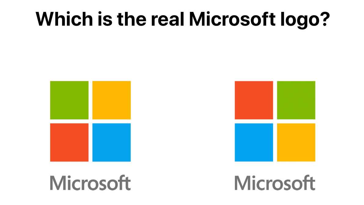
Luke Millar's quiz may sound easy – try it for yourself here – but have you really paid attention to which direction the lines slant in the Spotify logo or the exact positioning of the colours in the Microsoft squares (below)? How about exactly how big a bite has been taken out of the Apple logo or the exact shade of blue found on the Twitter bird? There are some examples here that are sure to catch you out, however much you stare at your homescreen.

With a simple 'correct' or dramatic 'womp womp' to indicate right or wrong answers, it's a nicely-formulated quiz with great personality. If all this has got you in the mood for procrastination through quizzing, we're here for you. Try this car logo quiz next, or see if you can spot the errors in these famous logos. Have fun!
Read more:
- Stunning iOS app icon designs
- Where to find logo design inspiration
- Logo design: All you need to know
Get the Creative Bloq Newsletter
Daily design news, reviews, how-tos and more, as picked by the editors.

Thank you for reading 5 articles this month* Join now for unlimited access
Enjoy your first month for just £1 / $1 / €1
*Read 5 free articles per month without a subscription

Join now for unlimited access
Try first month for just £1 / $1 / €1

Georgia has worked on Creative Bloq since 2018, and has been the site's Editor since 2022. With a specialism in branding and design, Georgia is also Programme Director of CB's award scheme – the Brand Impact Awards. As well as immersing herself with the industry through attending events like Adobe Max and the D&AD Awards and steering the site's content streams, Georgia has an eye on new commercial opportunities and ensuring they reflect the needs and interests of creatives.
