Is this FedEx logo redesign even better than the original?
Fan-made rebrand is a hit.

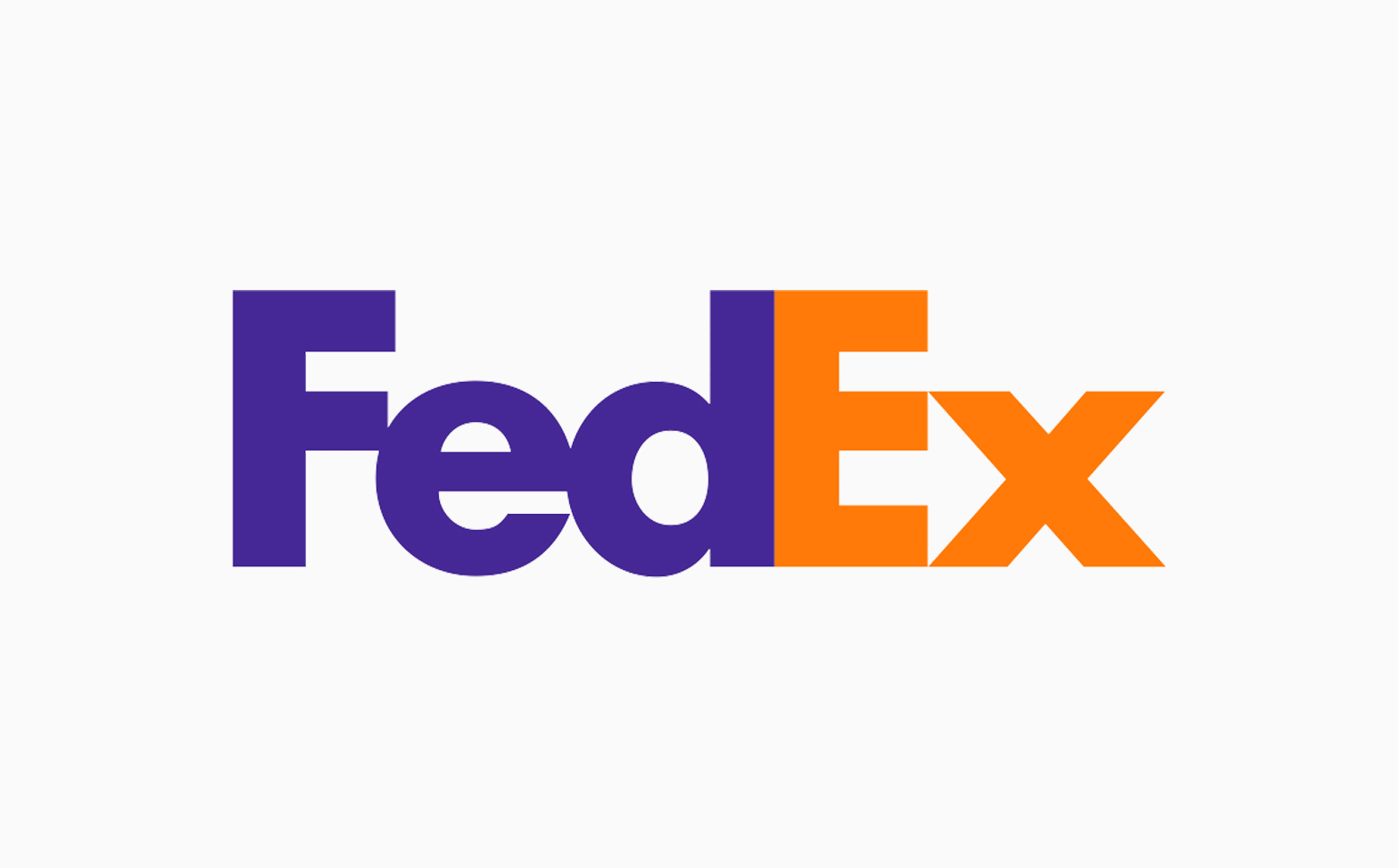
The FedEx logo is one of the most famous logos in the world, and one of the cleverest. Ask anyone to name a logo with a secret message, and they'll probably point to FedEx's hidden arrow (that or the Amazon smile). But could the iconic design be improved?
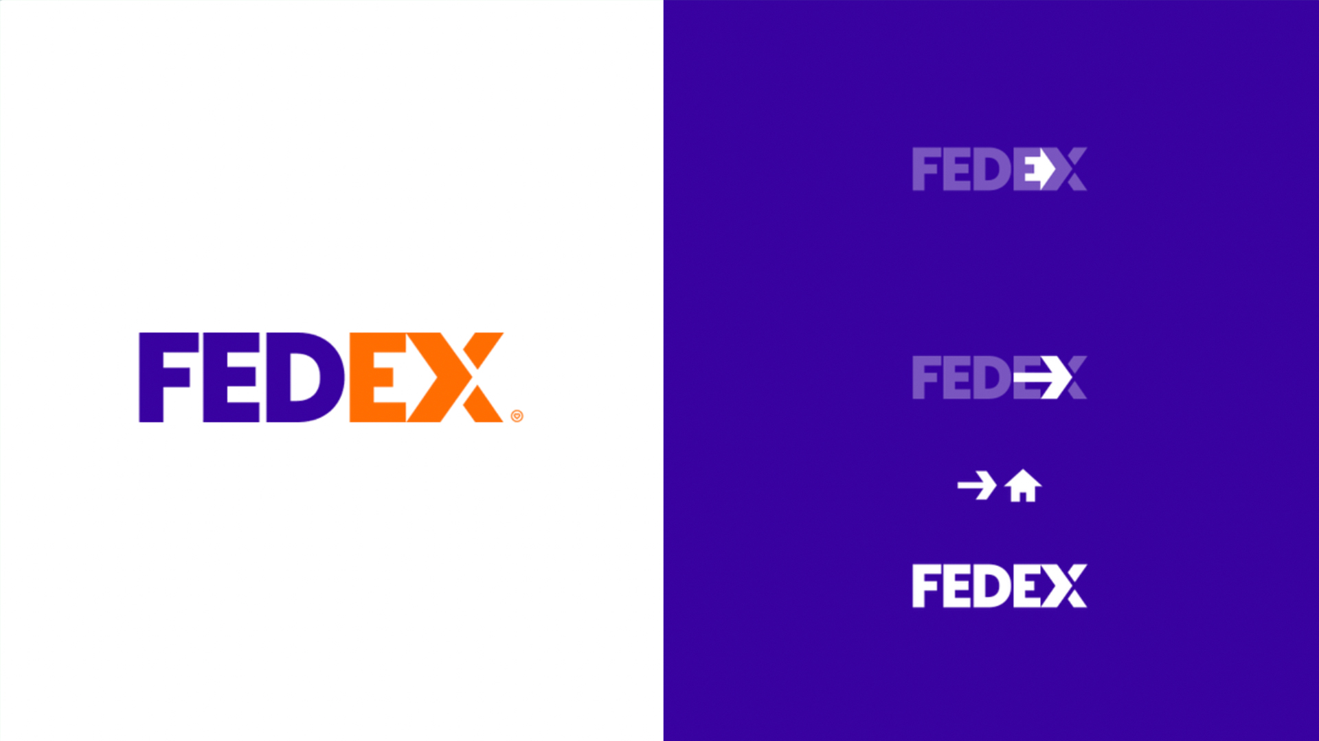
Designer Fabian Arbor is becoming synonymous on Twitter with logo redesigns, and his FedEx rebrand might be the best yet. Thanks to a few subtle tweaks, we now have not one but two hidden images within that E and X. (Looking for inspiration? Check out the best logos of all time.)
FedEx Rebrand !! pic.twitter.com/zzTDpoCKrpFebruary 9, 2023
Arbor's design slightly complicates the original, capitalising the 'X' to make it the same size as the 'E', so that the negative space now represents a house (because that's where parcels are delivered!). But there's still an arrow in there if you look hard enough – and Arbor has kindly provided a visual demonstration of the hidden messages alongside the design.

The update is getting a lot of love on Twitter. "Love the updated take here! Always felt like the negative space on their current one was almost too downplayed," one user comments, while another adds, "This version is even smarter than the original, love it!" But seeing as this is from the designer behind that awesome Domino's rebrand concept, it's no surprise we have another winner on our hands.
Read more:
- Are these Google logo concepts better than the real thing?
- We can't stop looking at the Domino's x Stranger Things mashup
- Is the new Burberry logo the start of an exciting design trend?
Get the Creative Bloq Newsletter
Daily design news, reviews, how-tos and more, as picked by the editors.

Thank you for reading 5 articles this month* Join now for unlimited access
Enjoy your first month for just £1 / $1 / €1
*Read 5 free articles per month without a subscription

Join now for unlimited access
Try first month for just £1 / $1 / €1

Daniel John is Design Editor at Creative Bloq. He reports on the worlds of design, branding and lifestyle tech, and has covered several industry events including Milan Design Week, OFFF Barcelona and Adobe Max in Los Angeles.
