Logo swap is surprisingly disturbing
Fast food logo mashups range from horrifying to quite good.
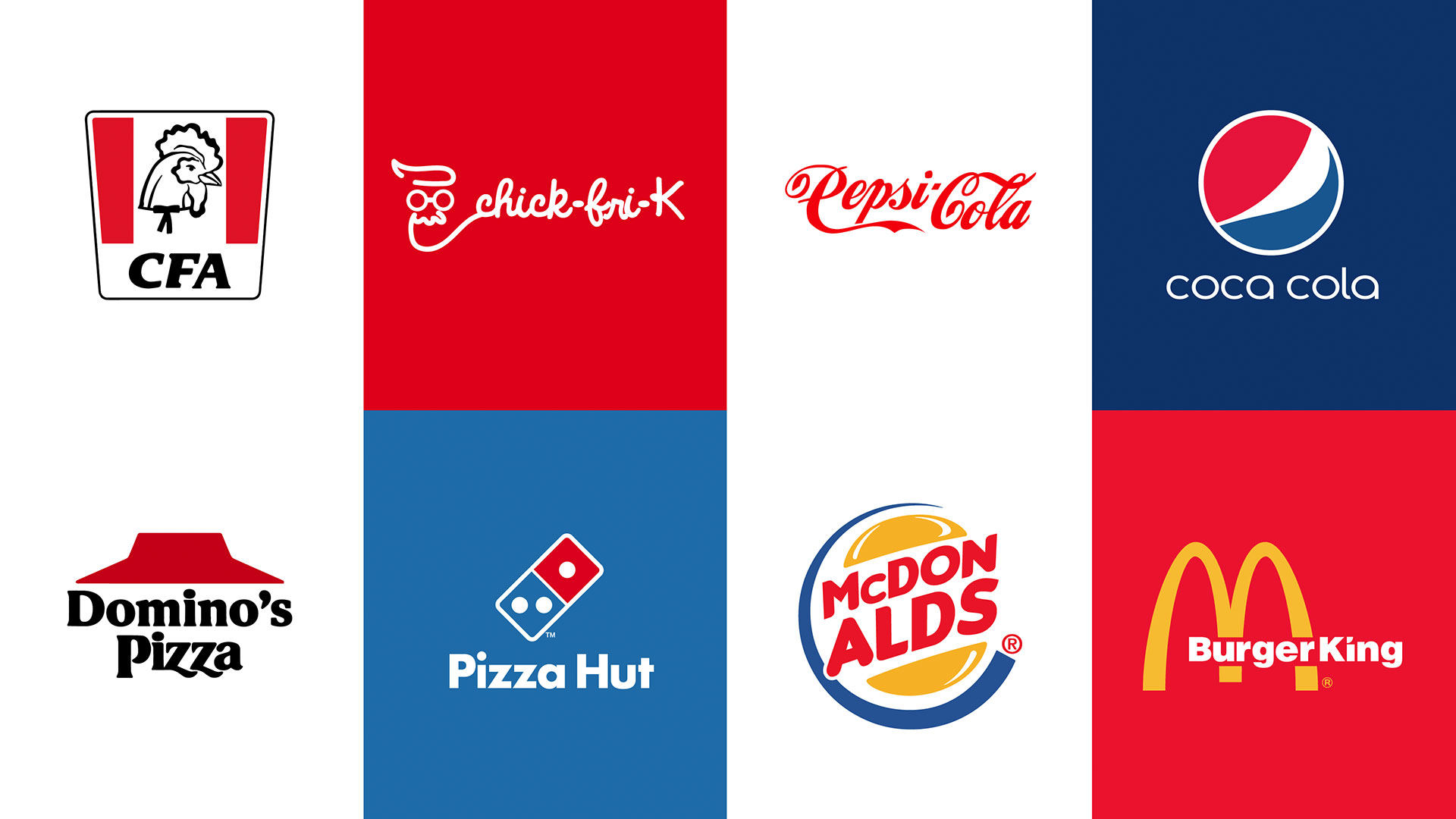
What would happen if rival brands decided to collaborate and combine their logos? That's what kitchen appliance dealer CDA has done, with a series of delicious logo mashups that have resulted in some impressive pieces of experimental design.
Slamming together two or more separate creative works is rarely the best idea, but when carried off with sensitivity and panache it can produce stunning results, and for one of the greatest examples of this you should definitely pay a visit to The Kleptones and avail yourself of some of their musical creations, all carefully constructed from other songs.
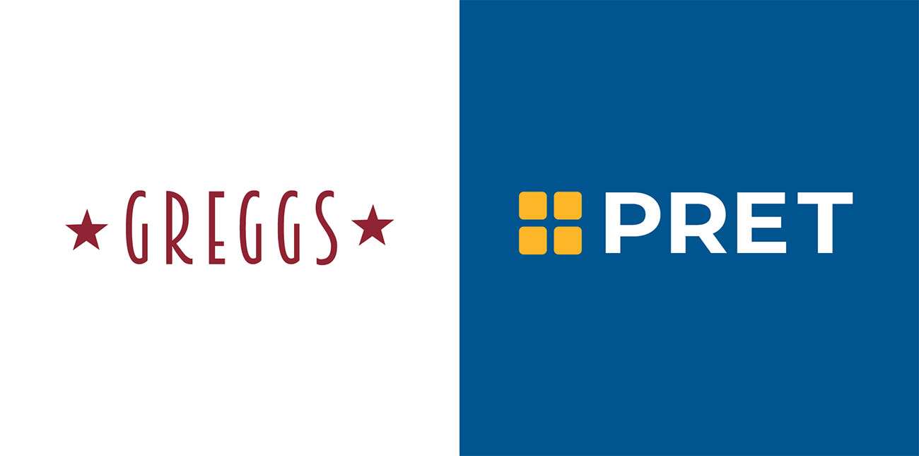
Musical mashups often work thanks to the surprise element of mixing unlikely genres of music together, but these visual mashups from CDA work in a different way. Here they've taken similar fast food brands and juggled their logos, with varying degrees of success. (See our logo design guide for advice on how to craft successful branding.)
CDA points out that fast food logos are often cultural icons that we immediately recognise. But, it asks, how deeply into our subconscious are these logos ingrained, and would we still recognise them if they weren't quite the same?
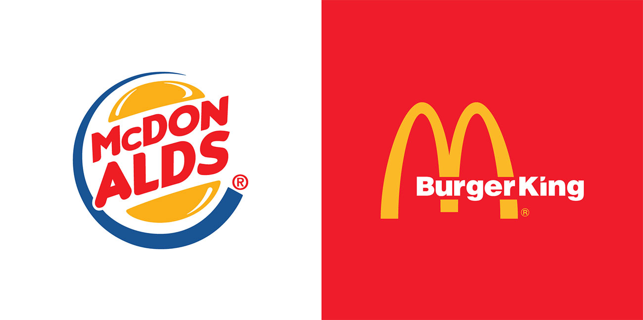
As these mashed-up logos demonstrate, the answer is, well, sometimes; it depends on just how familiar we are with the brands in question and how closely we associate them with their logo design.
So for example, when it comes to swapping round McDonald's and Burger King, nobody's going to fall for that one; they're simply too well-known for anyone to accept the mashed-up versions. Although interestingly, the Pepsi Cola brand name in the Coca-Cola style actually works, more so if you're aware that its early logos were drawn in a very similar script style.

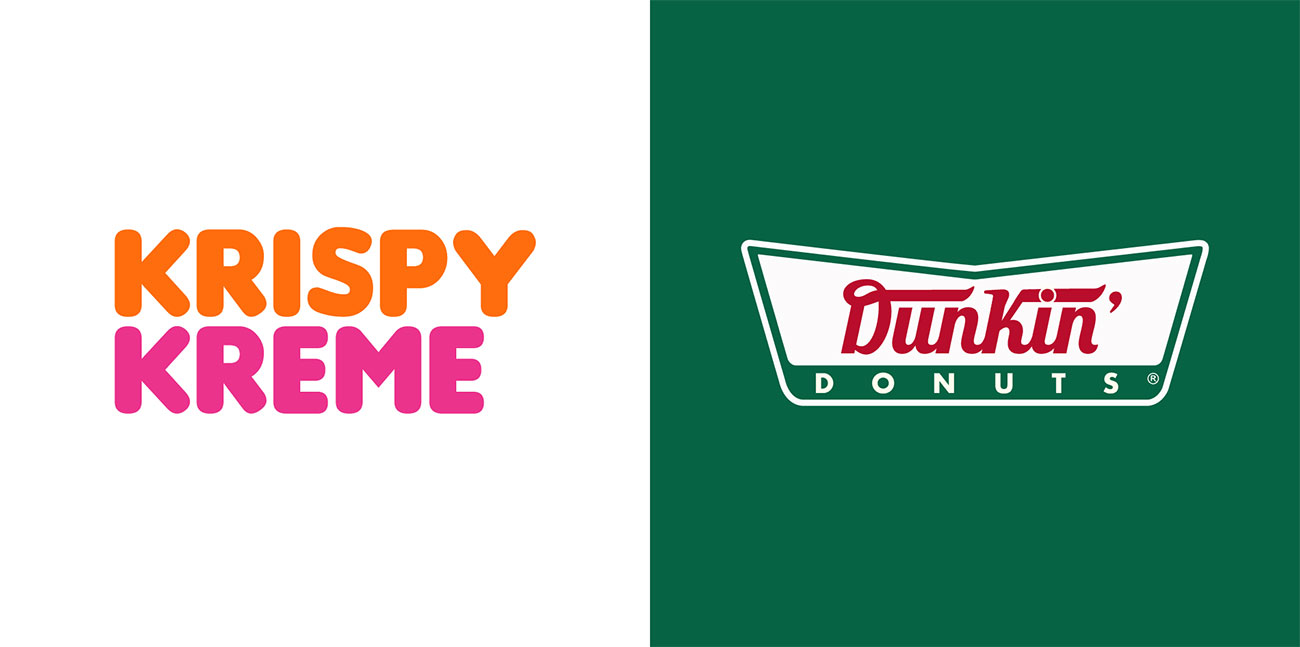
The most interesting experiments are the ones with brands that you don't pay that much attention to. We'd totally fall for the Dunkin Donuts/Krispy Kreme mashup, and the Baskin Robbins/Dairy Queen logo swap would sail by us unnoticed.
Get the Creative Bloq Newsletter
Daily design news, reviews, how-tos and more, as picked by the editors.
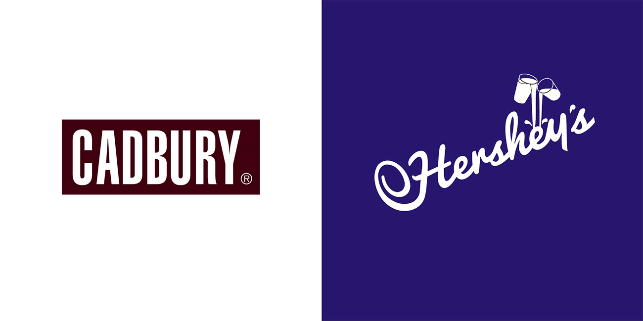
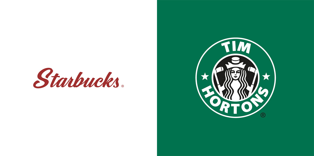
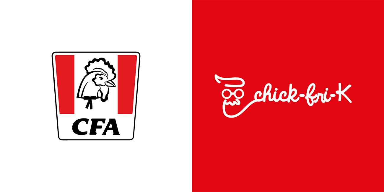
The Starbucks/Tim Hortons mashup is a fun one; we particularly like how the Starbucks mermaid logo has been changed to reflect Tim Hortons' hockey-playing history. As for the less successful efforts, we're strangely horrified by the collision of Cadbury's and Hershey; either logo would put us right off sampling whatever chocolate product it was promoting. And as for KFC vs Chick-Fil-A, well, we can see what they were trying to do, and they probably shouldn't have bothered.
Scroll through these logos by using the arrows below.
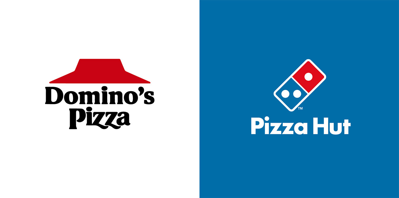
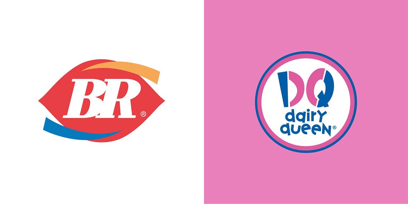
You can see CDA's full collection of mashed-up fast food logos here.
Related articles:

Thank you for reading 5 articles this month* Join now for unlimited access
Enjoy your first month for just £1 / $1 / €1
*Read 5 free articles per month without a subscription

Join now for unlimited access
Try first month for just £1 / $1 / €1
Jim McCauley is a writer, performer and cat-wrangler who started writing professionally way back in 1995 on PC Format magazine, and has been covering technology-related subjects ever since, whether it's hardware, software or videogames. A chance call in 2005 led to Jim taking charge of Computer Arts' website and developing an interest in the world of graphic design, and eventually led to a move over to the freshly-launched Creative Bloq in 2012. Jim now works as a freelance writer for sites including Creative Bloq, T3 and PetsRadar, specialising in design, technology, wellness and cats, while doing the occasional pantomime and street performance in Bath and designing posters for a local drama group on the side.
