Famous logos redesigned as fonts
Design project reveals the importance of logo typography.
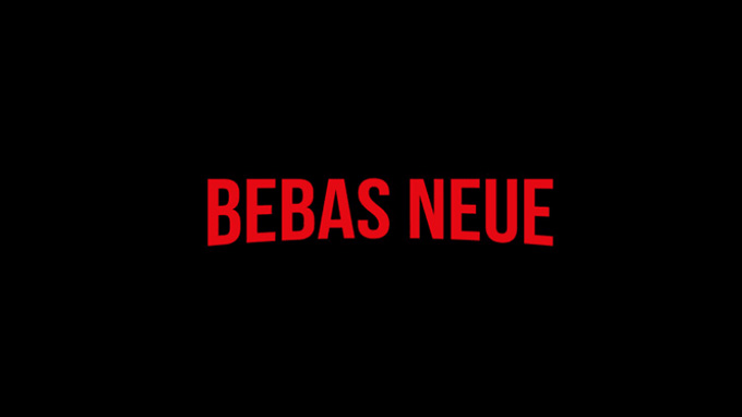
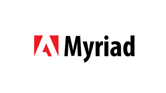
A good logo design often depends on a good typeface. If you get it right, the perfect font choice can become synonymous with a brand. To show how a strong identity can remain recognisable even when you swap out the brand name, designer and teacher Emanuele Abrate has been conducting a series of interesting logo experiments.
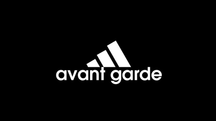
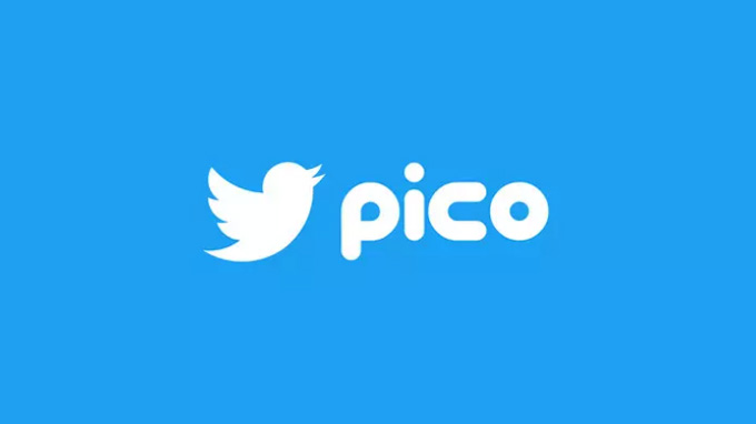
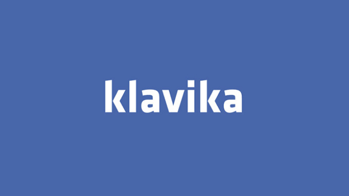
In his experiments, Abrate has swapped out the names of brands like Adidas and YouTube for the names of the fonts they use. Speaking to Co. Design, he revealed that the project came about as he struggled to identify the typeface in a logo. "Every time I see a logo, I wonder how it was conceived, how it was designed, what kind of typeface was used and why."
The results will make you double-take. In most cases, our eyes have become so used to the font styles and logo graphics that we'll just glaze over when looking at a design that looks recognisable enough. Take a look at them by scrolling left to right with the arrow icons in the gallery below.

Related articles:
Get the Creative Bloq Newsletter
Daily design news, reviews, how-tos and more, as picked by the editors.

Thank you for reading 5 articles this month* Join now for unlimited access
Enjoy your first month for just £1 / $1 / €1
*Read 5 free articles per month without a subscription

Join now for unlimited access
Try first month for just £1 / $1 / €1

Dom Carter is a freelance writer who specialises in art and design. Formerly a staff writer for Creative Bloq, his work has also appeared on Creative Boom and in the pages of ImagineFX, Computer Arts, 3D World, and .net. He has been a D&AD New Blood judge, and has a particular interest in picture books.
