Famous internet logos get a retro makeover
Is this how these brands would have looked in the '80s?
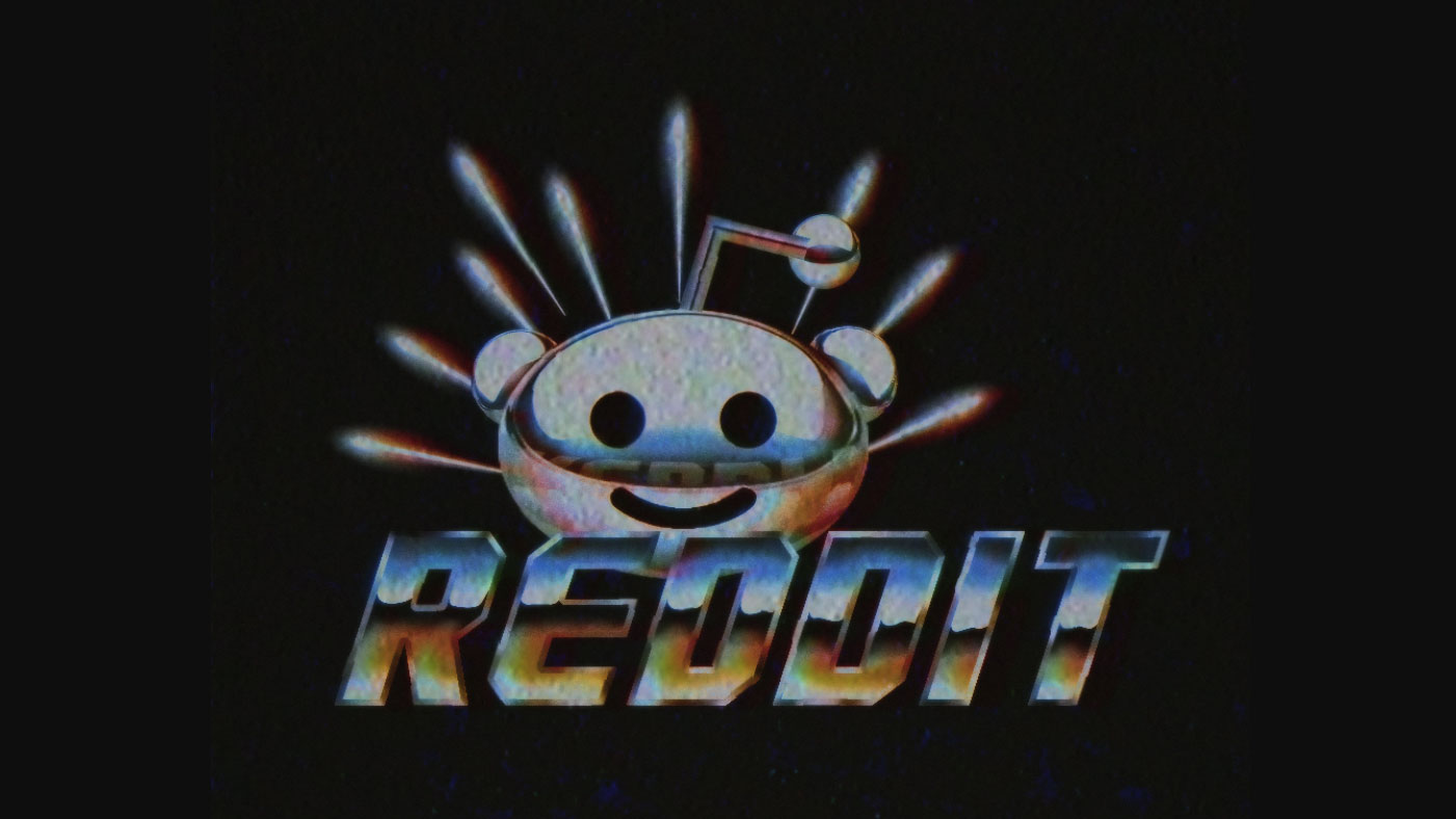
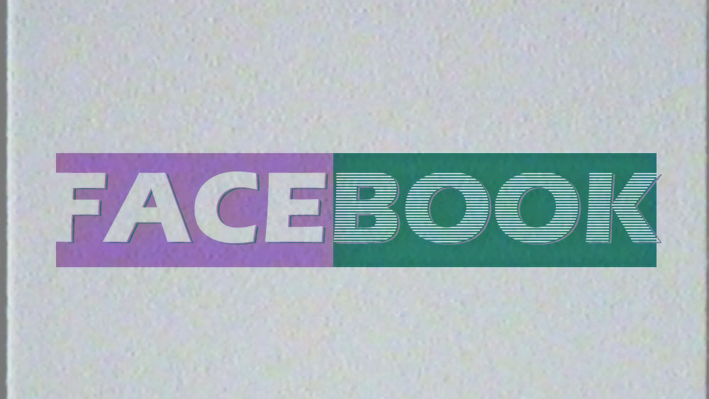
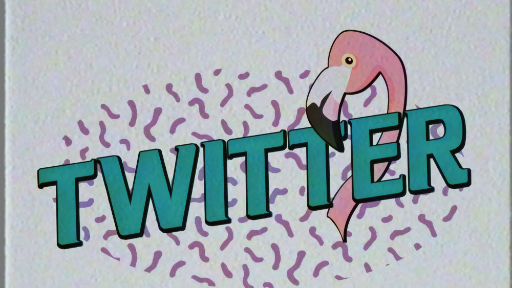
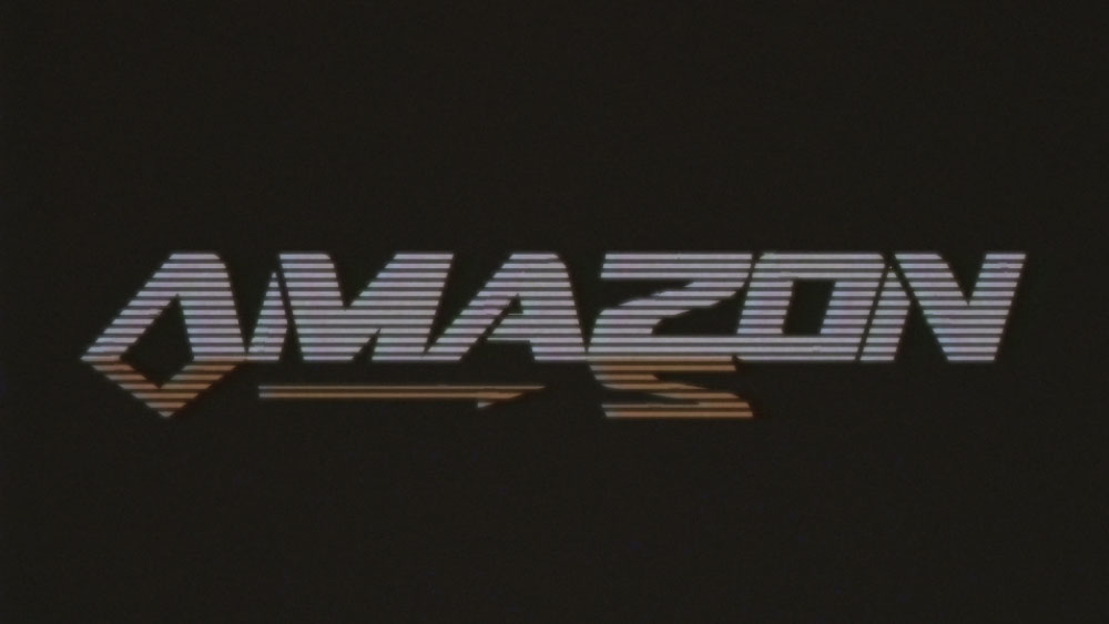
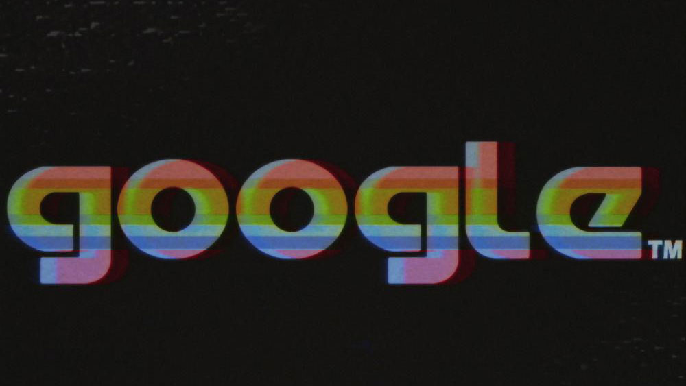
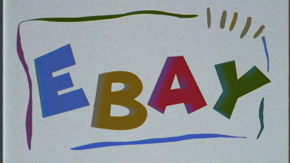
The biggest names on the internet have been given a retro rebrand and logo design makeover this week courtesy of Reddit user and designer FuturePunk. A self-proclaimed creative who specialises in "art & music and deals memes on the side", FuturePunk's keen eye for the aesthetics of yesteryear has seen the likes of Google, Instagram and YouTube get a strikingly '80s redesign.
The redesigns feature elements that readers of a certain age are sure to recognise. There's the blocky and spray painted visuals that call to mind the MTV logo, plus plenty of vibrant yet faded colours. The whole project looks like it was recorded on a VHS tape, but that's all part of the charm.
The logos were posted on Reddit's Outrun community – a forum that's dedicated to the synthwave music scene – and have unsurprisingly found a passionate audience of '80s fans.
Take a trip into an alternative past by scrolling through the logos in the gallery below. For best results we recommend listening to some Kavinsky for the ultimate Outrun community experience.
For more images, see parts one and two of the collection.
Related articles:
- New Burberry logo is stripped of knighthood
- Famous logos redesigned as fonts
- New Evernote logo is more evolution than revolution
Get the Creative Bloq Newsletter
Daily design news, reviews, how-tos and more, as picked by the editors.

Thank you for reading 5 articles this month* Join now for unlimited access
Enjoy your first month for just £1 / $1 / €1
*Read 5 free articles per month without a subscription

Join now for unlimited access
Try first month for just £1 / $1 / €1

Dom Carter is a freelance writer who specialises in art and design. Formerly a staff writer for Creative Bloq, his work has also appeared on Creative Boom and in the pages of ImagineFX, Computer Arts, 3D World, and .net. He has been a D&AD New Blood judge, and has a particular interest in picture books.
