Facebook (we mean Meta) gets a new logo – and the jokes are pouring in
Some of the comparisons are hilarious.

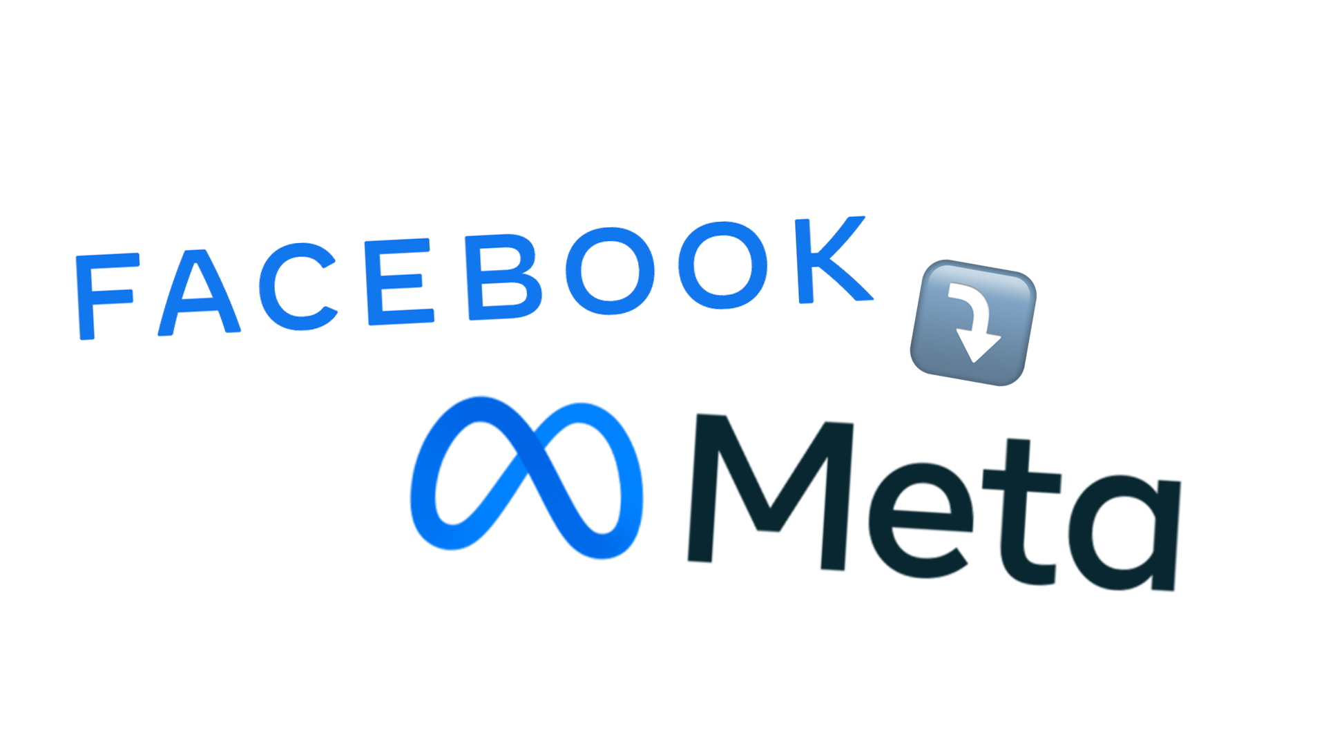
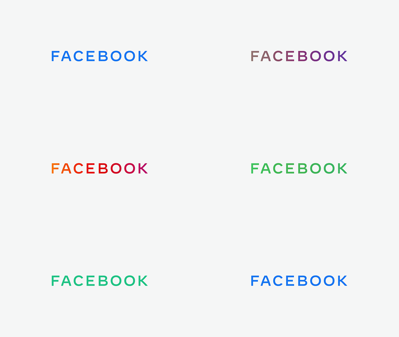
This morning, social media giant Facebook has revealed a major rebrand, changing its corporate name to Meta. It's also unveiled a brand new infinity shape logo, which is a world away from the previous company logo, which was an all-caps wordmark (see below) – not to be confused with the app's 'f' logo that we're all so used to seeing.
Facebook doesn't seem to have been aiming for familiarity here, with Meta – short for metaverse – representing an online virtual world, where users can do, well, just about anything (see our post on what is the metaverse if it's all feeling a bit meta to handle). The new identity will not, at this point, affect the company's individual platforms: Facebook, Instagram and WhatsApp.

There's already a lot of talk about the new name and identity online, and so far it doesn't look like it's going to win any awards for logo design any time soon. In fact, some of the comparisons to, er, certain body parts we've come across this morning already have made it now the only thing(s) we can see...
Bruh the new Facebook logo looks like testicles pic.twitter.com/IahAcNBz7dOctober 28, 2021
The new Facebook logo looks like lungs. Lungbook? #Metaverse pic.twitter.com/6sS9RX3mLpOctober 28, 2021
#Facebook is now #Meta ‘Our new logo is a rubber band because our morals are elastic. Oh, and we stretch the truth.’ pic.twitter.com/Sj7vlcwZhUOctober 29, 2021
this new facebook logo got my brand senses tingling pic.twitter.com/dqHXrjjIbQOctober 29, 2021
The jury is out for us at this time on the new identity, and, knowing little about the design process and the thinking behind it, we're going to reserve judgement. For now. Surely it can't be as bad as the terrible new McDonald's logo, right?
What we will say is that the reveal seems to be quite timely, with the company needing all the distractions it can get from the negative stories currently being leaked by ex-employee Frances Haugen. Although, based on the reactions online so far, it's not exactly having the desired effect just now.
Read more:
- The 10 best logos of all time
- Bad logos project is brilliantly awful
- How to choose the perfect logo colour for a brand
Get the Creative Bloq Newsletter
Daily design news, reviews, how-tos and more, as picked by the editors.

Thank you for reading 5 articles this month* Join now for unlimited access
Enjoy your first month for just £1 / $1 / €1
*Read 5 free articles per month without a subscription

Join now for unlimited access
Try first month for just £1 / $1 / €1

Kerrie Hughes is a frequent contributor to Creative Bloq, and was once its editor. One of the original CB crew, Kerrie joined the team back in 2013 after moving from her role as staff writer on 3D World. Since then she's written regularly for other creative publications such as ImagineFX, Computer Arts and Digital Camera World. After a stint working for the police, Kerrie is back reviewing creative tech for creative professionals.
