The Facebook logo: a history
The social media platform is 20 years old today.
Today is Facebook's 20th birthday, which means the social media platform is probably at college right now. Ironic, since that's where it all started – famously initially a 'campus' app, Facebook has arguably, for better or worse, since changed the entire concept of online relationships. But one thing that hasn't changed a huge amount is Facebook's logo.
Since 2004, Facebook's colour has been blue, and that's still the case here and now in 2024. But in the last twenty years, we've seen the company change its name and wordmark a few times, most recently in 2021 (although you might have to squint to see the difference with that one.) Here's how the logo has changed over the years – and if you're looking for more design inspiration, check out the best logos of all time.
Facebook logo: 2004
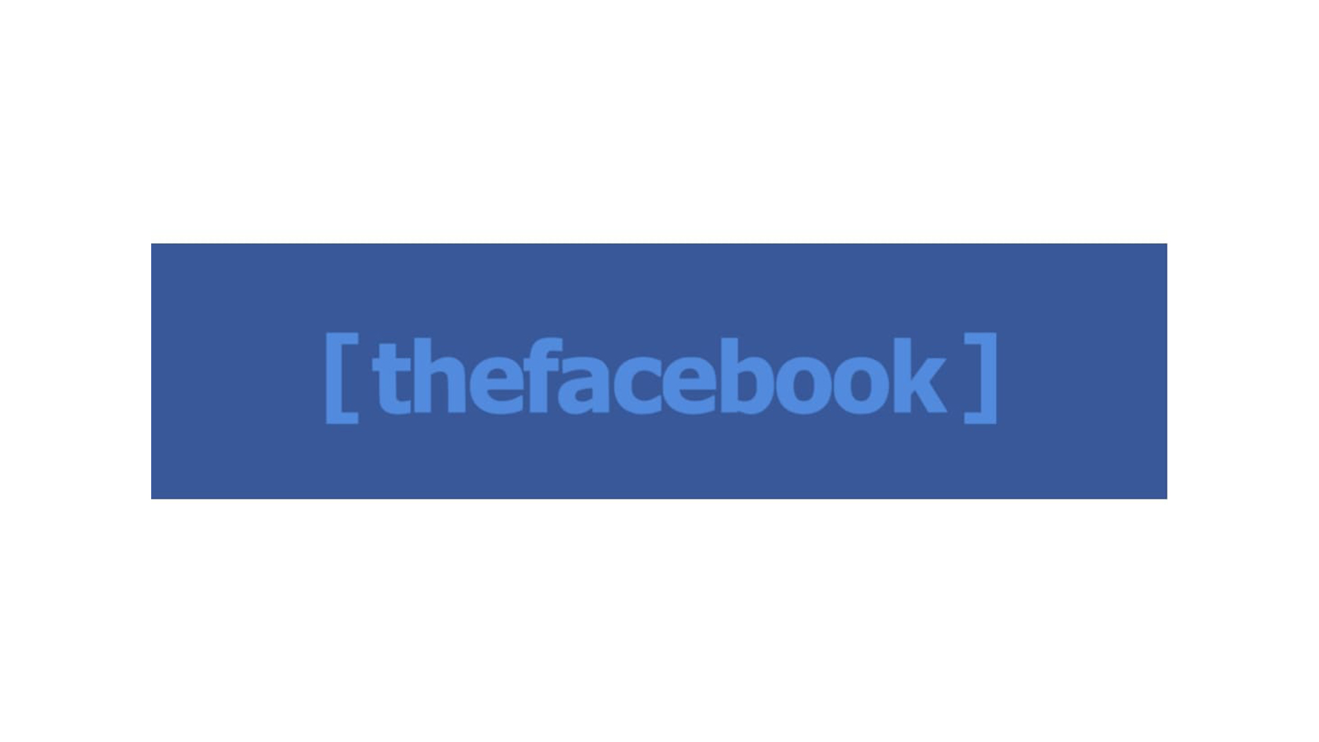
If you've seen The Social Network, you'll probably remember Justin Timberlake telling Jessie Eisenberg to "Drop the 'the'". Before Facebook, there was thefacebook, and its all lowercase wordmark probably wouldn't look out of place today (although those parenthesis are pretty dated).
While the blue-on-blue might seem an odd choice, according to 1000logos, it has a basis in Mark Zuckerberg's colourblindness. Apparently the founder "suffered deuteranopia – red-green color blindness. However, he could (and can) distinguish between shades of blue most of us normally cannot detect."
Facebook logo: 2005
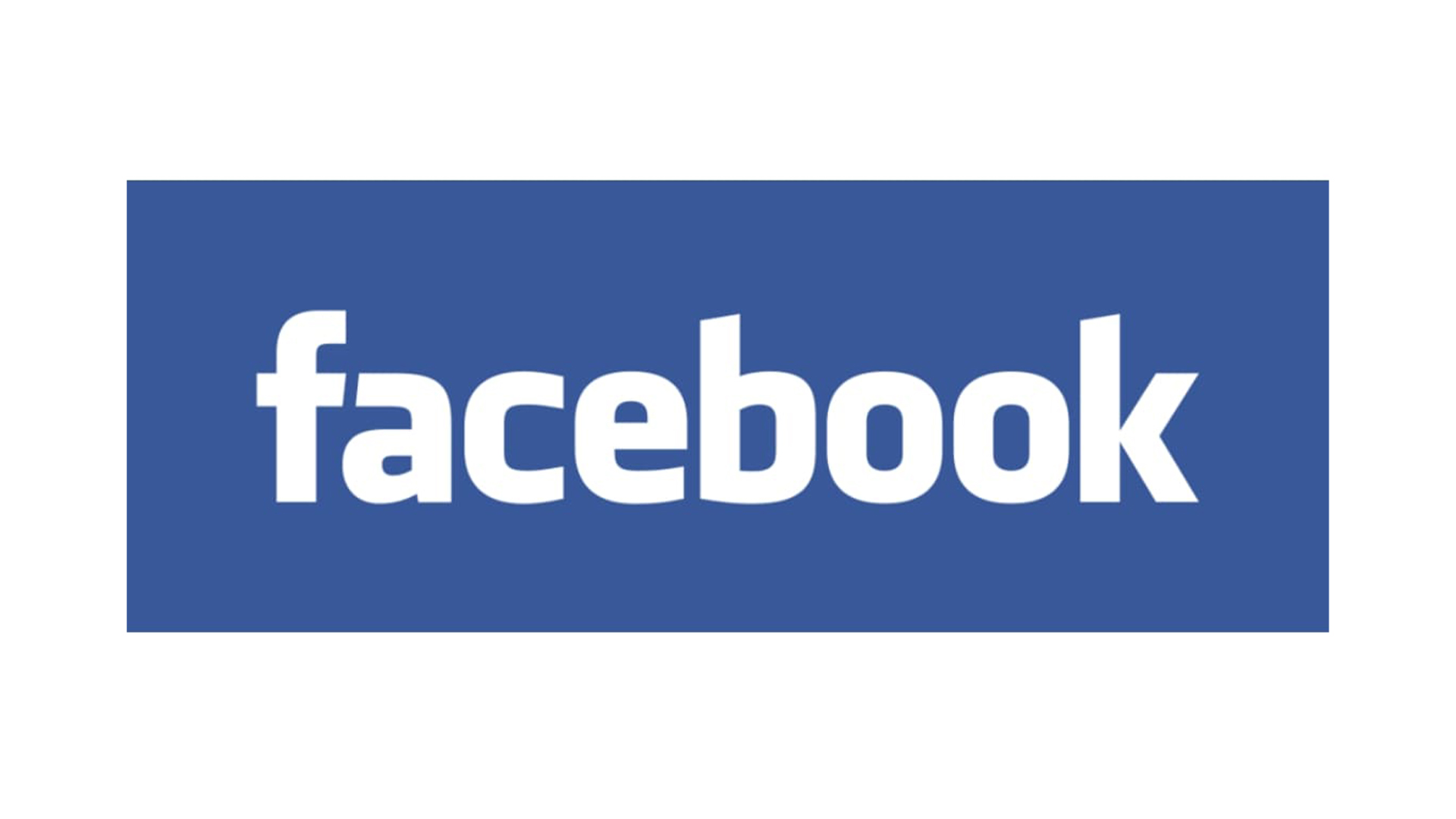
This one lasted a whole decade. When thefacebook become Facebook, a new wordmark arrived, offering a bespoke take on Eric Olson's Klavika font. It's a fairly simple logo, although the angled descenders are still recognisable today.
Facebook logo: 2015
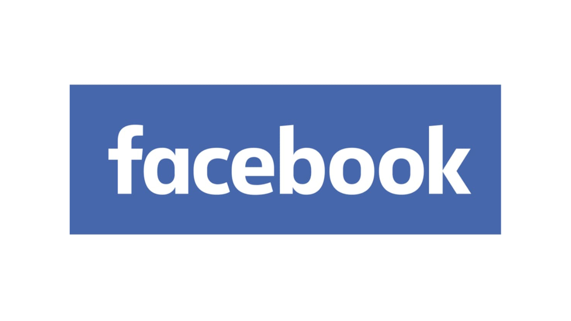
10 years later, Facebook unveiled subtle changes to its typography, with notably rounded 'a' and 'b' characters. At this point, the navy blue and white colour scheme remained unchanged.
Facebook logo: 2019
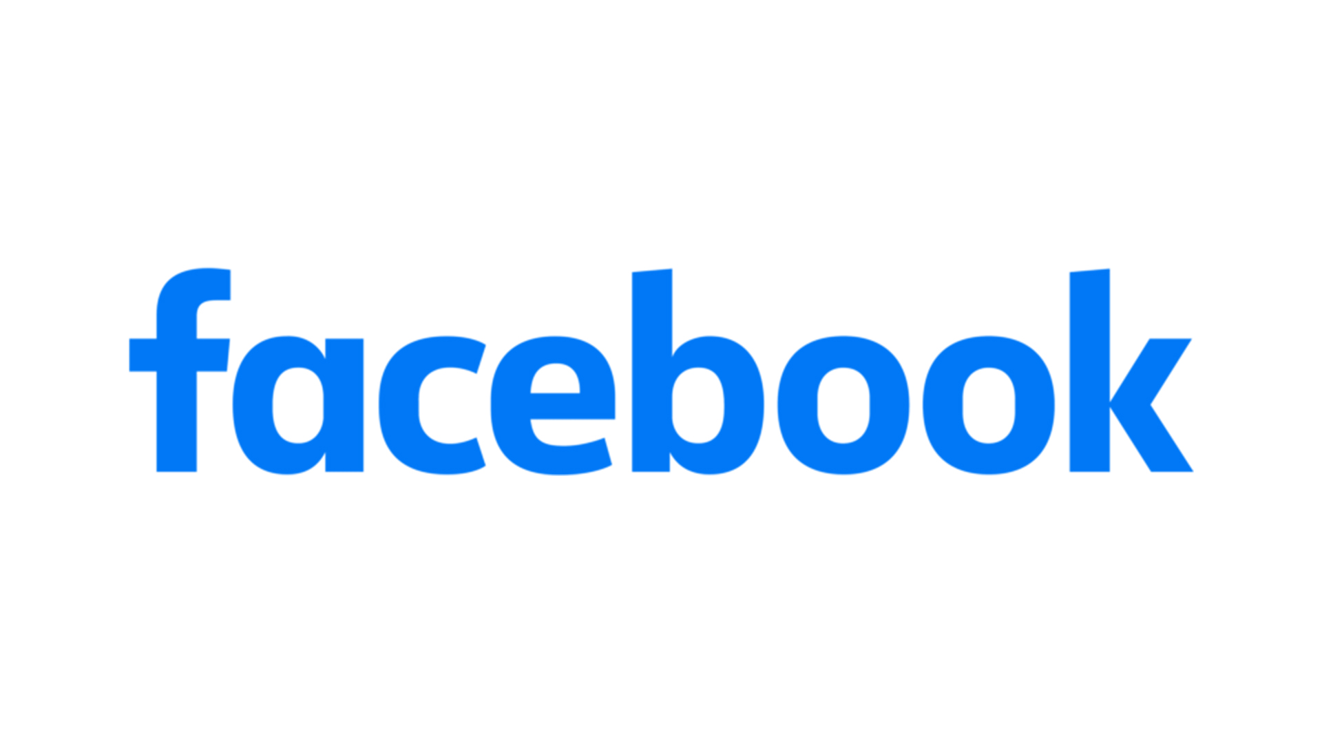
Facebook inverted its colour palette in 2019, switching from white-on-blue to blue-on-white. The blue, meanwhile, took on a notably lighter shade.
Sign up to Creative Bloq's daily newsletter, which brings you the latest news and inspiration from the worlds of art, design and technology.
Facebook logo: 2023
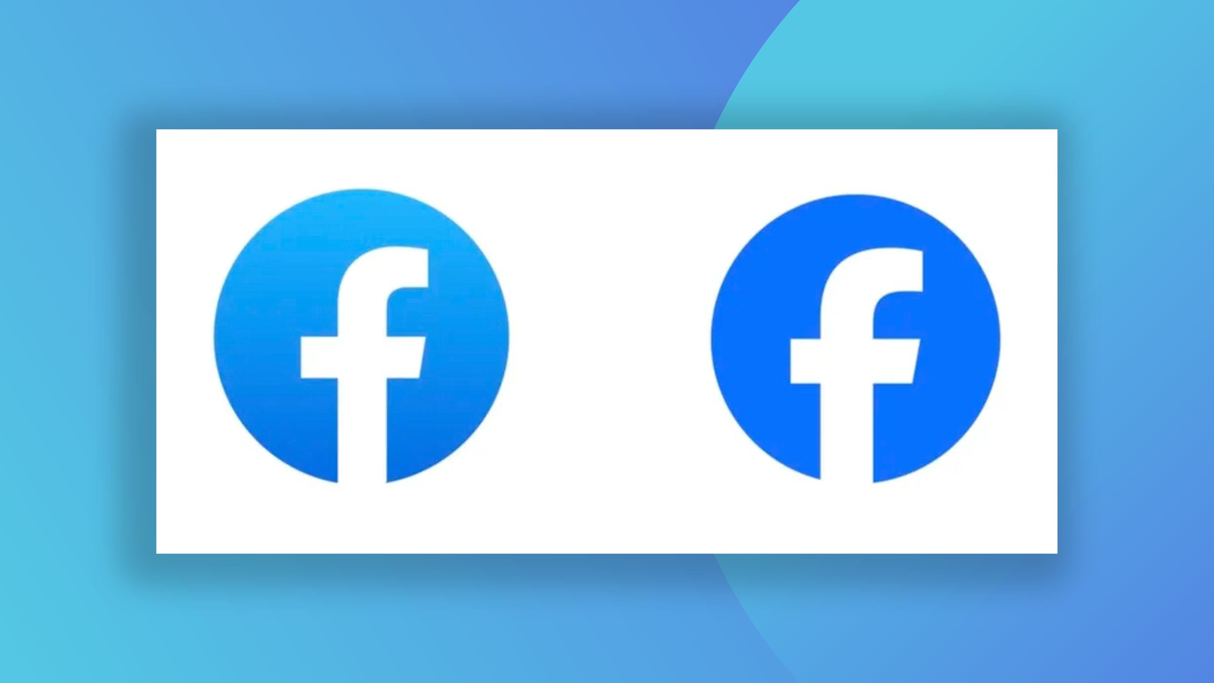
Last year, Facebook unveiled a subtle update to its monogram icon. The company called it "a bolder expression of Facebook's core blue", and that just about sums it up – it's more blue. Gone is the subtle gradient, replaced instead with a single, flat shade.
If you're looking for more social media logo histories, take a look at the history of the Instagram logo, and the history of the YouTube logo.

Daniel John is Design Editor at Creative Bloq. He reports on the worlds of design, branding and lifestyle tech, and has covered several industry events including Milan Design Week, OFFF Barcelona and Adobe Max in Los Angeles. He has interviewed leaders and designers at brands including Apple, Microsoft and Adobe. Daniel's debut book of short stories and poems was published in 2018, and his comedy newsletter is a Substack Bestseller.
