The new Facebook design is giving users the ick
Who thought this was a good idea?

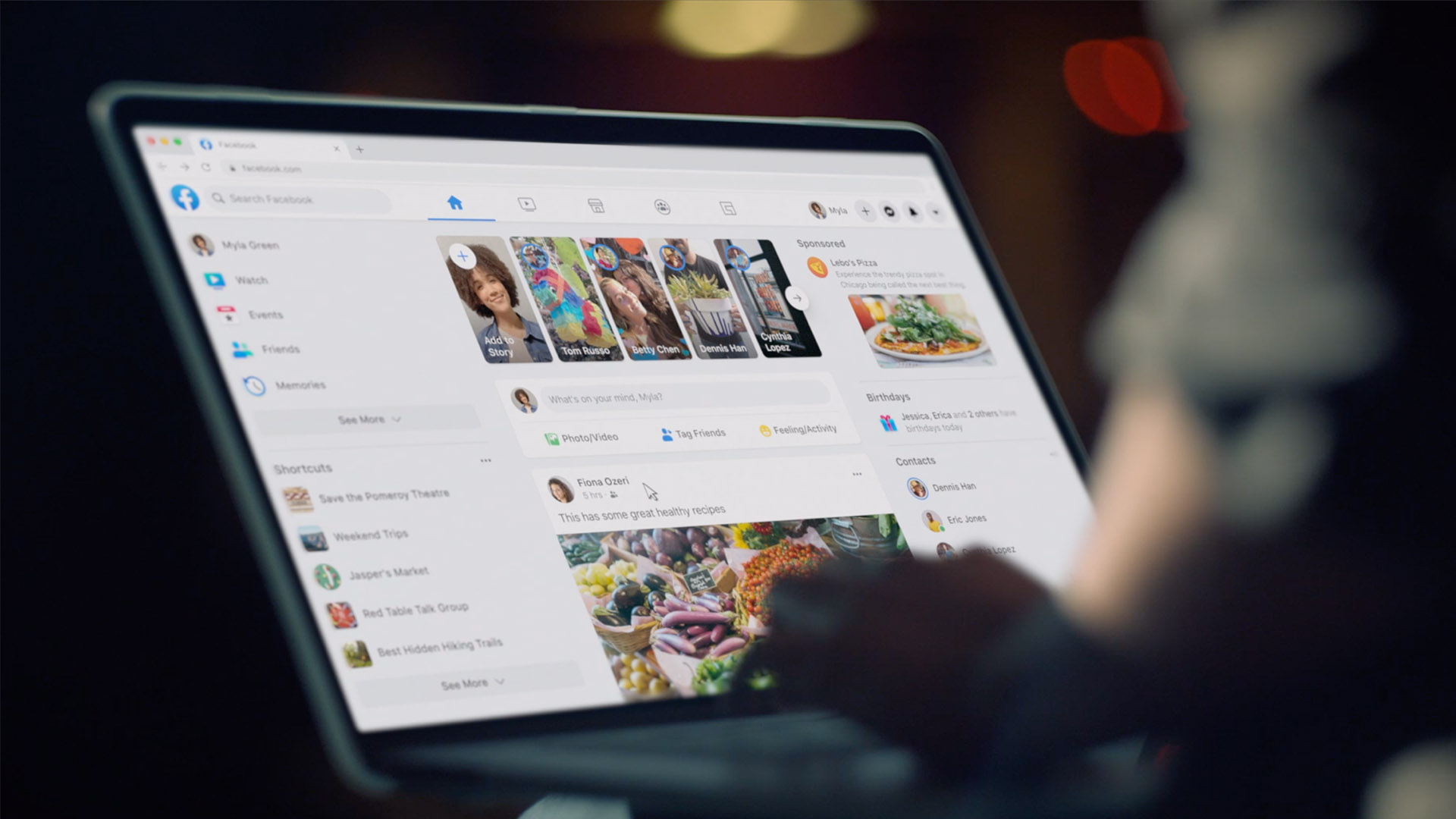
We know what you're thinking, is anyone actually still using the Facebook desktop browser? Well, apparently so. Now the famous social media site has received a makeover, and users are struggling to navigate their way around the new page design.
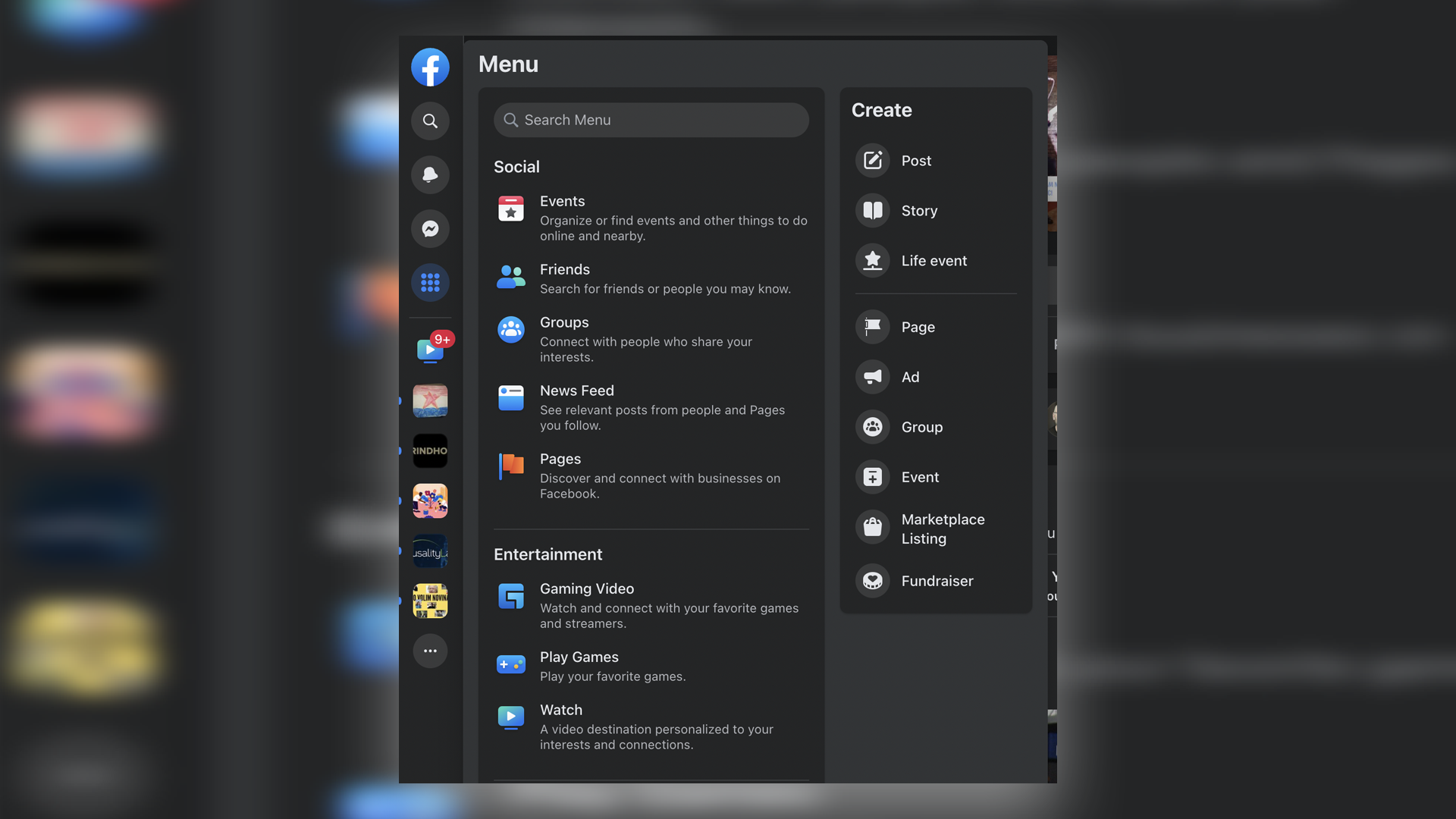
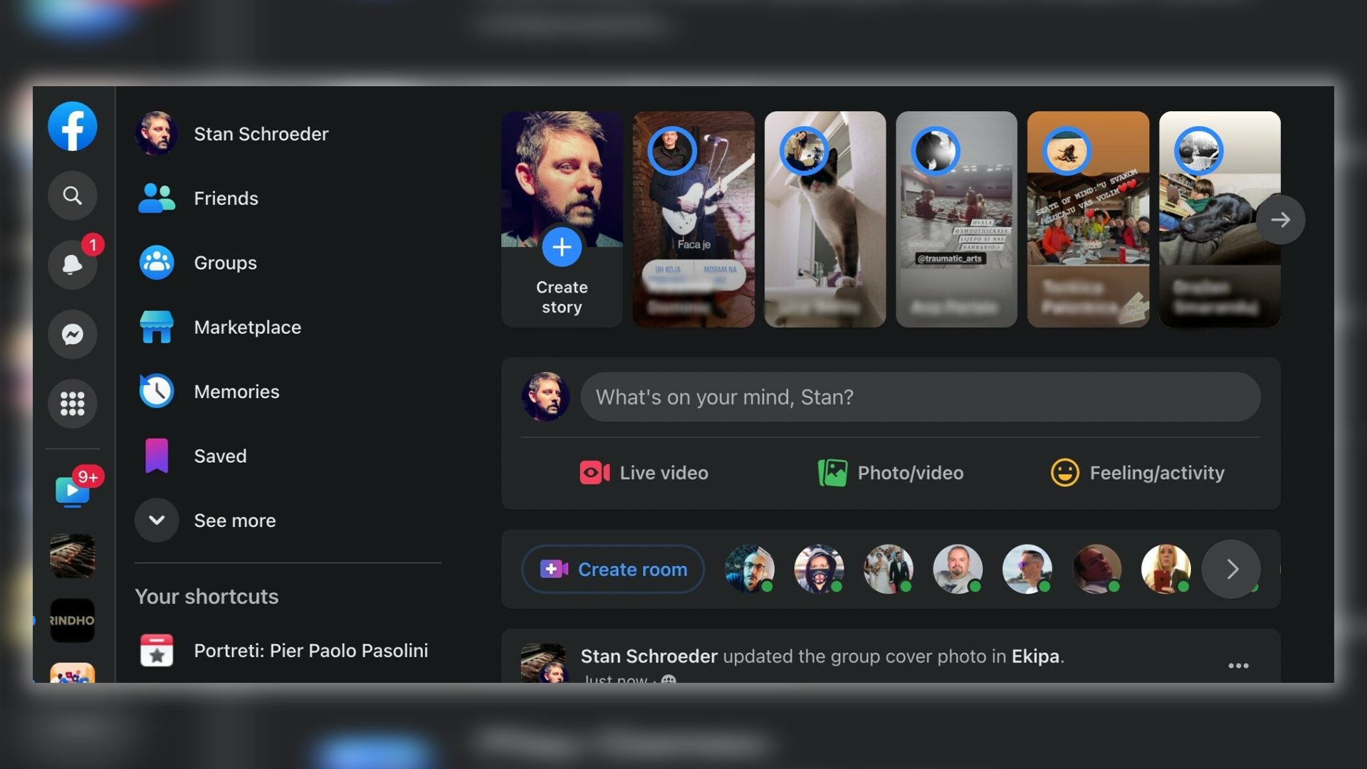
Meta has given the site a new look by shifting all the navigation options into one place on the left-hand side of the page – and it's pretty damn confusing. Want to experience the horror for yourself? Check out our roundup of the best MacBook pro deals.

If you hate the new layout, then don't panic. According to SocialMediaToday, only a select few users have received a desktop makeover as Facebook is still testing the design out. The last time Facebook had a refresh was back in 2020, so perhaps it's due for a makeover. Considering how disorientating users are finding the new update though, maybe it should be taken back to the drawing board.
In one of the screenshots posted by Twitter user Stan Schroeder, you can spot one of Facebook's pop-ups describing the update. The pop-up says, "We moved all your navigation options into one place. This change combines everything you need on Facebook – your profile, search, notifications, messages, and more".

It sounds as though the change is supposed to help make the website easier to navigate, but it looks like it's just perplexing people. One user on Twitter posted, "The FB design appeared for me too 2 days ago - it's very confusing," and another said, "Anyone else out there with this new Facebook design? Thinking of starting a support group".
We'll have to wait and see whether Facebook will start rolling out the new design to everyone, but in the meantime, we best make the most of the desktop we know how to use. If you'd like to give your browsing setup an upgrade, then why not treat yourself to one of the best 4K monitors.
Read More:
Get the Creative Bloq Newsletter
Daily design news, reviews, how-tos and more, as picked by the editors.
- Think Mario's hat is red? Think again
- Ugh, Apple still refuses to fix its most infuriating design
- Behold, these brilliant poster designs for the Vagina Museum

Thank you for reading 5 articles this month* Join now for unlimited access
Enjoy your first month for just £1 / $1 / €1
*Read 5 free articles per month without a subscription

Join now for unlimited access
Try first month for just £1 / $1 / €1

Amelia previously worked as Creative Bloq’s Staff Writer. After completing a degree in Popular Music and a Master’s in Song Writing, Amelia began designing posters, logos, album covers and websites for musicians. She covered a range of topics on Creative Bloq, including posters, optical illusions, logos (she's a particular fan of logo Easter eggs), gaming and illustration. In her free time, she relishes in the likes of art (especially the Pre-Raphaelites), photography and literature. Amelia prides herself on her unorthodox creative methods, her Animal Crossing island and her extensive music library.
