Facebook's new logo is just about worth a Like
Facebook rebrands, in a rather familiar way.
It can't be easy, being Facebook. One minute you're the cool social network that everyone's signing up for, the next everyone's cross at you for avoiding tax, undermining democracy, playing fast and loose with users' data and even copying other company's logos. It's so unfair!
But we all know what can change that, right? You got it, a shiny new rebrand is just the thing to turn around perceptions of your beleaguered multi-billion-dollar megacorporation, and that's exactly what Facebook's just unveiled.
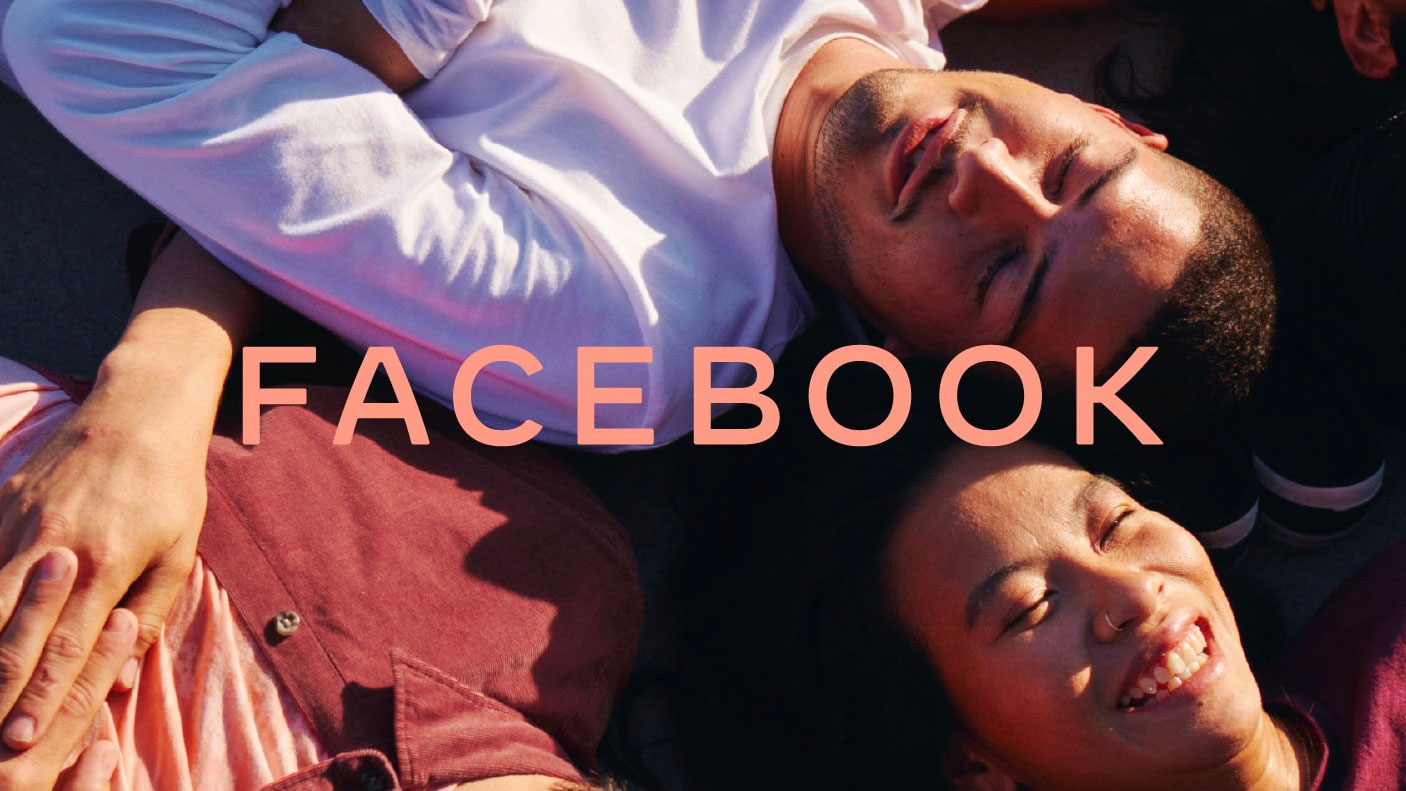
Let's be clear, here; the logo you see on Facebook itself isn't about to change; this new logo design is a corporate identity that, says Facebook, is, "designed to help us better represent the diversity of products we build, establish distinction from the Facebook app and communicate our purpose in the world."
So it's a bit like that time Google became Alphabet; obviously Alphabet's still there (or at least it was last time we checked), but nobody really paid that much attention and as far as most of the world is concerned, Google is still Google.
The new Facebook logo is designed as an umbrella brand to unify its various brands such as the Facebook app, Instagram, WhatsApp and so on, and you're only likely to really notice it if you go looking for it. The apps themselves will retain their current branding, with the new logo tucked away further down.
Like just about every other big name rebrand over the last couple of years, Facebook has plumped for an all-caps logotype for its design. And like all those other corporate rebrands, it looks fine. You'd have to work really hard to be at all offended by it, or to have any strong feelings about it whatsoever. In Facebook terms, it gets a Like; that's to say that we acknowledge that this thing exists but don't care enough about it to click on the heart or the cross face or whatever.

Of course, Facebook itself has all the feels about it. "We designed the new company wordmark with clarity and openness in mind," it says, which we particularly love given Facebook's general lack of clarity and openness in the way it operates. But hey, maybe that means it's on a self-improvement trip from now on! Well, it's nice to hope.
Sign up to Creative Bloq's daily newsletter, which brings you the latest news and inspiration from the worlds of art, design and technology.
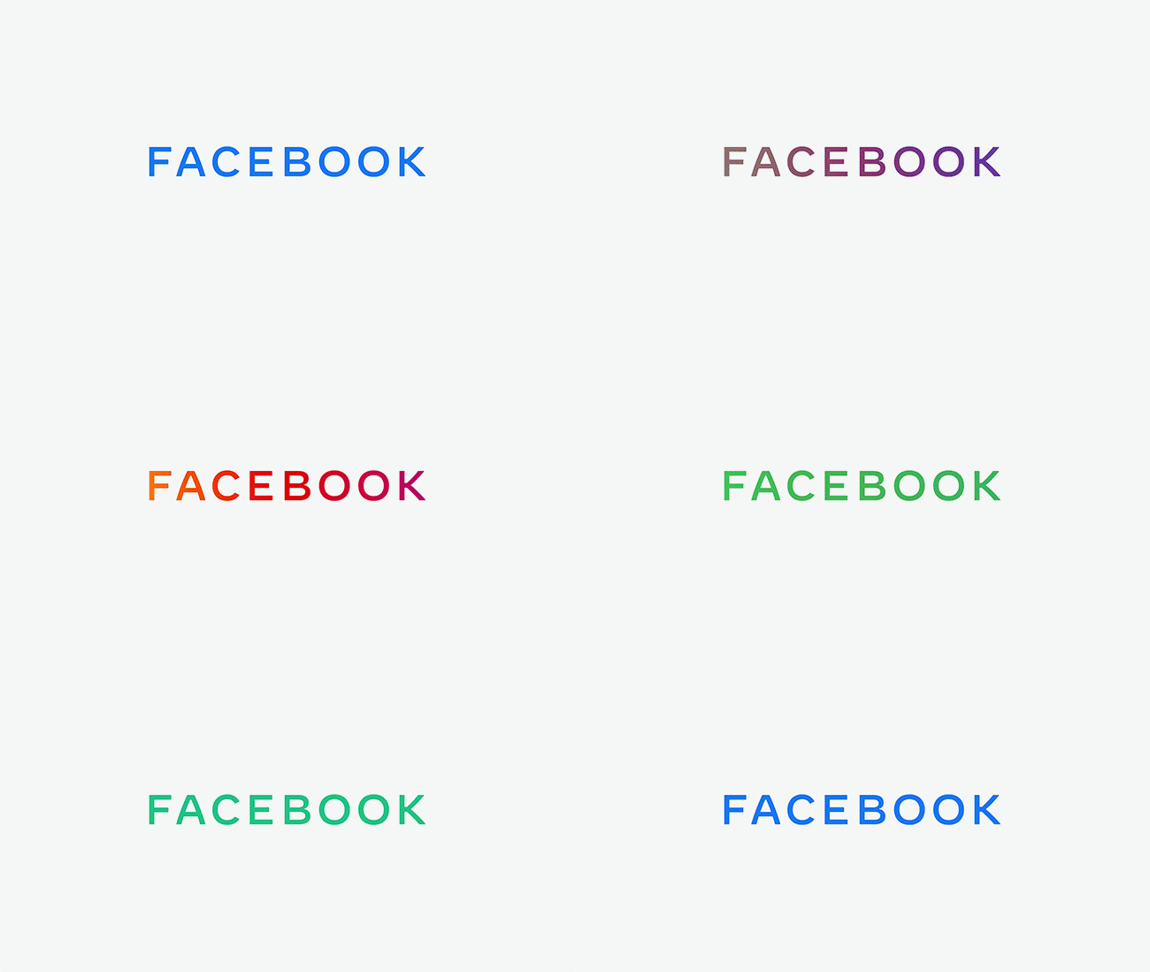
Facebook's particularly excited about the new logo's colour palette; rather than using a single colour, the wordmark's designed to take on the colour of individual brands, so if you see it in the Instagram app it'll be in that warm red gradient, and on WhatsApp it'll be green.
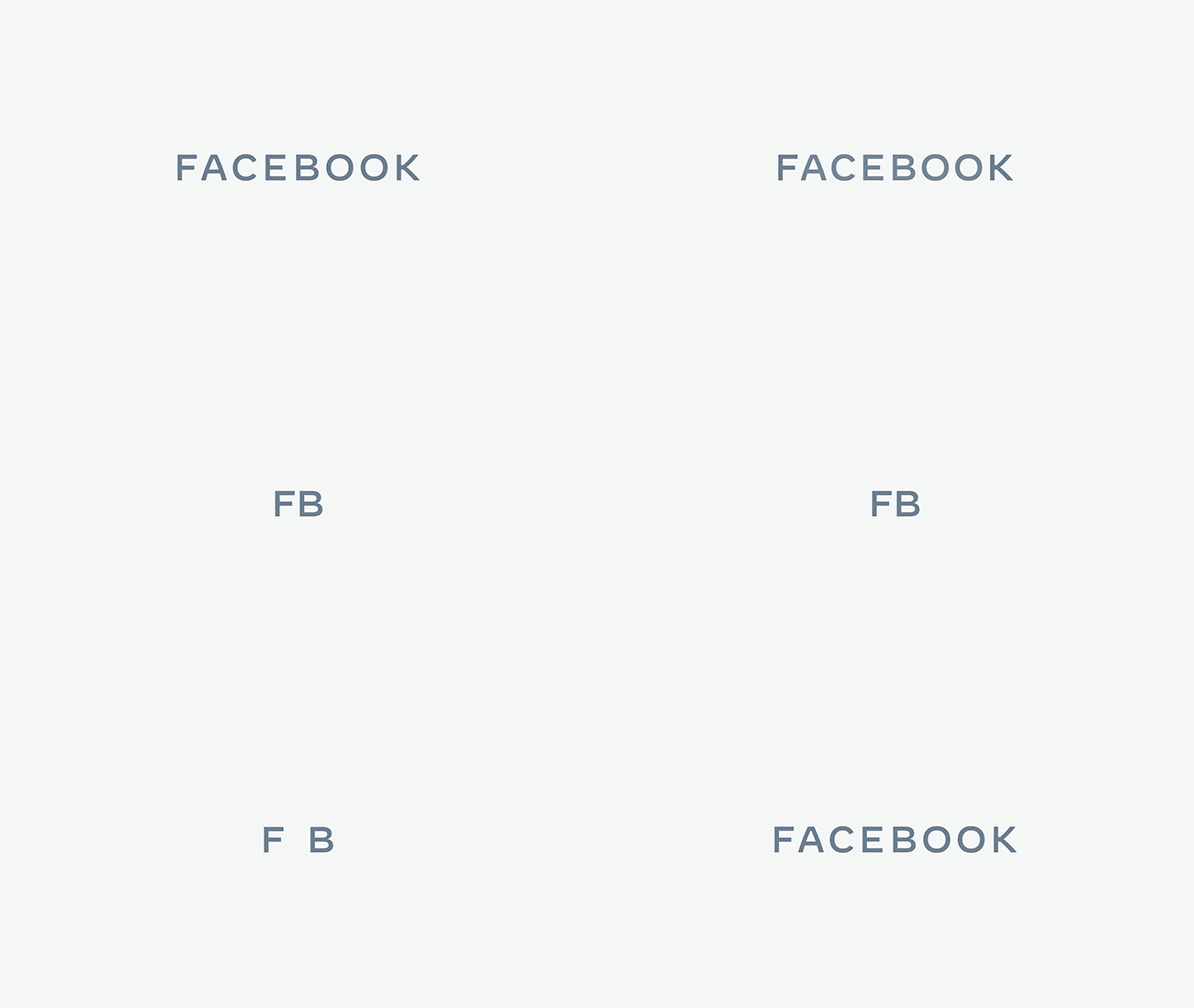
It's also really proud of the curved diagonals on the 'A' and 'K' of the logo – to our minds the 'A' looks like it's been printed on the side of a balloon – and how it uses motion, opening the workmark up through tracking and fading.
It's not a bad logo, but however much Facebook tries to talk it up by going on about clarity and empathy and the hope that the branding can help it communicate the progress it's making, nobody's getting very excited about it. This is the bit where we'd normally embed some furious tweets, but the most on-point one we can find is from US Senator Elizabeth Warren, who rightly looks past the design and focuses instead on Facebook's size and power:
Facebook can rebrand all they want but they can’t hide the fact that they are too big and powerful. It’s time to #BreakUpBIGTECH. https://t.co/suHSuR4AAxNovember 5, 2019
It's hard to argue with that. From a design point of view, though, there's not a lot to get worked up about. We're kind of hoping that we've reached peak minimal logotype now; wouldn't it be nice to swing swing back towards ludicrously over-designed logos with far too much ornamentation?
Related articles:
Jim McCauley is a writer, performer and cat-wrangler who started writing professionally way back in 1995 on PC Format magazine, and has been covering technology-related subjects ever since, whether it's hardware, software or videogames. A chance call in 2005 led to Jim taking charge of Computer Arts' website and developing an interest in the world of graphic design, and eventually led to a move over to the freshly-launched Creative Bloq in 2012. Jim now works as a freelance writer for sites including Creative Bloq, T3 and PetsRadar, specialising in design, technology, wellness and cats, while doing the occasional pantomime and street performance in Bath and designing posters for a local drama group on the side.

