One of the many consequences of the brutal conflict in Ukraine has been the exodus of Western countries from Russia. In some cases, that's led to local companies stepping into the void left behind. McDonald's was one of the most high-profile companies to pull out, selling its 850 restaurants to Siberian billionaire and existing McDonald's franchisee Alexander Govor.
Now just days ahead of the scheduled reopening of the first restaurants in Moscow, the company managing them, SPO System LLC, has revealed new branding to replace McDonald's famous golden arches. And it looks bizarrely familiar (suffice it to say it won't be making it into our pick of the best logos of all time).

According to the Russian news agency TASS, the logo depicts "two sticks of yellow fried potatoes and a yellow orange burger". The agency also quoted a company spokesperson as saying that "the green background of the logo symbolizes the quality of products and service that our guests are accustomed to."
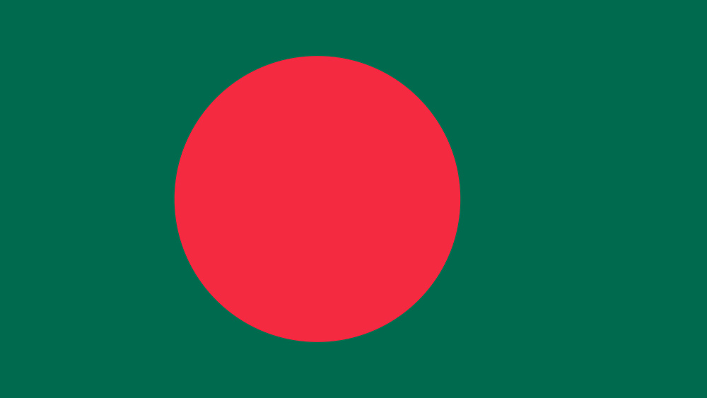
We're unsure of how the dark green colour represents quality products and service and whether there may be cultural connotations we're unaware of, but our first thought was that they've taken the colours of the flag of Bangladesh. And that's not the only similarity that's struck keen-eyed observers online.
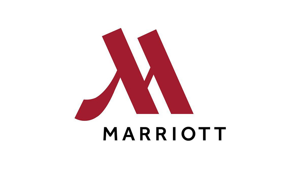
There's also an uncanny resemblance to several major Western brands. While the logo very conspicuously looks like an M, perhaps in a direct attempt to connect the still unnamed new brand to McDonald's, the first brands we thought of were the hotel chain Marriott and Warner Music (upside down).
We're not the only ones to have noticed the similarity. Observers on Twitter have picked up on the same resemblances and more, including the Japanese burger chain MOS Burger.
https://t.co/YXqPqBEsETWhy does Russia's "new version of McDonalds" look like its logo was heavily inspired by MOS Burger of Japan/Asia? pic.twitter.com/reqA6y99lPJune 10, 2022
pic.twitter.com/GkqCqQlRvWJune 9, 2022
In an unusual branding process, it seems the logo design has been decided before the actual name of the brand – we assume due to the rush to open the restaurants. Newspaper Izvestia reports that PBO has submitted eight options to Rospatent, the government agency in charge of intellectual property. They apparently include 'Tot Samyi', which translates as 'the same one', and 'Svobodnaya Kassa', which means "available cash register". UPDATE: the name finally chosen was 'Vkusno-i tochka', which is being translated as 'Tasty and that's it'.
Get the Creative Bloq Newsletter
Daily design news, reviews, how-tos and more, as picked by the editors.
McDonalds isn't the first western brand to be replaced in Russia. The Coca-Cola Company suspended business in Russia in March, and last month, its former bottler Ochakovo revealed its range of beverages to replace Coca-Cola, Fanta and Sprite: CoolCola, Fancy and Street, all with familiar colours. Russia's Starbucks replacement also looks very familiar.
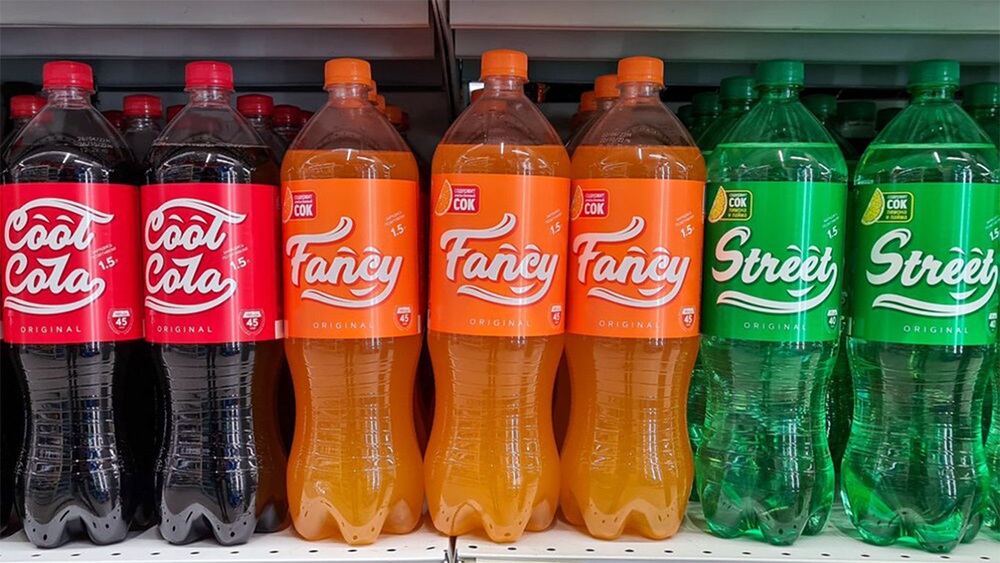
It kind of surprises us that PBO Systems didn't follow the same line and stick with colours similar to McDonald's. We appreciate that there may be cultural nuances here that we don't get, and we're not sure what agreement McDonald's came to with the new owners of its restaurants (it has an option to buy them back in the future), but the branding certainly doesn't strike us as a sizzling look for a fast food chain. If you need some tips yourself, take a look at out golden rules of how to design a logo.
Read more:
- The ridiculed Street Fighter 6 logo has been fixed
- Disney Plus goes big with these Ms Marvel logos
- The 5 best Pride logos this year

Thank you for reading 5 articles this month* Join now for unlimited access
Enjoy your first month for just £1 / $1 / €1
*Read 5 free articles per month without a subscription

Join now for unlimited access
Try first month for just £1 / $1 / €1

Joe is a regular freelance journalist and editor at Creative Bloq. He writes news, features and buying guides and keeps track of the best equipment and software for creatives, from video editing programs to monitors and accessories. A veteran news writer and photographer, he now works as a project manager at the London and Buenos Aires-based design, production and branding agency Hermana Creatives. There he manages a team of designers, photographers and video editors who specialise in producing visual content and design assets for the hospitality sector. He also dances Argentine tango.
