These everyday product design fails are annoying us all
From TVs to toasters, these designs have got people's backs up.
When it comes to product design, you expect the things you use every day to do exactly what you need them to, right? But a recent Reddit thread has alerted us to the fact that sometimes even the most ubiquitous of products have some pretty major design flaws.
The thread was started by a user asking for examples of products that were clearly not used by whoever designed them. With stellar points made about the functionality of products ranging from toasters to doorbells to bras, there's a wealth of products out there that could use a rethink. Perhaps you could design your own perfect new versions using 3D modelling software?
What’s your best example of “whoever designed this must not use their own product”? from r/AskReddit
Responses flooded in, with peel-off lids (think yoghurts, tin cans etc) held up as an example of a truly annoying design.

"Yoghurt lids that are hard to peel, that tear, or that take half the yoghurt with them. God help you if your hands are not completely dry (as can happen when you're in a – I don't know – kitchen?)," said user junglesgeorge.
"For that matter, all peel-off lids," they continued. "The genius who designed the lids on our cat food made sure that the brute force you need to open them ensures that you spill delicious cat-food-juice all over your hands. But hey, it sure keeps the food safe during... uh... earthquakes?"

Some brilliant points were made about toasters by Moist_Examination811. "Why oh why does the top half of the bread never fit into to it? These designers should go out, get themselves a loaf of bread and a toaster before they design another one. There doesn't seem to be any that come in a different size."
They continued, "don't even get me started on the bloody elements – one side will be a light beige the other side of the toast will look like it's been toasted in a smelting factory".
Get the Creative Bloq Newsletter
Daily design news, reviews, how-tos and more, as picked by the editors.
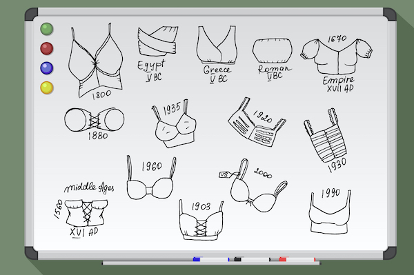
"BRAS." said Aphid61.
"Straps can stretch out during a long day's wear. Whose brilliant idea was it to put the adjusters in the back where you can't see or reach them?"
Well, InfanticideAquifer had an answer for this. "I think the trend of fasteners in the back for women's clothing started because wealthy women were dressed by servants – and everyone else wanted to dress like them." Perhaps time for a change, then?
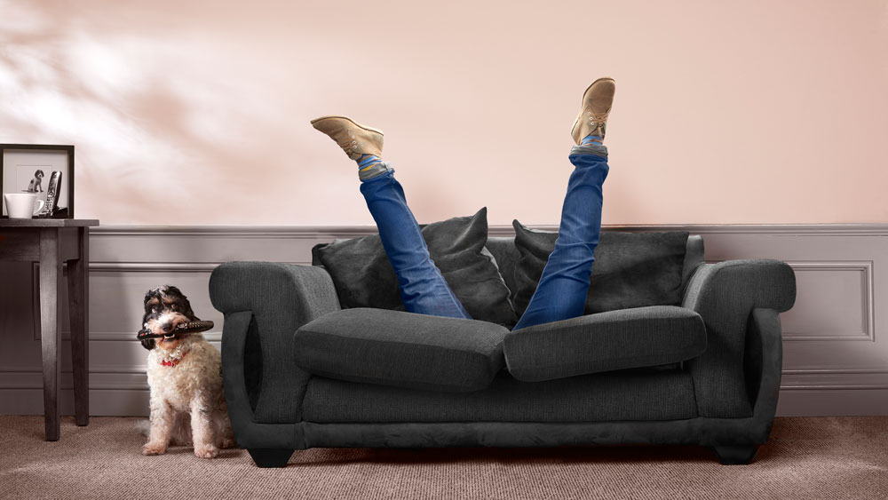
TVs that need the remote control to function were a particular favourite, with willbeach8890 stating that "all TVs without at least the basic controls on the TV. Engineers must have forgotten the possibility of breaking or losing the remote".
Anustart15 agreed, suggesting, "that seems like the sort of things the people in charge of designing the aesthetic of the TV would do while the engineers grit their teeth in the back of the room".
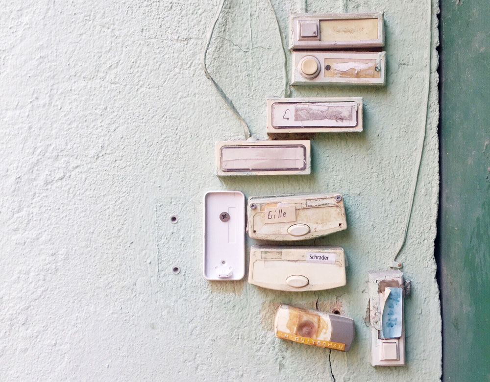
Wonky-sounding doorbells were a hot topic for Back2Bach, who said their "friends have a doorbell that rings "dong-ding" (instead of ding-dong). It's not the wiring, but just the way the electric device was designed."
And finally, "I have a fan with a bright LED light that shows what setting it's on", says ArtemisJQ "Luckily, there's a 'sleep' mode that makes the light dimmer. Except another light comes on to let you know sleep mode is on, and that one is at full brightness. Just... why?" Why, indeed.
To explore more of the irksome product design fails, head to the original post here. And for bad design of the graphic type, see our pick of 12 design fails so bad they were actually good.
Read more:

Thank you for reading 5 articles this month* Join now for unlimited access
Enjoy your first month for just £1 / $1 / €1
*Read 5 free articles per month without a subscription

Join now for unlimited access
Try first month for just £1 / $1 / €1

Georgia is lucky enough to be Creative Bloq's Editor. She has been working for Creative Bloq since 2018, starting out as a freelancer writing about all things branding, design, art, tech and creativity – as well as sniffing out genuinely good deals on creative technology. Since becoming Editor, she has been managing the site and its long term strategy, helping to shape the diverse content streams CB is known for and leading the team in their own creativity.
