Duolingo's redesigned mascot is a hoot
Say hello, bonjour, konichiwa to a new look for the language-learning tool.
When it comes to failed new year's resolutions, learning a new language is up there with attending the gym regularly and staying sober in January. To keep multi-linguists in the making coming back for more, freemium language-learning platform Duolingo has mastered the art of emotional manipulation with Duo, the green owl mascot who has a reputation for keeping users in check.
Duo, along with the rest of the tool's layout and design, has been given a refresh for 2019 that aims to make the website and app more consistent and engaging. With the likes of Instagram and Twitter offering easy distractions from language study, Duolingo has also borrowed heavily from the gamification playbook.
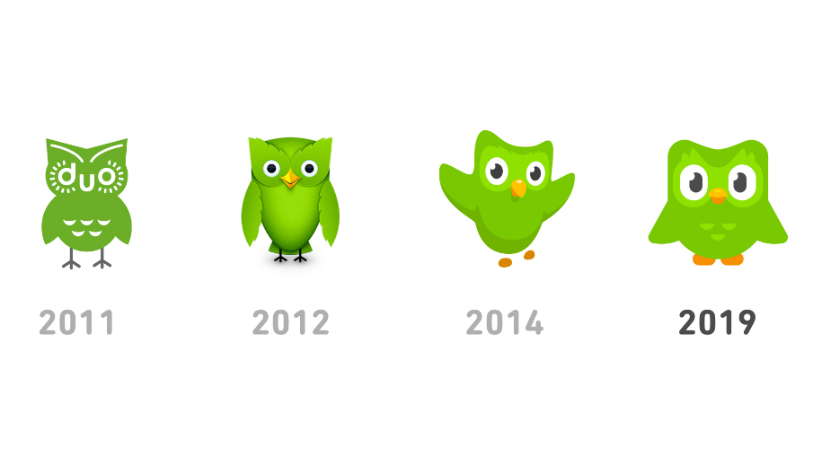
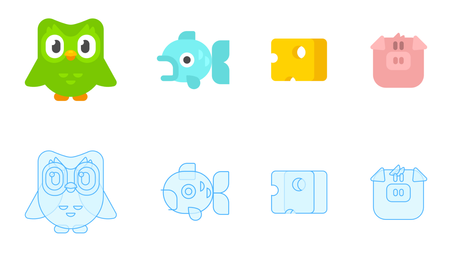
The redesign – including the new logo design – was created by Duolingo's in-house team, and is the biggest update to the tool in five years. Duo's design has been simplified to make it easier to animate and the entire interface has been given a more cartoony refresh.
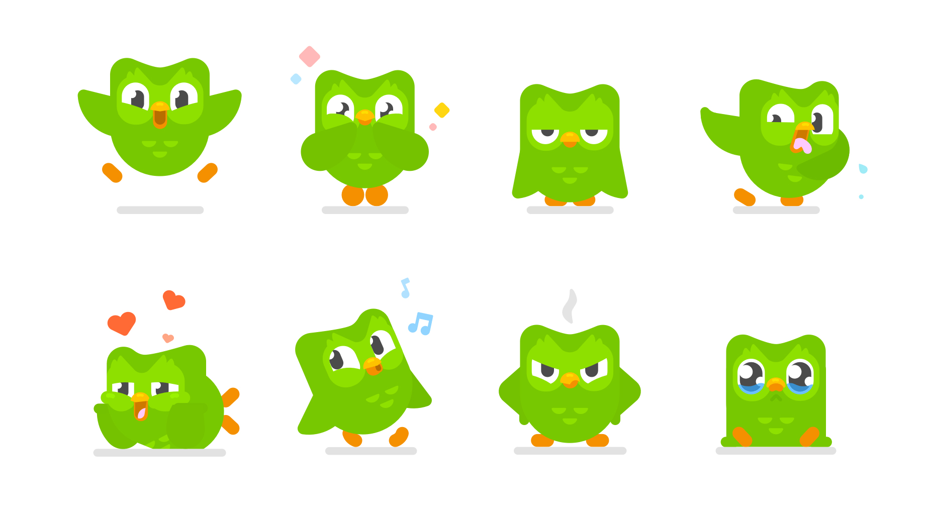
Regular and intermittent users of Duolingo will already know that it relies on gamification. Heart bars encourage you to get an answer right and maintain a winning streak, while the Duo mascot helps to build a more personal attachment thanks to his reactions to user activity. Practise regularly and Duo will be overjoyed, skip a few sessions and he'll soon whip out the waterworks.
For its latest iteration, Duo has been brought to life with more positions and animations to get the most out of his connection with audiences. A closely cropped profile of his beaky face has also been used for the Duolingo app icon to really cement the connection with mobile games.
Speaking to The Verge, Duolingo's head of design, Tyler Murphy, explains why Duo is being preened into the platform's version of a gaming mascot. "Games have this unique ability where you get really attached to their character. That’s why they can keep releasing new games with that same character, and people will rush out to buy them."
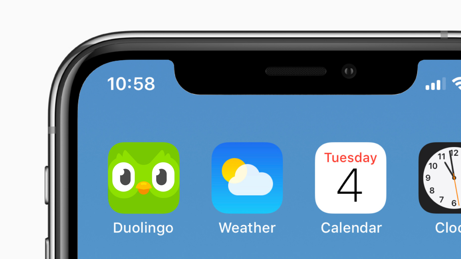
For a mascot that has gone on to inspire memes, it's fitting that Duo started out as an act of trolling. He's an owl because the bird is associated with knowledge, however his distinctive green plumage was a joke aimed at Duolingo co-founder Severin Hacker.
Get the Creative Bloq Newsletter
Daily design news, reviews, how-tos and more, as picked by the editors.
After Hacker specified that anything was fair game for the mascot except the colour green, the creative team found the bait too hard to resist and made Duo green as a joke. It's a choice that seems to have paid off though. The green colouring makes Duo stand out, and it helps to make the platform feel even more like a computer game than an educational tool.
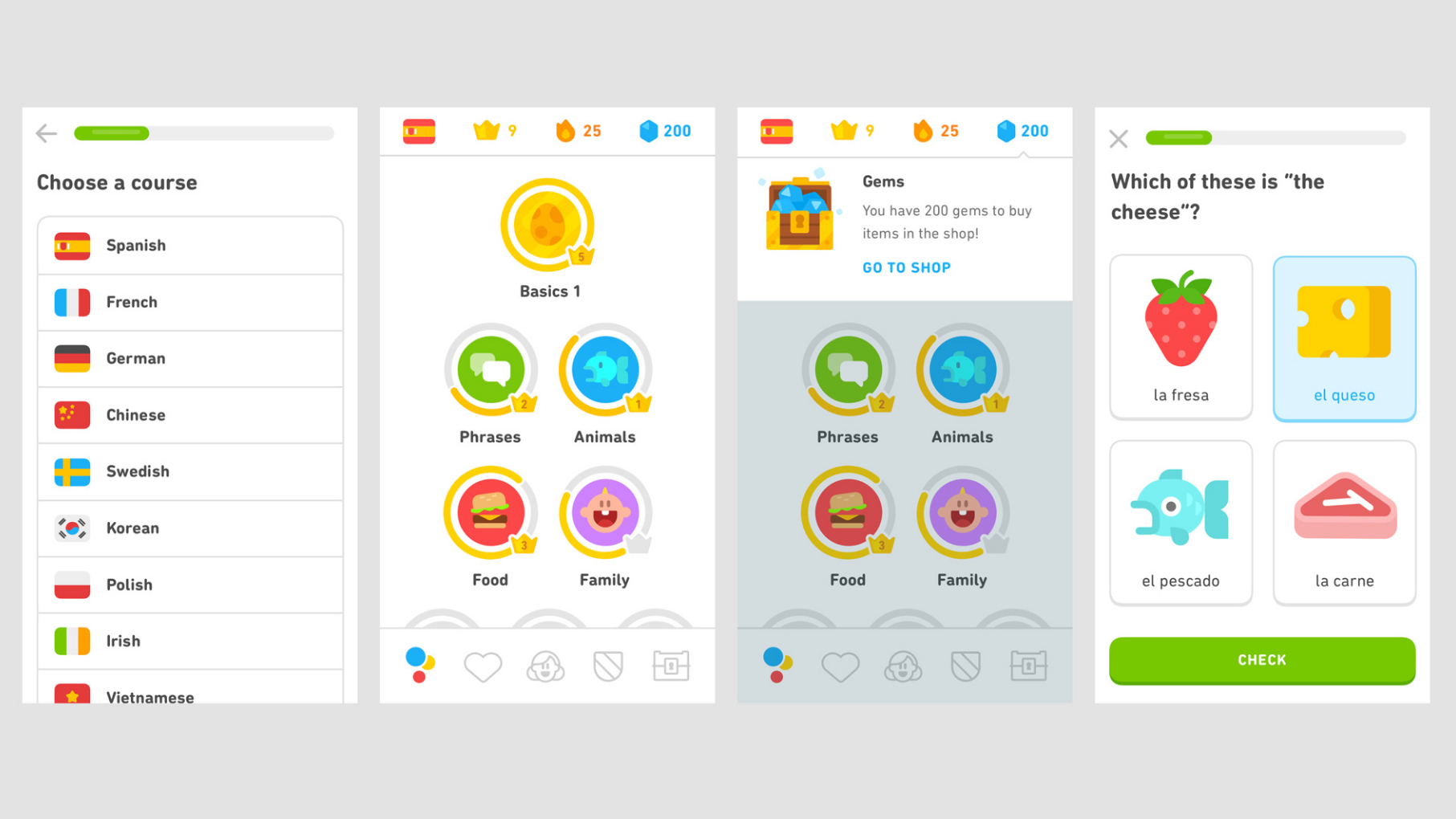
Duolingo currently has roughly 300 million registered users and offers 81 different language courses. Some users saw the updated app and mascot roll out at the tail end of 2018, while everyone else can expect to see the spruced up platform very soon.
Related articles:

Thank you for reading 5 articles this month* Join now for unlimited access
Enjoy your first month for just £1 / $1 / €1
*Read 5 free articles per month without a subscription

Join now for unlimited access
Try first month for just £1 / $1 / €1

Dom Carter is a freelance writer who specialises in art and design. Formerly a staff writer for Creative Bloq, his work has also appeared on Creative Boom and in the pages of ImagineFX, Computer Arts, 3D World, and .net. He has been a D&AD New Blood judge, and has a particular interest in picture books.
