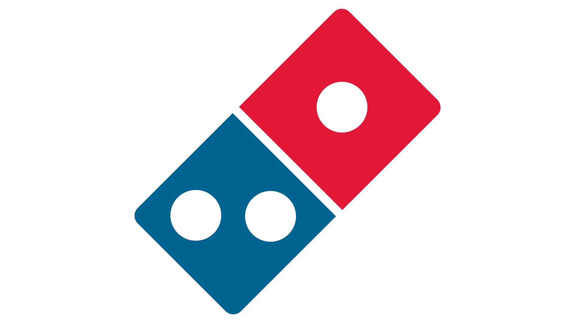
New Domino's logo concept is a slice of design heaven
I just wish it was real.
We've seen plenty of brilliant logo redesigns over the last couple of years – but not all of them have been the real deal. These days, fan-made concepts are often where the real ingenuity is to be found, and that's exactly the case with this awesome Domino's design.
The pizza chain's logo is one of the most recognisable around, and one of the most literal. It's a domino. But with a few subtle tweaks, one designer has managed to make the design lean much more strongly into its pizza making credentials – and judging by the response on Twitter, pretty much everyone wishes it was real. (Looking for inspiration? Check out the best logo designs of all time and recap on the chess logo redesign that caused controversy.)

Simply by making the two halves of the domino sit perpendicular to one-another, the design by Fabian Arbor (a self-proclaimed 'ruiner of your favourite logos') now also resembles an open pizza box. It's such a simple yet effective transformation that Domino's' design team are probably wondering why they didn't think of it.
Domino's Rebrand !! pic.twitter.com/NzD9YZA3cgJanuary 15, 2023
"They should totally rebrand to this. So perfect!" one Twitter user comments, while another adds, "I wish this was real, Fabian." And as one user points out, it isn't just a pizza box that the brilliant design resembles: "Looks like a pizza box. Looks like two thirds of a pizza. Looks like dominoes. Looks like the domino effect. Damn, really nailed this one."

Still, while this brilliant concept might make the real logo look dull, there's a little more going on with that design than meets the eye. As we reported last year, it turns out there's a special significance to those three dots. If you're looking for more brilliant fan-made logos, check out these awesome medieval logo redesigns.
Read more:
- Is this really the most offensive logo?
- Behold, the dreadful new Twitter Blue logo
- The Nike logo: a history
Get the Creative Bloq Newsletter
Daily design news, reviews, how-tos and more, as picked by the editors.

Thank you for reading 5 articles this month* Join now for unlimited access
Enjoy your first month for just £1 / $1 / €1
*Read 5 free articles per month without a subscription

Join now for unlimited access
Try first month for just £1 / $1 / €1

Daniel John is Design Editor at Creative Bloq. He reports on the worlds of design, branding and lifestyle tech, and has covered several industry events including Milan Design Week, OFFF Barcelona and Adobe Max in Los Angeles.
