Doctor Who logo is a stroke of genius
Now, this is how to design a logo.

Doctor Who has become a staple of British TV, and everyone has a favourite Doctor. And now the time-travelling, alien-busting show has caught our eye with its brilliant logo design.
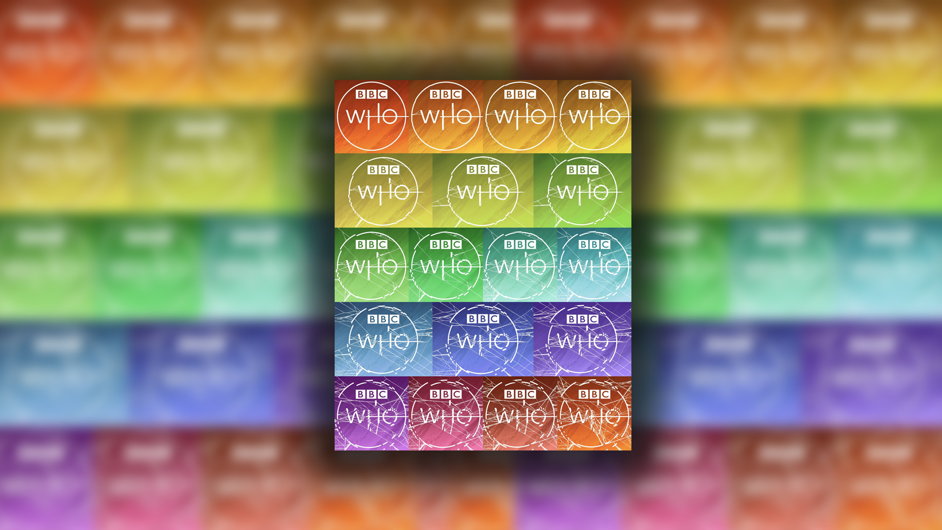
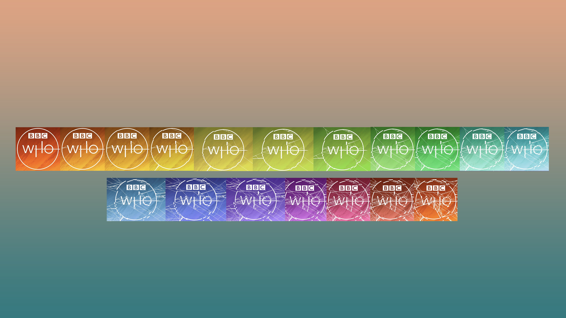
Jodie Whittaker is coming to the end of her reign as the two-hearted time traveller, and as she does, the BBC has been creating a logo that will stick with us long after Whittaker has left the role. As the world descends into chaos in the current Doctor Who series, so does its logo. Gradually over the season, we have seen the breakdown of the logo, as if the Doctor's antics have had an effect on our world. Fancy designing your own logo? Check out of golden rules of logo design to make sure your logo stands out amongst the crowd.

The logo evolves into a shattered mess and progresses through the colours of the rainbow. As one Twitter user who posted all the logos pointed out, the final colour is the same as the first logo in the evolution. The Twitter user goes on to suggest that this will be the last logo update in the disintegration of the logo, which would reflect the fact that the series ended this week.
We think this is absolute genius, and we love the BBC's attention to detail. Doctor Who has always been a show with a dedicated fan base, and such precise and intricate designs like this give fans something to really sink their teeth into and create theories about. It also shows how well-designed the original logo is, because despite being smashed to pieces, you can still recognise the original Doctor Who logo.
Fans of the show responded to the original tweet and it seems as though a lot of them liked the design, but they had their own suspicions as to how the logo would evolve with the series. One user responded, "I did hope it would turn black", and another replied, "It would be nice if it completely shattered at the end of Jodie's [Whittaker] run, and then gradually repair itself when Russell [Russell T Davey] returns".
We are yet to see how the logo will evolve next, but we won't find out until 2022 when it's rumoured that Jodie Whittaker will return for three brand new specials. Until then we can sit totally enamoured by this brilliant design. Or perhaps you would like to create your own Doctor Who designs, if so, why not check out our roundup of the best free logo designer tools.
Read More:
Get the Creative Bloq Newsletter
Daily design news, reviews, how-tos and more, as picked by the editors.
- Strap in Apple fans, this might be the wildest Mac rumour yet
- Spotify Wrapped is a design nightmare
- Tesla’s new Cyberquad sells out immediately

Thank you for reading 5 articles this month* Join now for unlimited access
Enjoy your first month for just £1 / $1 / €1
*Read 5 free articles per month without a subscription

Join now for unlimited access
Try first month for just £1 / $1 / €1

Amelia previously worked as Creative Bloq’s Staff Writer. After completing a degree in Popular Music and a Master’s in Song Writing, Amelia began designing posters, logos, album covers and websites for musicians. She covered a range of topics on Creative Bloq, including posters, optical illusions, logos (she's a particular fan of logo Easter eggs), gaming and illustration. In her free time, she relishes in the likes of art (especially the Pre-Raphaelites), photography and literature. Amelia prides herself on her unorthodox creative methods, her Animal Crossing island and her extensive music library.
