The Disney logo debate that won't go away
Some people are reading it all wrong.
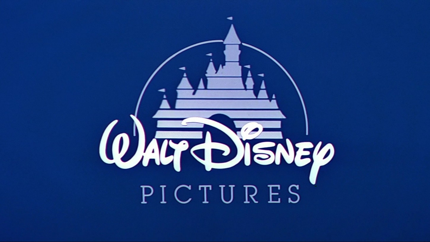
Some logos are burned into our consciousness from an early age, and Disney's graphic is definitely one of those designs. But what does it really look like to you? An iconic 'D' or a backwards 'G'?
This debate is one of those that rears its ugly head every now and again, before everyone forgets they were confused and goes back to watching Disney Plus (see below for a tempting deal if you're not already signed up).
Though the Disney logo has taken on different looks over the century since its inception in 1923, a form of cursive script has been a staple of most of them. And this particular 'D' first began confusing kids in 1972. You can see the logo's various formations in our best Disney logos roundup, or read on for a short history of the logo, and the 'D'/'G' confusion.
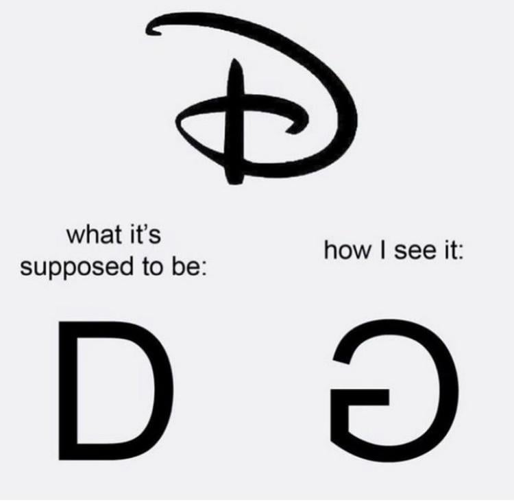
The above picture is occasionally posted on social media, when a host of puzzled ex-children tend to agree with the sentiment within the meme: that it does look more like a backwards 'G'.
Why exactly is the 'D' potentially confusing for some? It's probably because of its cursive style. Walt Disney himself was said to be passionate about calligraphy. Apparently, the letter 'D's in the various Disney logos are based on Disney's own signatures, which also changed over the years. Though Disney never had a signature that included this exact letter 'D', it is an evolution of the different signatures he used over the decades.
"Disney's signature from the 1920s does not resemble his signature from the 1950s or '60s," writes Disney expert Phil Sears. "Walt consciously re-designed his signature over the years, in much the same way he changed the appearance of Mickey Mouse over time". Check out examples of Disney's changing signatures below:
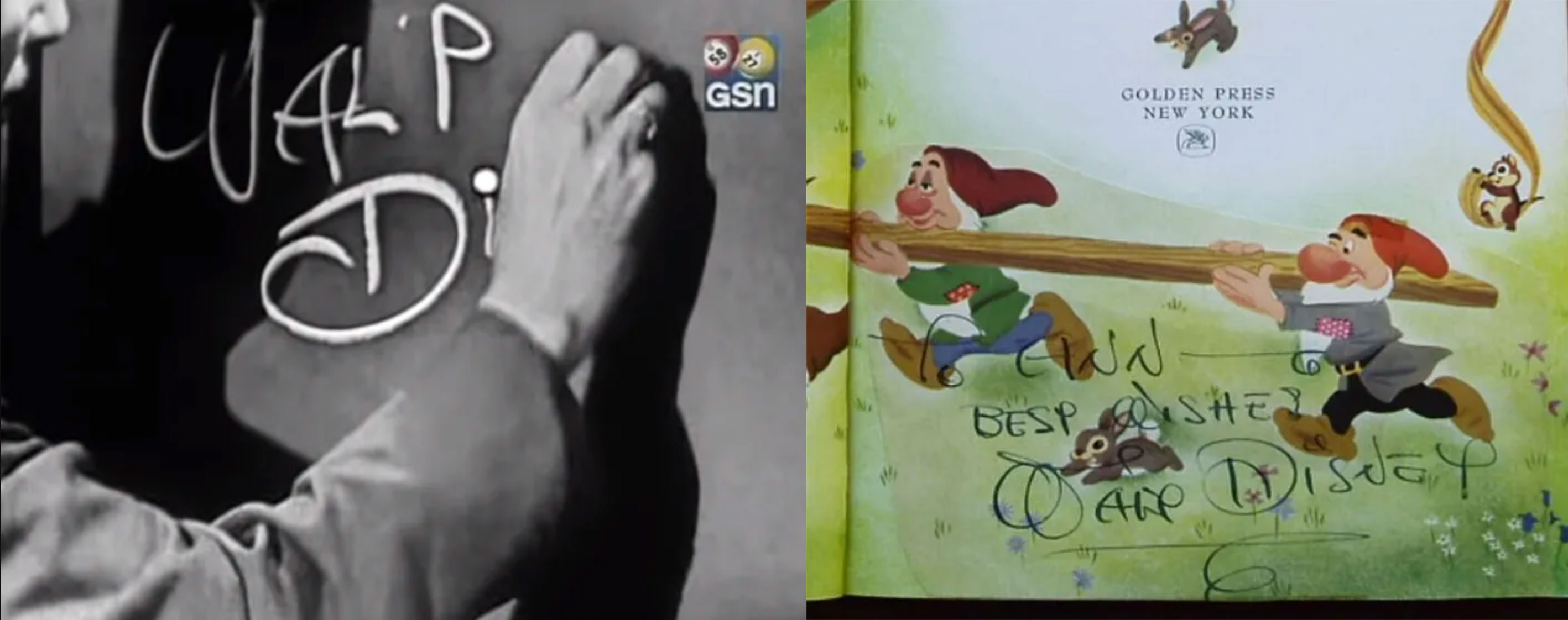
Now compare them with the Disney logo evolution. You'll notice that Disney's signature is pretty recognisable in the early versions.
Get the Creative Bloq Newsletter
Daily design news, reviews, how-tos and more, as picked by the editors.
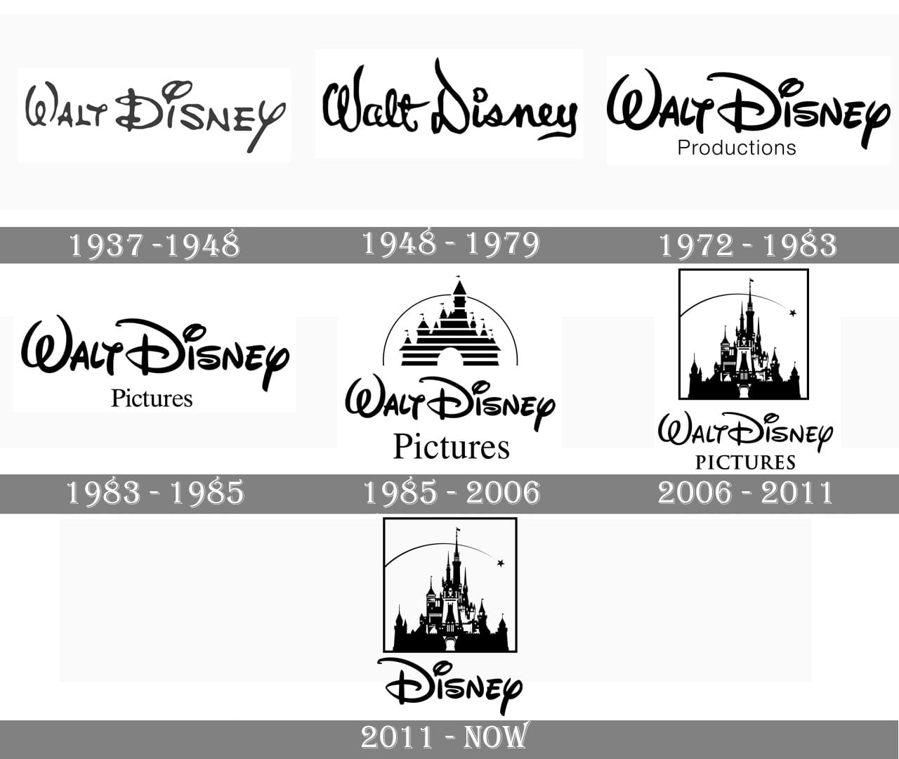
The current version of a letter 'D' has become more than a single letter (and it seems lots of people agree, though perhaps not in the way Disney intended). The universal recognition of it shows it has now transcended standard calligraphy – even though it has never been straightforward to recognise (especially for modern day children – Disney's target audience). It is now a symbol of the company, a feat that belies the power of the brand and the success of the design.
It's so well-known and so well protected by the Disney brand that the world couldn't believe it when a Chinese company tried to use a stupidly similar version of it in 2019 (remember that?). Though the logo has undergone changes in the past, that 'D' has remained consistent since 1972, and we can't imagine it changing in the future. And for the record, it's definitely a 'D'.
Read more:
- Understand Disney's 12 principles of animation
- Aaron Blaise reveals why he quit his dream job at Disney
- Disney Plus movies: The 20 best films on Disney+ right now

Thank you for reading 5 articles this month* Join now for unlimited access
Enjoy your first month for just £1 / $1 / €1
*Read 5 free articles per month without a subscription

Join now for unlimited access
Try first month for just £1 / $1 / €1

Georgia is lucky enough to be Creative Bloq's Editor. She has been working for Creative Bloq since 2018, starting out as a freelancer writing about all things branding, design, art, tech and creativity – as well as sniffing out genuinely good deals on creative technology. Since becoming Editor, she has been managing the site and its long term strategy, helping to shape the diverse content streams CB is known for and leading the team in their own creativity.
