Discover why Donald Trump ditched his brand-new logo design
The presidential candidate’s campaign got off to a bad start when social media castigated his logo.
Sign up to Creative Bloq's daily newsletter, which brings you the latest news and inspiration from the worlds of art, design and technology.
You are now subscribed
Your newsletter sign-up was successful
Want to add more newsletters?
Five times a week
CreativeBloq
Sign up to Creative Bloq's daily newsletter, which brings you the latest news and inspiration from the worlds of art, design and technology.
Once a week
By Design
Sign up to Creative Bloq's daily newsletter, which brings you the latest news and inspiration from the worlds of art, design and technology.
Once a week
State of the Art
Sign up to Creative Bloq's daily newsletter, which brings you the latest news and inspiration from the worlds of art, design and technology.
Seasonal (around events)
Brand Impact Awards
Sign up to Creative Bloq's daily newsletter, which brings you the latest news and inspiration from the worlds of art, design and technology.
The race to the White House continues to gather speed, with Republican hopeful Donald Trump announcing that US Governor Mike Pence will serve as his running mate. It’s not our place to comment on the politics of the election, however the logo design for the Trump-Pence candidacy has certainly caused a stir online. Can you tell why?
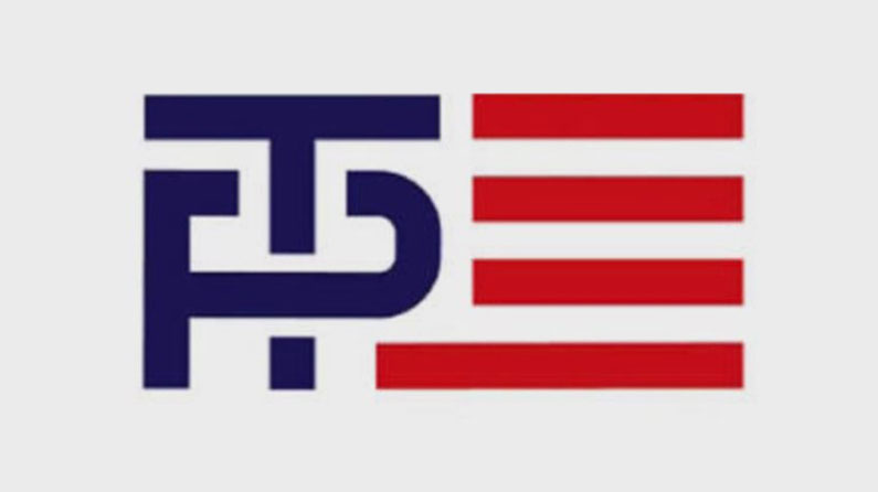
Some people might see it straight away, while others might think it’s a lot of fuss over nothing. Revealed on 15 July, the Republican hopeful’s logo is a suitably brash and patriotic design, which tweaks the image of the American flag to include an interlocking monogram of the candidate’s surnames, T and P, in place of the usual block of 50 stars. The problem? Well, a lot have people have noticed that it looks a bit, let's say, suggestive.
This might be a case of people wanting to ridicule the politician at every opportunity they get, but once you see the subtext they’re getting at, it’s hard not to notice it. With the T slotting through the loop in the P monogram, it’s doesn't take a huge amount of imagination to make some sort of vulgar connection.
Aside from the smutty connotations, the logo has failed to impress designers online and it’s easy to see why. Using the image of the American flag isn’t exactly the most imaginative symbol a candidate could use, plus the composition of the monogram doesn’t even sit comfortably alongside the red and white stripes.
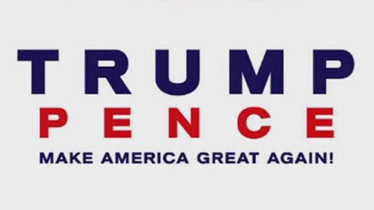
In the face of all the online criticism, the logo was pulled and replaced with a less suggestive design which simply stacks the candidate’s names. With bold colours, no serifs, and block capitals, the only trace of personality to be found is the exclamation mark at the end of the slogan ‘make America great again!’
This isn’t the first time a political design has been mocked for its subtext. Hillary Clinton’s running logo also got ripped to bits online with observers noting that it looked amateurish, as well as appearing to contain a terrorism-themed hidden message. Unlike Trump, however, Clinton stuck by her logo…
It’s impossible to tell how much difference, if any, these logos will make in the run up to the election, but either way we’re sure to see a lot more of them before a new President is appointed in November.
Sign up to Creative Bloq's daily newsletter, which brings you the latest news and inspiration from the worlds of art, design and technology.

Dom Carter is a freelance writer who specialises in art and design. Formerly a staff writer for Creative Bloq, his work has also appeared on Creative Boom and in the pages of ImagineFX, Computer Arts, 3D World, and .net. He has been a D&AD New Blood judge, and has a particular interest in picture books.
