DeviantArt rolls out sleek new look
Online art community gets a much-needed update with Eclipse.
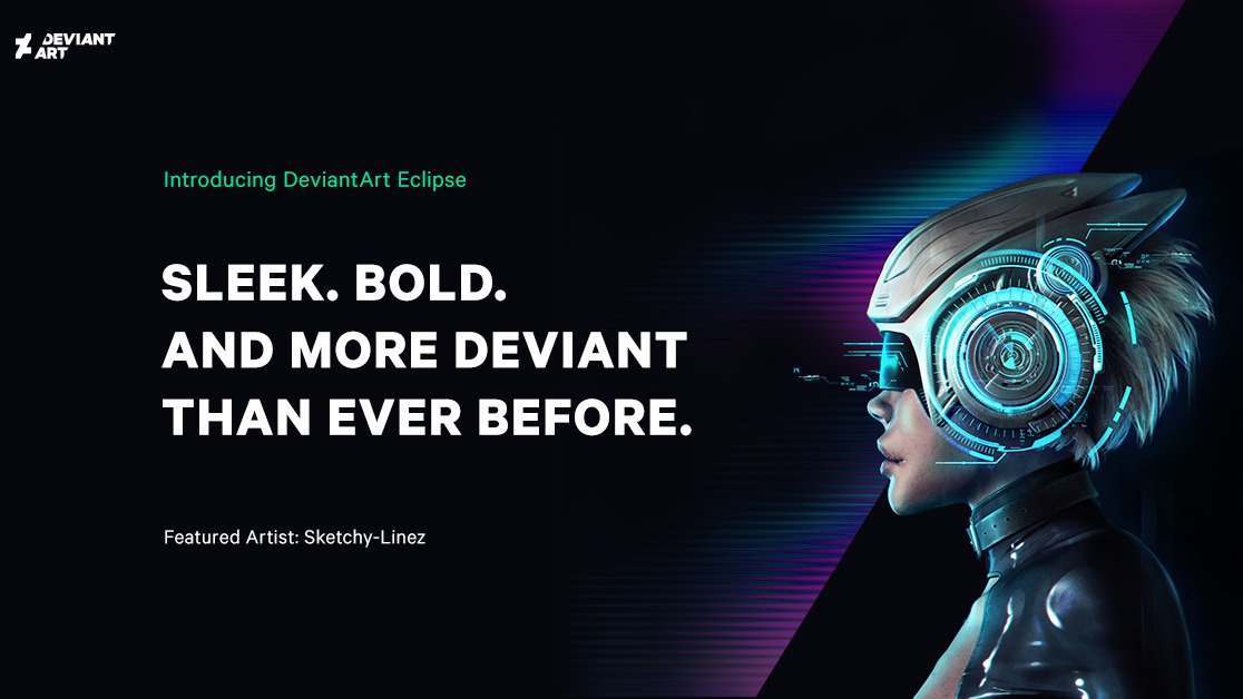
If you've been keeping a keen eye on DeviantArt over the last few months, you might be aware that an update has been going on behind the scenes. A few months ago, the site, which is home to the world's largest online art community, quietly began rolling out its Eclipse platform in a beta test. But this week sees the update going live to a larger group of users.
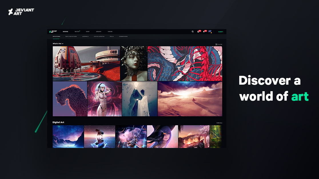
For a site that's pushing 20, it makes sense that the Eclipse update has a focus on giving DeviantArt a modern aesthetic overhaul. Gone are the shades of olive green that characterised the site for years, instead the site now sports a dark and sleek design that enables it to sit comfortably alongside competitors such as ArtStation.
The refresh has come about since website builder Wix bought DeviantArt for $36million. Following extensive research into functionalities and what users want from the site, Eclipse currently has a focus on bringing DeviantArt's existing portfolios, products and pages up-to-date with a modern visual language.

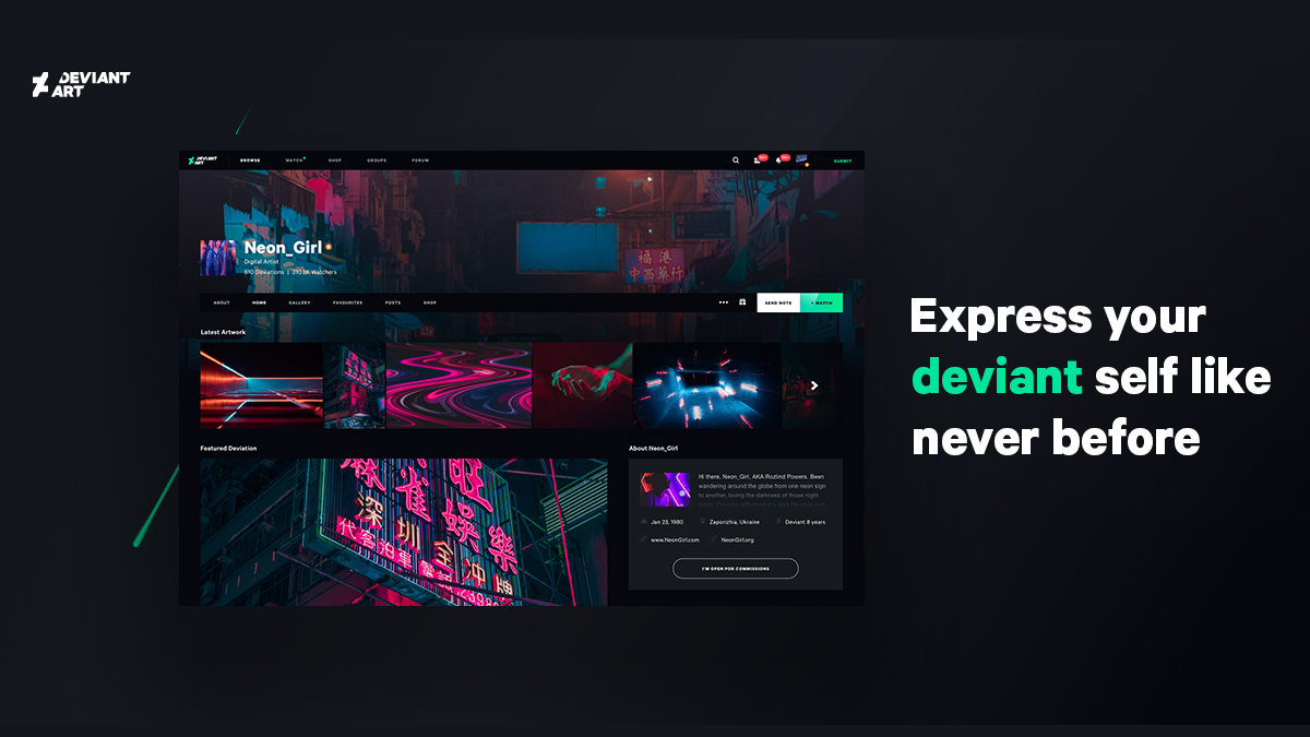
Changes to user profiles, and browse and search capabilities are all geared towards building DeviantArt's community of over 47 million creatives, with an aim of helping artists of all levels take their work and careers further.
"From a broad perspective, we will be implementing tools that facilitate the creation and development of artwork in a unique way to enable artists to grow and develop in a structured environment," DeviantArt's CCO Justin Maller tells Creative Bloq.
"For beginners and intermediate level artists, we will be incorporating elements of education through video and live-stream features. For people moving toward a professional art career, we will be offering new ways for artists to monetise and scale their art and build their personal brands."

Specifically, these updates include an option that allows users to choose their deviation backgrounds to put more of a focus on their art. New visual grids, a private Love Meter that gauges your taste, and multiple viewing modes also help show off your work in the best way possible.
Get the Creative Bloq Newsletter
Daily design news, reviews, how-tos and more, as picked by the editors.
"The Eclipse Deviation page is one of the most beautiful places you can view art on the Internet," adds Maller. "It’s simple. It’s uncluttered. It’s art first. Unlike other social platforms, Eclipse offers artists a full screen, large format that showcases the art and the artists who create it."
As well as simplifying the art, Eclipse also streamlines notifications to help creators keep on top of feedback. Messages are split into three sections: Watch, Feedback and Notes, while a handy drop-down gives you a snapshot of what's happening right now.
Meanwhile, save features let you bookmark notifications you want to return to later. Alternatively, users can remove notifications, but keep them safe in their archive.

Eclipse also wants to provide the DeviantArt community with real value in the form of creative growth. It hopes that artists will benefit from participating in daily life on the site.
"Eclipse’s bold new design sees the launch of extended artist profiles featuring shop pages with paid downloads, prints and commissioned work as we move toward helping artists fully facilitate their creative lives," says Maller.
This doesn't mean the character of DeviantArt has been thrown out though, the site's famous llama badges are still there. The Eclipse refresh has also found creative ways round previous intrusions. "We've completely removed third-party ads and are replacing those with artist-focused challenges and activities provided by DeviantArt and select brand partners," explains Maller.
With a host of other features that look set to help artists of all levels progress, sell and commission work, DeviantArt hopes that Eclipse will help to grow the site's massive community even further.
Related articles:

Thank you for reading 5 articles this month* Join now for unlimited access
Enjoy your first month for just £1 / $1 / €1
*Read 5 free articles per month without a subscription

Join now for unlimited access
Try first month for just £1 / $1 / €1

Dom Carter is a freelance writer who specialises in art and design. Formerly a staff writer for Creative Bloq, his work has also appeared on Creative Boom and in the pages of ImagineFX, Computer Arts, 3D World, and .net. He has been a D&AD New Blood judge, and has a particular interest in picture books.
