We heart the new Canadian tourism logo
Love it or hate it, you can't say it's boring.

Suddenly feeling inspired to visit Canada? The new brand evolution for the country's national tourism marketing agency, Destination Canada, must be doing its job, then.
The old Destination Canada logo was a pretty standard and unexciting text-based effort, adorned with a maple leaf. For the new logo design, though, it's pulled out all the stops and stretched the word 'CANADA' into a typographic heart (with an optional maple leaf adornment to the side), and it's one hell of a striking piece of work that's definitely going to divide opinion.

The unevenly stretched text is guaranteed to infuriate as many people as it delights, and the heart it forms is just a little on the wide side, to the extent that it might not immediately be clear to viewers that it's actually a heart. But it's fun and quirky and not really the sort of brand identity you'd expect from Canada, which has a bit of a reputation as being maybe just a little boring, particularly compared to its brash neighbour to the south.
There's also a fleeting resemblance to Milton Glaser's iconic I Love New York logo; some might even say that it's the logo I Love New York could have been, but we wouldn't pay much attention to that sort of person.

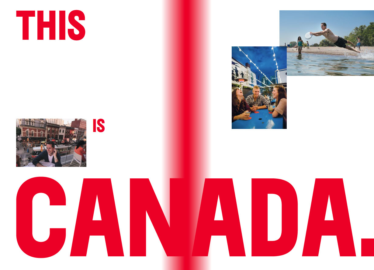
In the accompanying Destination Canada brand booklet - a veritable goldmine of wonderfully overblown branding pronouncements - the logo is explained as, "a reflection of Canada today, a study in movement and evolution rooted in our country's bold colour and iconography. Here, we take the nation's pulse and feel its heartbeat. It's an embodiment of the positive energy that makes hearts glow."
Who can argue with such passion? If you love a good design style guide, you really ought to download Destination Canada's brand booklet, which as well as providing those all-important tips on presenting the logo properly, also features loads of fantastic definitions of what Canada is, for example: 'Canada is more than a place on a map, it's a beacon to the world'.
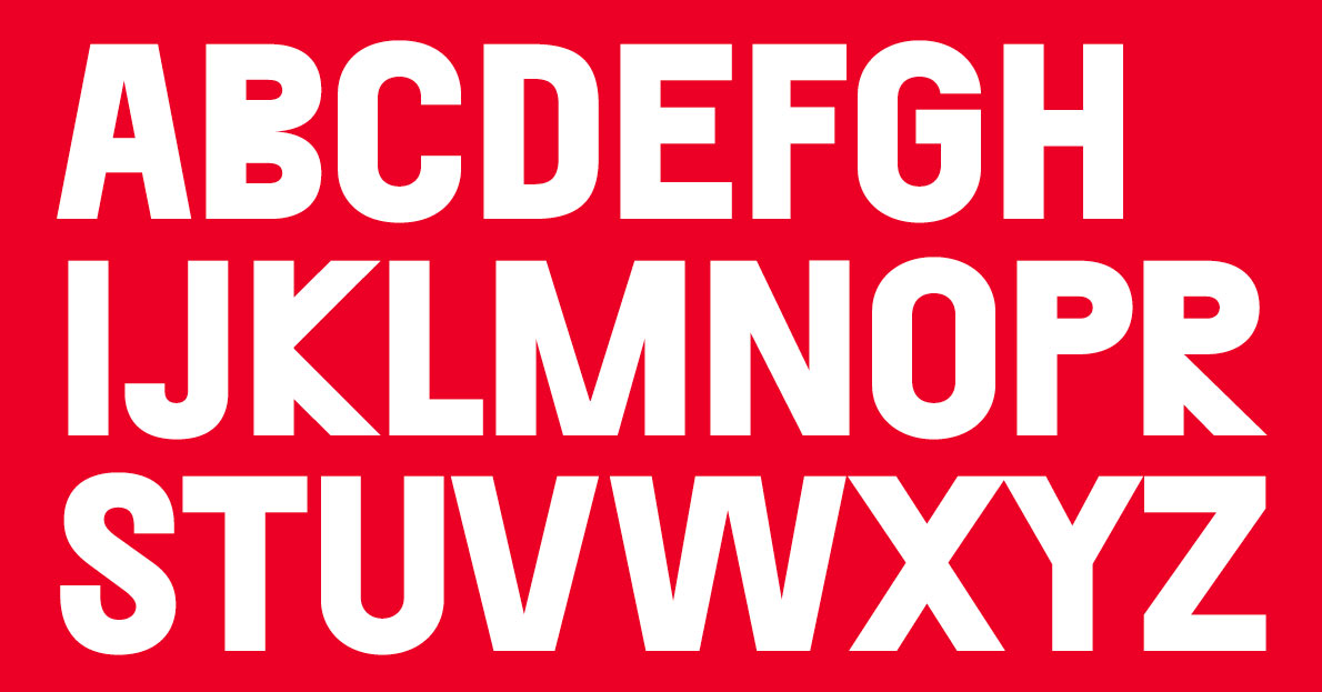
These are generally split across multiple double-page spreads along with some glorious photography, and they're all rendered in Destination Canada's display font, Separat Black, which is another undeniably quirky choice. Described as a font that stands out due to its offbeat yet approachable style, it's notable for its utterly bonkers R and K, both of which look like they've been drawn by someone who's forgotten what an R and a K actually look like.
Get the Creative Bloq Newsletter
Daily design news, reviews, how-tos and more, as picked by the editors.

In short, this is a brilliantly fun and unexpected piece of branding; find out more over at Destination Canada.
Related articles:

Thank you for reading 5 articles this month* Join now for unlimited access
Enjoy your first month for just £1 / $1 / €1
*Read 5 free articles per month without a subscription

Join now for unlimited access
Try first month for just £1 / $1 / €1

Jim McCauley is a writer, performer and cat-wrangler who started writing professionally way back in 1995 on PC Format magazine, and has been covering technology-related subjects ever since, whether it's hardware, software or videogames. A chance call in 2005 led to Jim taking charge of Computer Arts' website and developing an interest in the world of graphic design, and eventually led to a move over to the freshly-launched Creative Bloq in 2012. Jim now works as a freelance writer for sites including Creative Bloq, T3 and PetsRadar, specialising in design, technology, wellness and cats, while doing the occasional pantomime and street performance in Bath and designing posters for a local drama group on the side.
