Designers react to the Subway rebrand
Subway has seen various incarnations of its brand over the last half century. Here, designers critique its latest look.
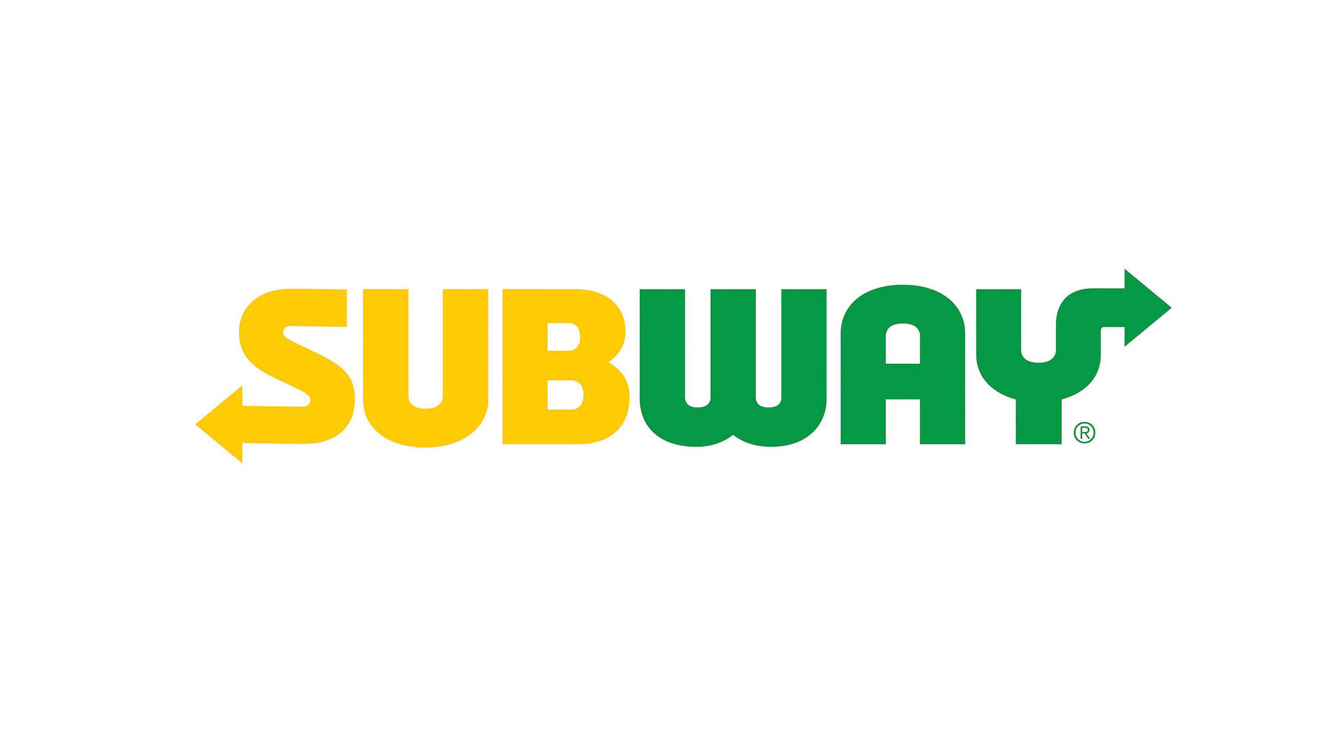
2016 has been a busy year for new branding and logo designs. Following in the footsteps of Mastercard and Budweiser, American fast food chain Subway recently revealed a fresh new look, with a redesigned logo and symbol set to be rolled out in restaurants early next year.
“We are on an exciting journey to meet the changing tastes of our guests," says Subway's president and CEO Suzanne Greco. "The Subway brand is recognised throughout the world, and this new look reinforces our commitment to staying fresh and forward-thinking with a design that is clear and confident, without losing sight of our heritage.”
But what does the design world make of the 'fresh, contemporary look'? We found out...
A wise move
“Subway has wisely taken the best elements of its brand equity, and remixed them into something contemporary, essentially taking its pre-2002 logo and refining it, with variations on the post-2002 colour scheme," says Kevin Tucker, creative director at Collide Creative.
"This gives the company the opportunity to shed some of the more negative aspects of its current reputation (which it’s hoping is as forgettable as its current logo), while symbolising a refocus on what originally made the brand successful. This is just one component of the major overhaul to the business announced last year, and only after Subway has started implementing the new logo can we fully gauge its success.”
A missed opportunity
“Even though it operates as the largest global fast food brand today, Subway’s food has maintained the right balance between health and taste," says Rohan Nanavati, founder and art director at Roar Studios.
"With the rebrand, I feel that the company missed an opportunity to reposition itself with a better identity that builds on the earned merit of the name and the unique product offering. With a more strategic approach, the brand could have further catered to unexplored segments, reached new consumers and uplifted its brand perception.”
Get the Creative Bloq Newsletter
Daily design news, reviews, how-tos and more, as picked by the editors.

As always, Twitter had a lot to say on the subject, with the rebrand receiving mixed reactions...
Rebrand FAIL! New #Subway logo looks like a recycling center identity. #Ballistic https://t.co/ze6We4drOfAugust 11, 2016
I'm quite liking the Subway rebrand, their nice symbol is pretty clever. pic.twitter.com/sIbO0cDAIgAugust 11, 2016
#subway new logo is so bad. Just stop the rebrand.August 10, 2016
The Subway rebrand is beautiful. Simple and easy, as well as thoughtful and combative. #subway #logo #brand pic.twitter.com/xYsDHeqktrAugust 9, 2016

Thank you for reading 5 articles this month* Join now for unlimited access
Enjoy your first month for just £1 / $1 / €1
*Read 5 free articles per month without a subscription

Join now for unlimited access
Try first month for just £1 / $1 / €1

Nick has worked with world-class agencies including Wolff Olins, Taxi Studio and Vault49 on brand storytelling, tone of voice and verbal strategy for global brands such as Virgin, TikTok, and Bite Back 2030. Nick launched the Brand Impact Awards in 2013 while editor of Computer Arts, and remains chair of judges. He's written for Creative Bloq on design and branding matters since the site's launch.
