Designers give iconic logos a radical makeover
How do these concept redesigns hold up against the official logos?
With time on our hands over the Easter weekend, we thought it a great time to marvel at the work of fellow design professionals. Last year, we covered these unofficial logo redesigns, which are still a brilliant source of inspiration and a celebration of the talent in the field. Enjoy!
Ever look at a famous logo and think, 'I could have done a better job'? Course you have. And some designers have put their money where their mouths are and actually given it a crack. Popular designer portfolio and networking platform Dribbble has put together a roundup of the best unofficial logo redesigns of the past year. All these designers have given world-famous logos a radical makeover, and the results are well worth checking out.
Some of the designs here are arguably better than the originals; others serve as a reminder that effective logo design is a lot harder than it looks. Even the ones we think don't work raise some interesting points as to what makes a logo successful or unsuccessful – for more on that, take a look at our feature on the stories behind the world's best logos, or our roundup of logo design advice.
Scroll down for a taster, and see what you think. A reminder: these are all unsolicited and unofficial. So don't worry, none of these new-look logos are going to be elbowing out the classics any time soon.
Click the icon in the top right of each image to enlarge it

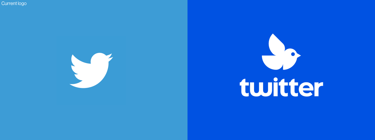
Twitter's little birdy is instantly recognisable in a range of contexts. This redesigned logo opts for a much curvier, more abstract shape. The addition of a circle to represent the eye helps ensure it's still recognisably a bird. This is one of the more divisive logos on the list. One of the reasons the current Twitter logo is so effective is that it easily passes the silhouette test, but does this version have such a strong impact? The redesign is the work of logo designer and self-confessed branding geek Myles Stockdale.

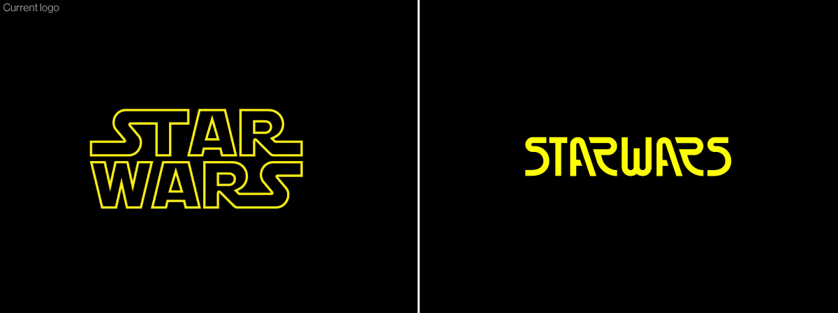
This is one of the most radical redesigns in Dribbble's roundup. The original Star Wars font is gone completely, and instead there's an unusual font with an Art Deco vibe. We wouldn't immediately associate this aesthetic with sci-fi, but this logo actually bears some resemblance to the second Star Wars logo – especially those 'A's. It was created by Ted Kulakevich for Florida agency Unfold.
Get the Creative Bloq Newsletter
Daily design news, reviews, how-tos and more, as picked by the editors.

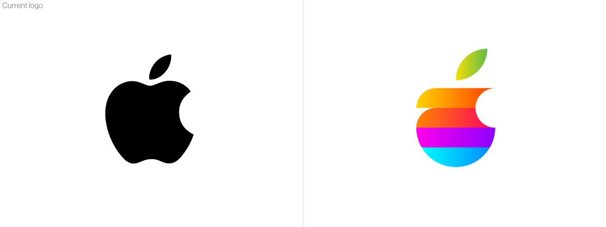
Another titan in the world of logos, Apple's apple has had broadly the same silhouette since 1977. Is it time to shake things up? Russian designer Ruslan Babkin has created a new look that makes a statement with colour and gradients. The striped, rainbow stylings hark back to Apple's 1977 logo, but this logo takes on a whole new silhouette. The much-discussed 'bite' remains (read about that here), but does it still look like an apple?
See the full roundup on Dribbble here.
Read more:

Thank you for reading 5 articles this month* Join now for unlimited access
Enjoy your first month for just £1 / $1 / €1
*Read 5 free articles per month without a subscription

Join now for unlimited access
Try first month for just £1 / $1 / €1

Ruth spent a couple of years as Deputy Editor of Creative Bloq, and has also either worked on or written for almost all of the site's former and current design print titles, from Computer Arts to ImagineFX. She now spends her days reviewing small appliances as the Homes Editor at TechRadar, but still occasionally writes about design on a freelance basis in her spare time.
