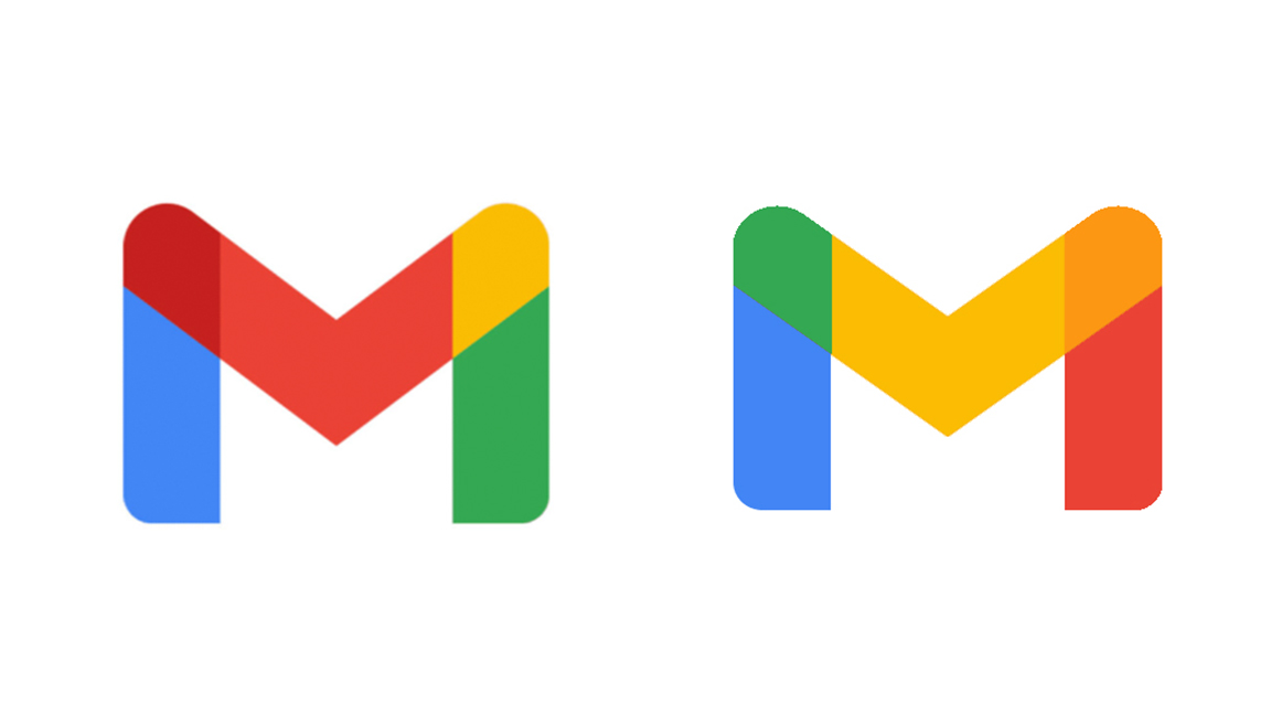
Is this how Google's new Gmail logo should have looked?
Designer's concept seems to make more sense.
When Google revealed its new Gmail logo earlier this month, it didn't exactly go down a storm online. The iconic envelope design was removed in favour of a more minimalist icon in Google's signature four colours – much like the rest of the logos within Google Workspace.
Many users have complained that the new logos for Gmail, Google Photos, Google Maps and the rest are too easily confused (which is one way of avoiding our best logos list). Now, one renowned Android leaker has shared his take on how the logo should have looked.
I feel like the new Gmail logo should have looked more like this, given the overlaps. pic.twitter.com/SAo2TLUgFXOctober 27, 2020
Rather than addressing the similarity concern across the whole of Google Workspace, Evan Blass's concept corrects an issue with the colours of the Gmail logo itself. Indeed, while there appears to be little logic to the order of the colours in Google's official effort, the overlap colours in Blass's correspond with those either side: blue and yellow become green, while yellow and red become orange.

Indeed, there's certainly something satisfying about seeing the colours combine correctly, and we can't help but wonder whether Google had even considered the overlaps (perhaps the company ought to have taken a look at our colour theory guide?).
And it seems many on Twitter are fans of Blass's update, with several users commenting (below) that his concept is not only more logical than Google's logo, but also more aesthetically pleasing.
Agreed, we all learned which 2 colors combined will make another color in kindergarten. They missed it on this one.October 28, 2020
This is so much, much betterOctober 27, 2020
Yes It's much easier on the eyes!October 27, 2020
We agree that Blass's design seems to make more sense than Google's. There's just one problem – none of Google's logos actually feature the colour orange. They all simply feature blue, red, yellow and green. That said, the new Gmail logo is the first to incorporate a darker shade of an existing colour. Instead of that magenta, should Google have simply bitten the bullet and thrown in an orange to allow for appropriate overlaps?
Google says that the new Google Workspace logos are designed to reflect "a more connected, helpful, and flexible experience". But judging by the response online, the confusingly consistent designs are proving anything but helpful. If the tech giant needs a little help next time, our logo design guide is a great place to start.
Get the Creative Bloq Newsletter
Daily design news, reviews, how-tos and more, as picked by the editors.
Read more:
- Apparently we've been doing logos wrong this whole time
- Black Friday and Cyber Monday deals 2020: When is it and all the best early deals
- Bold new Kia logo is coming soon (and we can’t wait)

Thank you for reading 5 articles this month* Join now for unlimited access
Enjoy your first month for just £1 / $1 / €1
*Read 5 free articles per month without a subscription

Join now for unlimited access
Try first month for just £1 / $1 / €1

Daniel John is Design Editor at Creative Bloq. He reports on the worlds of design, branding and lifestyle tech, and has covered several industry events including Milan Design Week, OFFF Barcelona and Adobe Max in Los Angeles. He has interviewed leaders and designers at brands including Apple, Microsoft and Adobe. Daniel's debut book of short stories and poems was published in 2018, and his comedy newsletter is a Substack Bestseller.
