Debenhams gets a joyful rebrand from Mother Design
The department store waves goodbye to 20 year old logo.
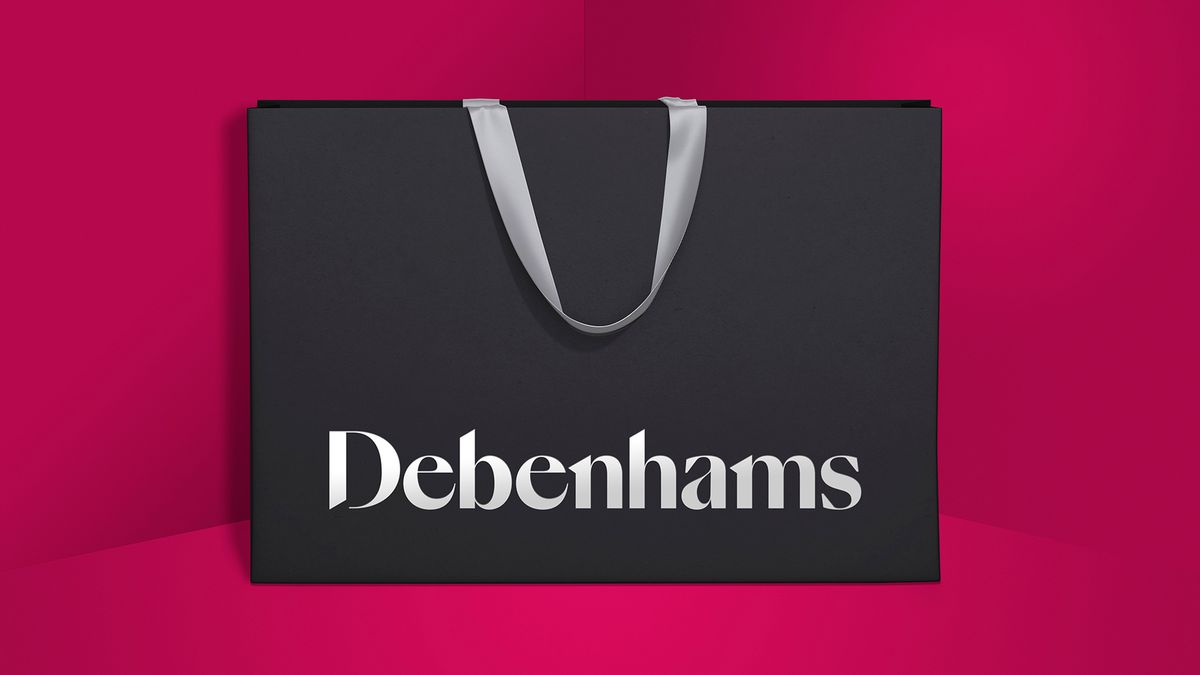
UK department store Debenhams has been given an identity overhaul courtesy of Mother Design, including a new logo design that will replace the design that has been in place since 1999. The rebrand forms part of an ongoing transformation dubbed 'Debenhams Redesigned', with the aim of injecting some of the joy back into the shopping experience. It comes alongside a playful marketing campaign from Mother, which asks customers to 'do a bit of Debenhams'.
"There are so few high street icons, and Debenhams is certainly one of them," says Mother's Ana Balarin. "It was a unique opportunity to revisit such a loved and established brand to reflect the modern business it has become."
Mother Design worked closely with Swiss Typefaces on a new logo for the retail giant (take a look at the gallery below to compare the old and new logos). The final design uses a custom typeface based on SangBleu, creating a more approachable, modern look that still contains echoes of Debenhams' 200 year heritage. The logo is supported by a vibrant colour palette and fresh illustration style.


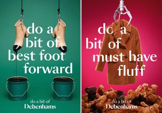
Mother's accompanying above the line campaign is designed to provide a point of difference and help mark Debenhams out in a crowded and competitive marketplace. It features product photography with an unexpected twist, such as a pair of shoes dipped in tins of paint, or a coat being plucked out of a pile of teddy bears by a fairground claw. Each also features a humorous slogan based on the theme 'Do a bit of Debenhams'.
“When talking about shopping, consumers told us of the real joy that they experience when exploring and trying new things in store," comments MD of Marketing and Beauty Richard Cristofoli. "Many lamented that shopping had lost its role in our culture... We wanted to present a rallying cry to consumers to celebrate the joy of shopping and reclaim it as the rich, experiential and joyous experience that brings family and friends together.”
The campaign will appear in still and GIF format across social and digital channels, alongside print brochures in several national magazines. Meanwhile, the rebrand is already live on Debenhams' site, and will be rolled out stores across the country in coming months.
Read more:
Get the Creative Bloq Newsletter
Daily design news, reviews, how-tos and more, as picked by the editors.

Thank you for reading 5 articles this month* Join now for unlimited access
Enjoy your first month for just £1 / $1 / €1
*Read 5 free articles per month without a subscription

Join now for unlimited access
Try first month for just £1 / $1 / €1
Ruth spent a couple of years as Deputy Editor of Creative Bloq, and has also either worked on or written for almost all of the site's former and current design print titles, from Computer Arts to ImagineFX. She now spends her days reviewing small appliances as the Homes Editor at TechRadar, but still occasionally writes about design on a freelance basis in her spare time.
