Darkmode: the typeface you didn't know you needed
There's more to this font than meets the eye.

You'd be forgiven for wondering why anyone would need to create a typeface which works across light and dark mode – surely it simply involves changing the colour from black to white? But as independent type foundry Dalton Maag's illuminating new typeface Darkmode reveals, there's a little more to it than that.
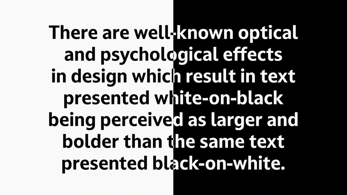
The rise of 'dark mode' across several operating systems and their UIs has created an unexpected challenge for those looking to create a consistent visual identity (don't forget to check out our best free fonts if you're looking for inspiration). According to Dalton Maag, white-on-black text is often subconsciously perceived as larger and bolder than the same text presented black-on-white.
Text presented white-on-black appears larger and bolder than text set black-on-white. Darkmode’s two variations have been crafted to provide typographic consistency between modes. Read more and try now at https://t.co/AC82u97pcn #DarkMode pic.twitter.com/WpUikE04UXMay 21, 2020
Enter Darkmode, a new typeface using "innovative variable font technology". Dalton Maag calls it the first retail font family to offer a ready-built solution to the problem. Darkmode offers two slightly different variants for each weight, which have been "carefully crafted to give a consistent appearance when switching between normal and inverse modes." In other words, the typeface offers two slightly different thicknesses: DarkmodeOn and DarkmodeOff (below).
Dalton Maag calls Darkmode "a typeface for the UIs of today and tomorrow," which improves digital navigation, on-screen reading and will ultimately help developers to create more reactive and responsive user experiences.
You can currently snap up a free trial of Darkmode on Dalton Maag's website. And if you're inspired by the amount of thought and detail that goes into font design, our font design guide is a great place to start your typographical journey.
Read more:
- These bad logo redesigns are the best (and worst) thing you'll see all day
- You've probably been writing the letter 'g' wrong for years
- Sun-Maid tries raisin' its profile with subtle logo tweak
Get the Creative Bloq Newsletter
Daily design news, reviews, how-tos and more, as picked by the editors.

Thank you for reading 5 articles this month* Join now for unlimited access
Enjoy your first month for just £1 / $1 / €1
*Read 5 free articles per month without a subscription

Join now for unlimited access
Try first month for just £1 / $1 / €1

Daniel John is Design Editor at Creative Bloq. He reports on the worlds of design, branding and lifestyle tech, and has covered several industry events including Milan Design Week, OFFF Barcelona and Adobe Max in Los Angeles.