Rebrand puts big (but unknown) company on the map.
(Image credit: Danaher)
Danaher is one of those big companies few people know about other than investors, and that's despite the fact that it owns a big portfolio of biotech, diagnostics and life sciences brands. But the Fortune 500 company is set to become a little more visible thanks to a sharp rebranding exercise that includes a new logo design.
The rebranding has given the medical and industrial products and services company a much more modern and more noticeable identity. But there's also a hidden meaning to the logo design that isn't immediately apparent (see our round up of logo secrets for more).
The old Danaher logo (left) and the new logo (right) (Image credit: Danaher)
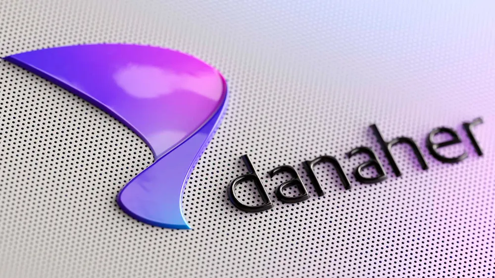
We've seen some surprising logo redesigns based around abstract shapes recently (the new Patreon logo, anyone?). Designed by Lippincott, the new Danaher logo might seem to fall into that trend with its gradient-filled curvaceous but angular new mark, still vaguely reminiscent of a 'D', while also looking somehow scienc-y.
Latest Videos From Creative Bloq
But the design is more calculated than might seem. Lippincott senior partner Dylan Stuart says the identity was built around the notion of an “acceleration curve" with "every component, from the logo and voice to illustration and motion, conveying dynamism and forward momentum.”
The shape of the logo mark is based on an acceleration curve (Image credit: Danaher)
"Because its impact story was historically always told through the lens of its portfolio companies, Danaher itself remained relatively unknown beyond Wall Street," Lippincott notes. To make the company known as a science and technology leader and turn the Danaher name itself into a business asset, Lippincott reimagined the company's identity from the ground up.
It conducted global research into brand perceptions and opportunities, explored the organisation’s aspirations and went on to develop a brand strategy around the idea of “Innovation at the speed of life". The idea is to present Danaher as accelerating science and technology's power to improve human health.
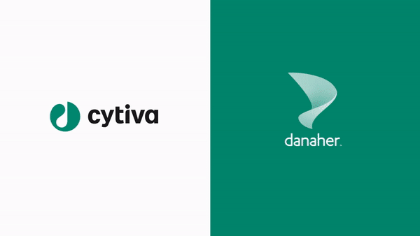
The new Danaher logo will be used as a trustmark alongside its various brands (Image credit: Danaher)
"Danaher’s new brand identity needed to assure all stakeholders that the core values of continuous improvement, responsiveness to customers and business performance that had driven its success were unchanged, while helping them better understand the company’s deep capabilities. Danaher’s visual and verbal brand expression was reimagined and imbued with profound meaning, vibrancy, and purpose," Lippincott says.
Get the Creative Bloq Newsletter
Daily design news, reviews, how-tos and more, as picked by the editors.
Part of the new identity includes giving more visibility to the Danaher name by using its logo as a trustmark alongside its various brands. A library of guidelines has been created along with and assets covering video, social, events tradeshows and a new website that aims to show the group as greater than the sum of its parts.
The result is a radical rebrand (it's certainly not a subtle logo change) that finally gives a big but little-known company a genuine identity. The previous branding, included a logo that had barely changed over the company's history and could apply as much to its beginnings as real estate trust in 1969 as its current status as a major innovator in life sciences. It felt nondescript and invisible. The new identity resolves that in a clever way that makes the brand more tangible and understandable.
Thank you for reading 5 articles this month* Join now for unlimited access
Joe is a regular freelance journalist and editor at Creative Bloq. He writes news, features and buying guides and keeps track of the best equipment and software for creatives, from video editing programs to monitors and accessories. A veteran news writer and photographer, he now works as a project manager at the London and Buenos Aires-based design, production and branding agency Hermana Creatives. There he manages a team of designers, photographers and video editors who specialise in producing visual content and design assets for the hospitality sector. He also dances Argentine tango.