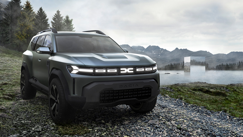
Car rebrands have tended to involve relatively minor tweaks lately, usually simplifying a well-established logo. But Renault's Dacia is going for a more radical revamp with its new logo, colour and vehicle designs. It's finally revealed how the new Dacia logo unveiled last year looks in situ on the cars – and it looks kinda sharp.
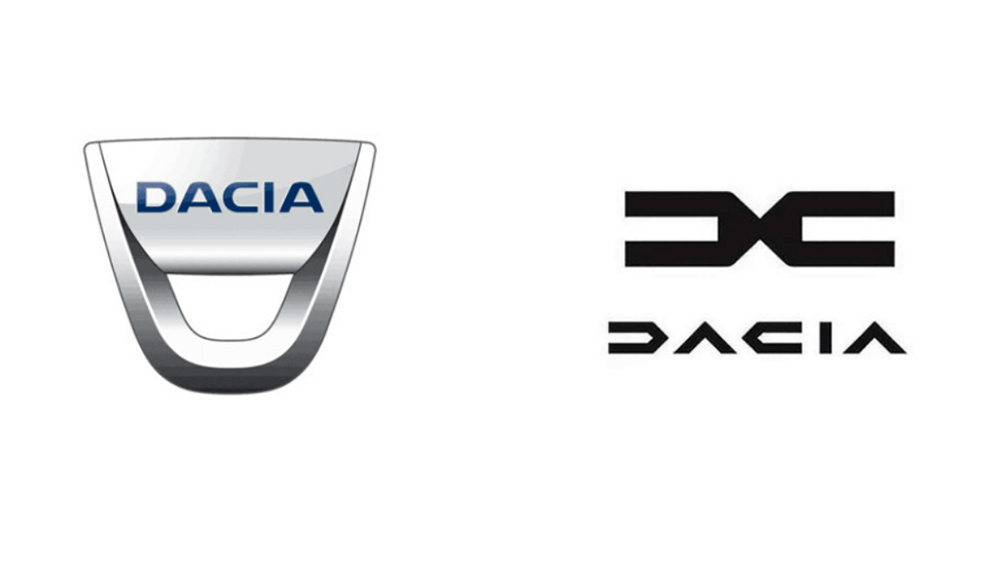
The new Dacia logo in particular is a radical departure from its previous identity with a more modern, geometric look that could almost convince us that it's a higher-end brand. It's a refreshing transformation for a carmaker that Renault bought from the Romanian government just over 20 years ago. And while it isn't going to make it to our pick of the best logos of all time, it's certainly a sharp new look for a value-focus brand.
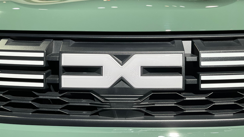
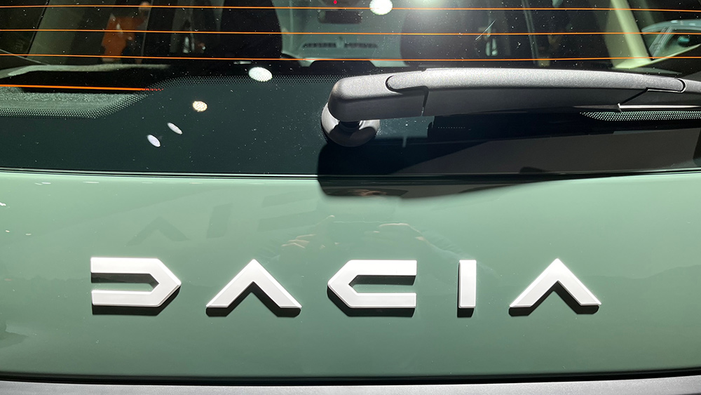
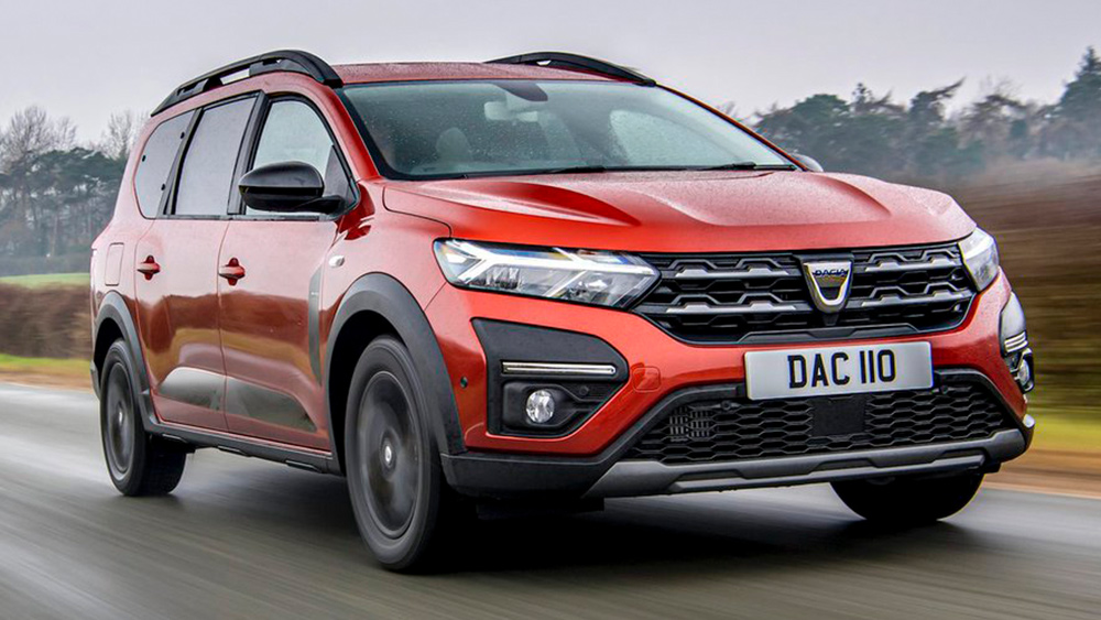
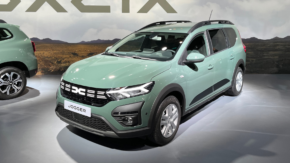
Dacia's revealed a new look for its cars, with sharper headlights and the new Dacia logo prominently placed on the grille. The brand has changed the style of its photography and advertising too, focusing more on customers with an active lifestyle who want a car with sharp design. It's launching innovations such as a camp bed system for its Jogger family car and even a tent.
It's also focusing on recycled materials: its Duster model will feature a recycled polypropylene material with a flecked finish that doesn't require painting. Dealers have also undergone a redesign, applying Dacia's new logo and colours.
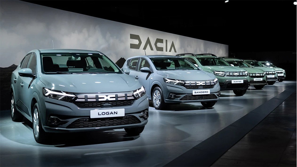
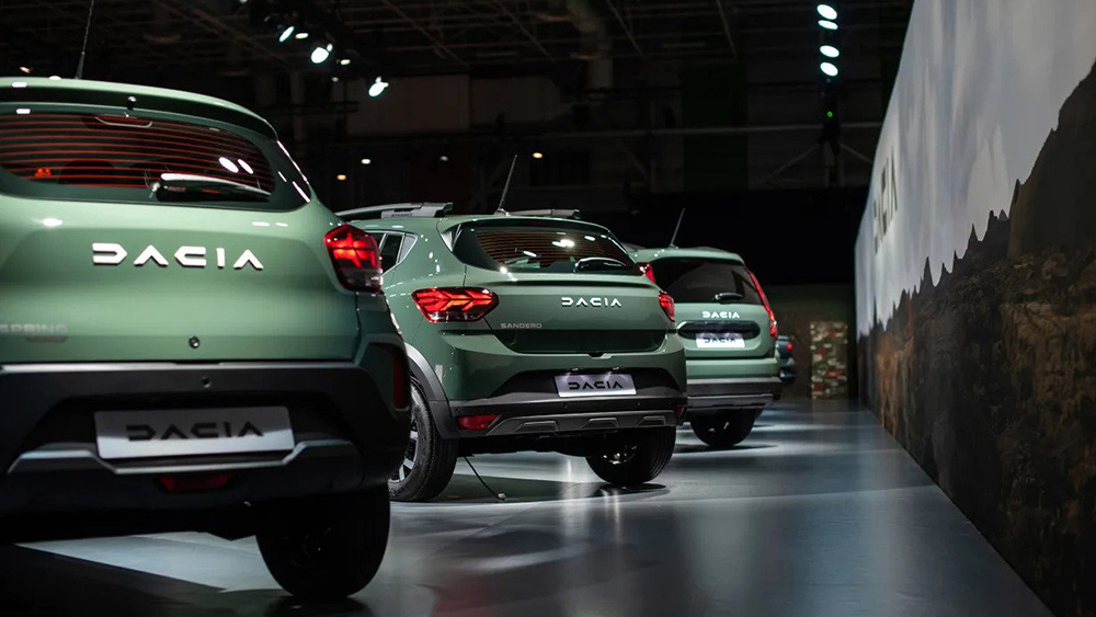
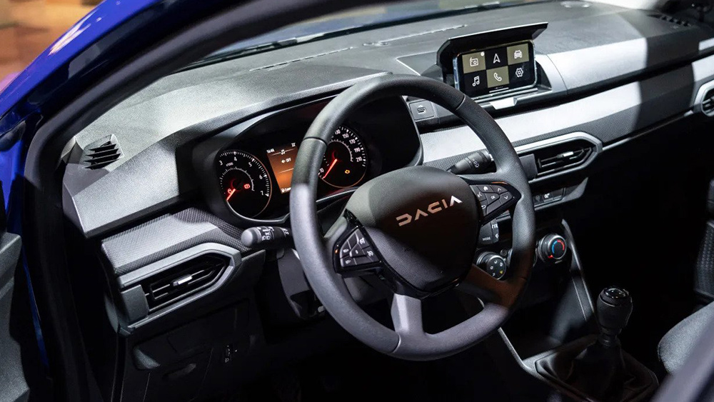
As for the logo, Renault said last year that the goal was "to change the brand’s visual language by tapping into its fundamental characteristics: robust, simple design, and a willingness to focus on the essentials." The minimalist letters are intended to communicate a "pared-back and cunning character." Yes, 'cunning', that's what they said.
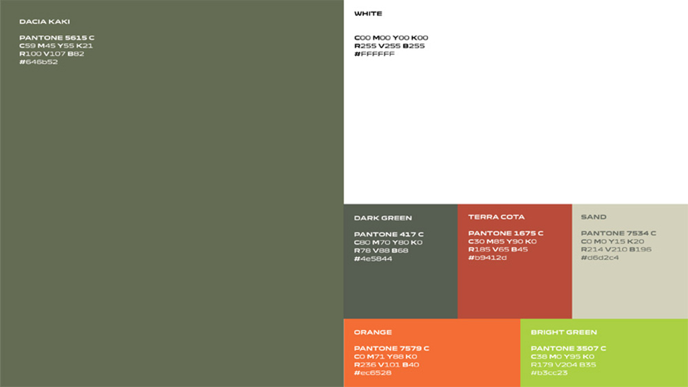
It's scrapped the closing strokes on the ‘D’ and ‘A’ , leaving minimal forms, which are also mirror images, creating a simple, geometrical look with a mechanical feel. The accompanying emblem is derived from the logotype, bringing together the ‘D’ and ‘C’, to form a symmetrical link, which Renault says symbolises a strong, cohesive bond. The new earthy colour palette was built around khaki-green to evoke "the brand’s closeness to nature", although that's an association that can be controversial for car brands as Mercedes found out.
The refresh seems to be going down well. On Twitter, people have suggested the new emblem both looks like a chromosome and a DMC DeLorean, but many see it as a chic improvement for the brand. One person wrote: "It looks rejuvenated and both more serious and fun at the same time."
Get the Creative Bloq Newsletter
Daily design news, reviews, how-tos and more, as picked by the editors.
Other recent new logos from car manufacturers have included a new Aston Martin logo and new Skoda logo (UPDATE: and now we've seen a new Citroen logo). We weren't very sure about the design decisions made by the latter, and it looks a little like another well-known car brand too.
Meanwhile, the new NFL logo for NHHM has been roasted on social media this week. For more on logo design, see our guide to how to design a logo. You might also want to make sure you have the best graphic design software.

Thank you for reading 5 articles this month* Join now for unlimited access
Enjoy your first month for just £1 / $1 / €1
*Read 5 free articles per month without a subscription

Join now for unlimited access
Try first month for just £1 / $1 / €1

Joe is a regular freelance journalist and editor at Creative Bloq. He writes news, features and buying guides and keeps track of the best equipment and software for creatives, from video editing programs to monitors and accessories. A veteran news writer and photographer, he now works as a project manager at the London and Buenos Aires-based design, production and branding agency Hermana Creatives. There he manages a team of designers, photographers and video editors who specialise in producing visual content and design assets for the hospitality sector. He also dances Argentine tango.
