This logo is so simple you'll wish you'd thought of it
Theatre rebrand is a crowning typographic achievement.

We love it when designers have a bit of fun with a project while turning in a top-class job, and this new piece of identity work by North ticks all the boxes.
It's for the Coronet Theatre in Notting Hill, London, which has been around since 1898, became a cinema in 1928 and eventually fell into disrepair. In recent years it's been undergoing an extensive restoration and relaunch programme after another theatre, the Print Room, acquired the building in 2014.
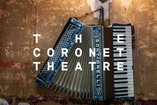
Part of this initiative has been a new identity and logo design that returns the theatre to its original name (for the past few years it's been known as the Print Room), and North has carried it off with a design that takes a big typographic liberty – and gets away with it.

The new logo uses a monospace font – Maison Neue Mono by Milieu Grotesque – and through the simple (but often frowned upon) trick of extreme justification, it turns the name of the Coronet Theatre into a simple but instantly recognisable representation of an actual coronet.
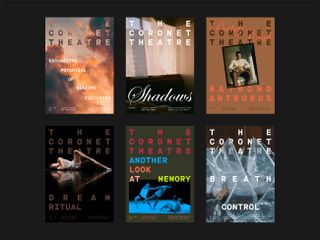
The effect's most noticeable on the posters for the theatre's new season launch campaign, where it's superimposed on a head and set at a jaunty angle. It works just as well, though, on other posters where it fills the top third of the layout. Its rigid grid-based structure, combined with more playful typography and striking imagery, adds up to a strong and engaging look that perfectly suits the reinvigorated theatre's new identity.

While Maison Neue Mono is the typographic centrepiece of this new desigb, other fonts are in play across North's identity system, providing the Coronet's designers with plenty of scope moving forward. There's a great-looking serif in the form of Colophon Foundry's Fortescue, and a gorgeous script font – ITC Edwardian Script from Linotype – which you can see being used to great effect across a number of posters.
One lovely final touch is the use of a number of hand-drawn coronet symbols being used as a secondary visual language across the theatre's merchandise and staff badges. These were inspired by original illustrations from the Coronet's theatre programmes and posters, found by North at the V&A museum.
Get the Creative Bloq Newsletter
Daily design news, reviews, how-tos and more, as picked by the editors.

You can find out more about the Coronet Theatre – and see further great examples of its stunning rebrand – on its site.
Related articles:

Thank you for reading 5 articles this month* Join now for unlimited access
Enjoy your first month for just £1 / $1 / €1
*Read 5 free articles per month without a subscription

Join now for unlimited access
Try first month for just £1 / $1 / €1
Jim McCauley is a writer, performer and cat-wrangler who started writing professionally way back in 1995 on PC Format magazine, and has been covering technology-related subjects ever since, whether it's hardware, software or videogames. A chance call in 2005 led to Jim taking charge of Computer Arts' website and developing an interest in the world of graphic design, and eventually led to a move over to the freshly-launched Creative Bloq in 2012. Jim now works as a freelance writer for sites including Creative Bloq, T3 and PetsRadar, specialising in design, technology, wellness and cats, while doing the occasional pantomime and street performance in Bath and designing posters for a local drama group on the side.
