Controversial BBC competition produces some incredible fan art
Whatever you thought of the Peaky Blinders comp, the results are worth exploring.

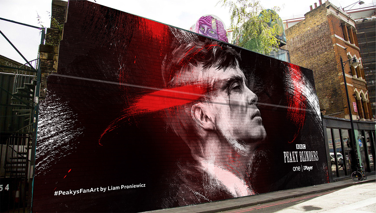
The winning designs from the BBC's controversial Peaky Blinders poster competition have been unveiled – and we're seriously impressed. The contest attracted over 1,200 entries from all over the UK, and the results showcase incredible artistic talent from illustrators of all kinds and from all backgrounds (including the work above, by Harry Ward).
The contest asked creatives to design a poster design based on one of the characters from its hugely popular period crime drama Peaky Blinders, with the winning designs appearing in the marketing campaign for the fifth series. The aim was to provide a platform for the huge quantities of professional-quality fan art the show has inspired since its debut. As a result, the contest was open to "anyone with a creative mind" – from professional illustrators to budding hobbyists.
- Inspired to get creative? Take a look at our guide to how to draw just about anything

So why was it controversial? Although the designers behind the winning posters received £1,000 each, unsuccessful illustrators were not compensated for their time and effort. When the competition was announced, a number of creatives questioned why a massive organisation such as the BBC was soliciting spec work.
Whatever your views on how the contest was run, there's no denying it has uncovered some incredible design talent. Read on for a closer look at some of the winning designs.

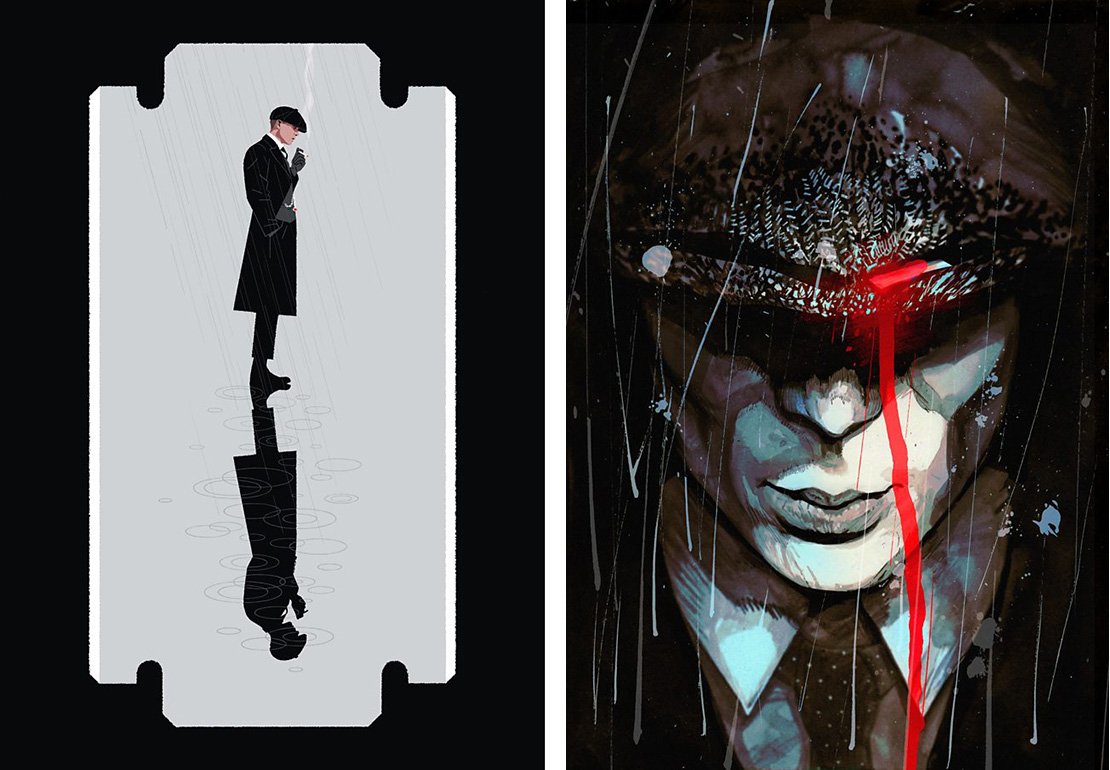
Matt Clough created On a Razor's Edge (above left). "I wanted to create an image with duality, that would show both the gravity of the decisions Tommy Shelby has made, and the looming impact of the violent lifestyle he has lived in his pursuit of power," he explains.
Adam Martins' ink creation, Violent Men are the Easiest to Deal With (above right), was also successful in the competition. The aim was to capture the idea that "no matter how brutal [Tommy Shelby's] actions become, he retains respect and honour".

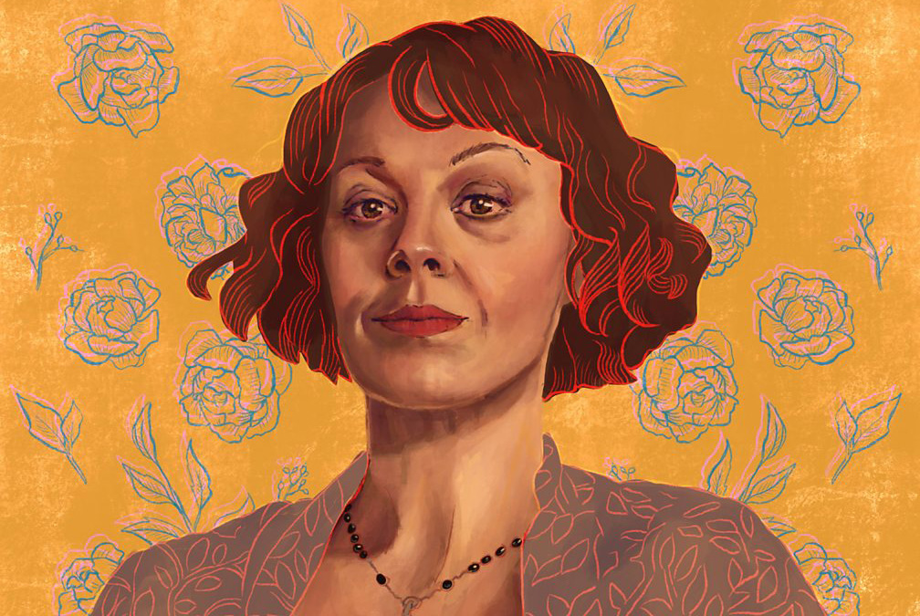
Alice Matthews turned her attentions to another key character, Polly Shelby, in her competition entry. "Polly is a powerhouse of a woman, but her character is more than just being the matriarch of the family," she says. "I wanted to paint something that showed her strength and resolve." To capture the duality of Polly's character, Matthews contrasted a strong pose with a soft colour palette and delicate detailing.
Get the Creative Bloq Newsletter
Daily design news, reviews, how-tos and more, as picked by the editors.

Sam Ding's Already Broken (above left) explores the price Tommy pays for the difficult decisions he has to make. The artist sought to capture both strength and vulnerability in the poster design.
Peter Carroll's pencil and ink Sundown (above right) is equally emotional and powerful. "I felt it was important to design a piece that was bold yet simple, so I limited myself to three primary colours, with strong black shapes and silhouettes," he says.
Explore the showcase of posters on the BBC’s website. If you created any of the artworks included here and would like your website linked up, get in touch with the details.
Read more:

Thank you for reading 5 articles this month* Join now for unlimited access
Enjoy your first month for just £1 / $1 / €1
*Read 5 free articles per month without a subscription

Join now for unlimited access
Try first month for just £1 / $1 / €1

Ruth spent a couple of years as Deputy Editor of Creative Bloq, and has also either worked on or written for almost all of the site's former and current design print titles, from Computer Arts to ImagineFX. She now spends her days reviewing small appliances as the Homes Editor at TechRadar, but still occasionally writes about design on a freelance basis in her spare time.
