The most controversial character designs of 2022
These designs caused quite a stir online.
Character designers often have a hard task on their hands. Everyone has an opinion about the way their favourites should look, and interpretations of famous characters can often be controversial.
This has been especially true this year, as we've encountered a whole lot of character designs that have caused a stir. From issues with brand mascots, to problems with animated favourites, internet dwellers have had a bunch of strong views – and they haven't been afraid to share them. To avoid your own character-based controversies, you'll want to check out our character design masterclass. But first, here are the four most controversial character design stories of the year.
01. Green M&M
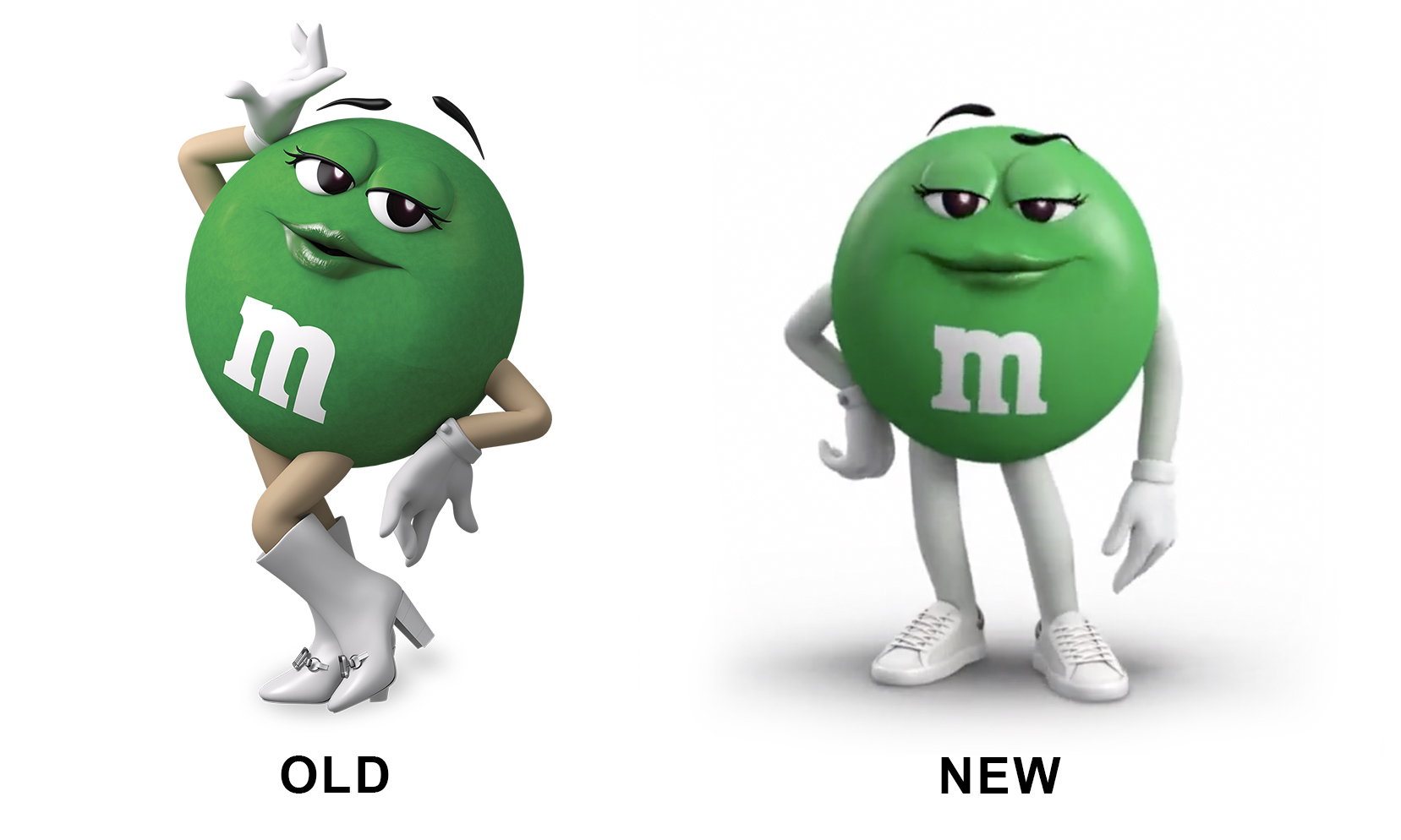
For our first character design mega-controversy, we're travelling right back to the start of 2022, which saw the redesign of the cast of M&Ms. Now, we weren't expecting such an outpouring of anger over this project, but the internet always takes us by surprise – especially when it comes to design-related news.
Most of the M&M designs seemed to be accepted by fans, but the Green M&M was an exception. Green used to have high-heeled boots, long lashes, lip gloss and a decidedly sassy air, but the more 'inclusive' redesign has done away with such character traits in a thorough de-sexualisation that many deemed unnecessary.
A pair of sneakers replaced the glam shoes, the make-up was dialled down and the character's pose became much more subtle. The critics called the new footwear "old maiden, 40-50-year-old auntie sneakers" and labelled the redesign "woke". Ouch.
02. She-Hulk
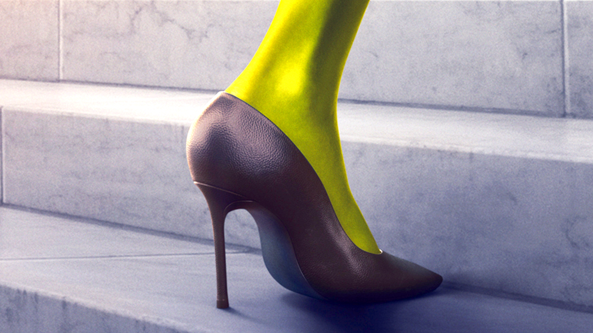
This year saw the release of a new She-Hulk series on Disney Plus. The clue's in the name as to the character design controversy in question, as the female version of The Hulk did not go down well at all. As soon as the first images of the angriest character in the land were released, folks spotted a problem. In short, for a character that's meant to be known for her strength, She-Hulk doesn't look very strong.
Viewers complained on Twitter about She-Hulk's petite size, pointing out that she doesn't have the bulk of The Hulk himself. And members of the VFX team agreed, as a now-deleted tweet showed.
Get the Creative Bloq Newsletter
Daily design news, reviews, how-tos and more, as picked by the editors.
The Gamer shared a comment from one member of the animation team, Sean Ruecroft. "I was at a company that did VFX for this." writes Ruecroft. "Apparently, she was bigger early on, but the notes kept saying to 'make her smaller. We always roll our eyes (like we did on Sonic) but at the end of the day artists gotta follow orders."
03. Minnie Mouse
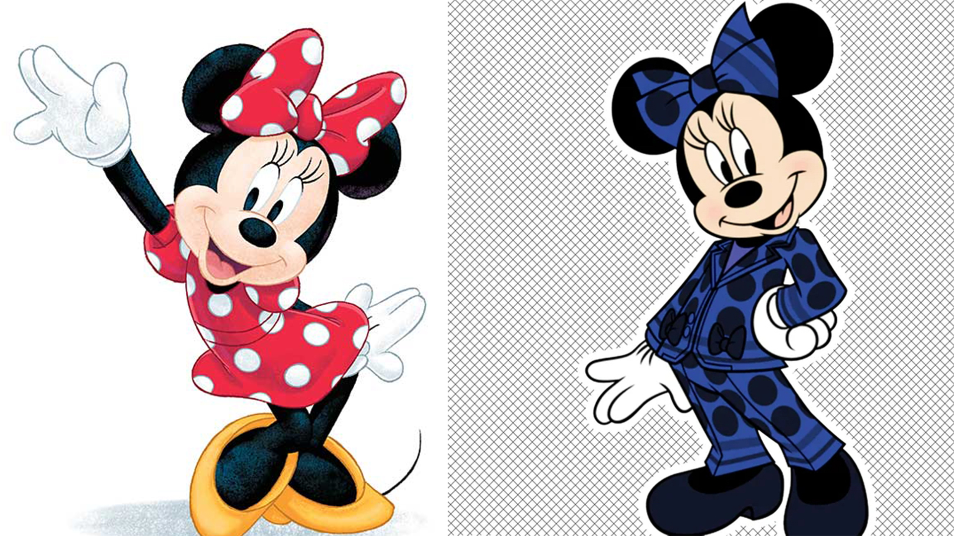
When an animation classic is redesigned, there are going to be opinions. And this year's (temporary) redesign of Minnie Mouse certainly served up a few. We're sure you know that Minnie Mouse is usually clad in her red dress, studded with white polka dots. But a redesign for Women's History Month and Disneyland Paris' 30th anniversary gave Minnie a makeover courtesy of none other than Stella McCartney.
A blue and black pantsuit replaced her normal dress, with a real-life version made from sustainable fabrics. Some fans were not impressed, yearning for the mouse's "fun, red dress" and calling the pantsuit "ugly". However, the mouse makeover did have its fans, with other commenters saying she "slays" in the business-first attire. You can't please 'em all.
04. Pokémon
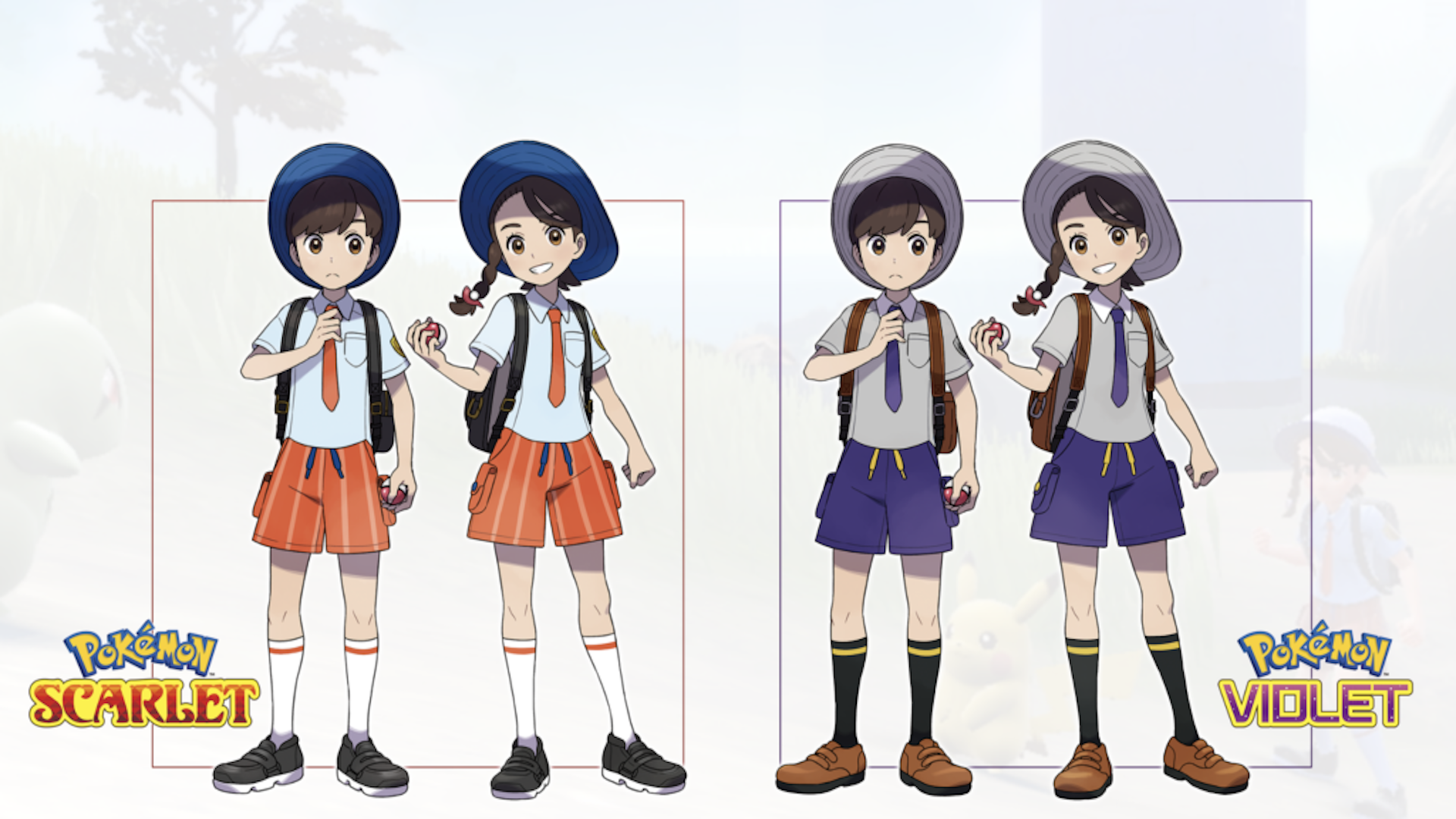
Pokémon celebrated the ninth generation of games this year, and released Pokémon Scarlet and Violet to mark it. But many gamers were super-unhappy with the character designs, and specifically the eyes.
Whereas the usual shape for the eyes of Pokémon trainers is vertical and oval, the eye shapes of the new characters were rounder, and less tall – leading some critics to call them "cold" and "dead". Many compared the design to the style of Studio Ghibli but not necessarily in a good way, believing the circular eyes to be too much of a departure from the usual look of Pokémon trainers.
We'll leave you with our favourite comment: "They look like Ghibli (which would be cool) but crossed with those dolls that your grandma has a few too many of in a scary room." Yikes.
Read more:
- Digital art software: Get creating on these top programs
- How to be a character designer
- Best drawing apps for iPad: Awesome apps for artistic work

Thank you for reading 5 articles this month* Join now for unlimited access
Enjoy your first month for just £1 / $1 / €1
*Read 5 free articles per month without a subscription

Join now for unlimited access
Try first month for just £1 / $1 / €1

Georgia is lucky enough to be Creative Bloq's Editor. She has been working for Creative Bloq since 2018, starting out as a freelancer writing about all things branding, design, art, tech and creativity – as well as sniffing out genuinely good deals on creative technology. Since becoming Editor, she has been managing the site and its long term strategy, helping to shape the diverse content streams CB is known for and leading the team in their own creativity.
