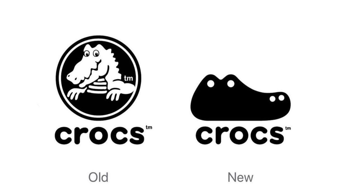
Concept crocs logo gives 'ugly' shoe brand a smart new look
Should Crocs snap up this new logo design?

Designers reimagining classic logo designs is nothing new. A brilliant way to hone your design skills, taking on an instantly recognisable logomark with a new concept design is no easy feat. But occasionally, the practise throws up some incredible gems, just like this concept Crocs logo by designer Stephen Kelleher.
His design replaces the original crocodile-in-a-circle design with a simple vector shape, representative of a crocodile's head, which features the signature holes found in Crocs' classic clogs. A brilliant but seemingly obvious design, it's hard to believe no-one, including Crocs themselves, has come up with it before. The overall shape of the logo creates an immediate connection with the product line, a task much harder than it might seem and testament to Kelleher's design skills.
Speaking on Instagram, Kelleher had this to say about the redesign: "Historically perceived as an 'ugly' shoe, Crocs have in recent years become a favourite of working artists and the fashion vanguard by reinventing their famous silhouette to speak to a new audience. This rebrand concept was inspired by the iconic silhouette as a basis for their mascot ‘Croc’, streamlining and unifying both into one simple mark."
A photo posted by @stephen.kelleher.studio on Aug 6, 2019 at 8:55am PDT
And if the reaction online so far is anything to go by, we'd say it won't be long until the new design lands on the desks of Crocs HQ, with many people taking to Twitter and Instagram to call for Kelleher's design to be made official:
Some of the best logo designs are the ones that seem obvious at first glance, but plainly took a lot of hard work to get them just right. Like this faux Crocs Redesign. https://t.co/RKoIFihOKaAugust 9, 2019
say what u want about crocs but the new logo is😩😤👌🏻💯 pic.twitter.com/omnHZF0ULPAugust 9, 2019
Actually unsolicited redesigns are often better than anything a large studio will churn out. If @Crocs has any sense they will snap this up.August 9, 2019
So what do you think? Should Crocs be snappy about implementing Kelleher's logo design? (Sorry, couldn't resist).
Read more:
- Logo swap is surprisingly disturbing
- 10 of the best logos ever
- Boots reveals biggest logo redesign in 170 years
Get the Creative Bloq Newsletter
Daily design news, reviews, how-tos and more, as picked by the editors.

Thank you for reading 5 articles this month* Join now for unlimited access
Enjoy your first month for just £1 / $1 / €1
*Read 5 free articles per month without a subscription

Join now for unlimited access
Try first month for just £1 / $1 / €1

Kerrie Hughes is a frequent contributor to Creative Bloq, and was once its editor. One of the original CB crew, Kerrie joined the team back in 2013 after moving from her role as staff writer on 3D World. Since then she's written regularly for other creative publications such as ImagineFX, Computer Arts and Digital Camera World. After a stint working for the police, Kerrie is back reviewing creative tech for creative professionals.
