Computer Arts cover design contest 2017: Top 10 revealed!
Here's the final shortlist for who will design the cover of CA's fourth-annual New Talent special.
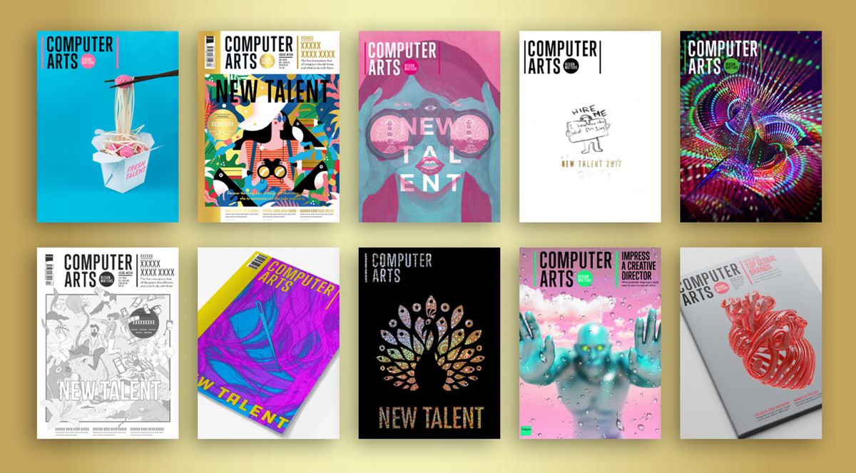
For the last four years, Computer Arts has run a contest in partnership with D&AD New Blood for students and recent graduates to design the cover of the magazine's annual New Talent special.
For this year's brief, CA's print finishing partner Celloglas offered up an extra-special finish for the entrants to get creative with: Mirri.
After much deliberation, the CA team can now reveal the final shortlist of 10, one of whom will receive a £500 commission to develop their idea into the final cover of the issue, which goes on sale on 21 July 2017 (subscribe to CA now to guarantee your copy, and get 5 issues for £5!)
So without further ado, here's this year's top 10 in alphabetical order...
01. Camelia Pham
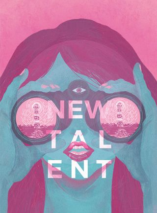
Camelia Pham is a second-year graphic design student at the Academy of Fine Art in Frosinone, Italy.
"My idea is about a lighthouse as the talent seekers, shining down to find and shed a path to us, the young ones in the art community," she explains.
"Meanwhile, we try to reciprocate the effort by sending you our best works with part of our soul attached to them, as seen in the eye in the forehead – the window of the soul."
Get the Creative Bloq Newsletter
Daily design news, reviews, how-tos and more, as picked by the editors.
02. Cathrine Understrup
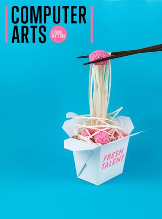
Cathrine Understrup graduated from the Danish School of Media & Journalism in 2015. She describes herself as "a creative wildcard", working across both advertising and graphic design.
"I develop concepts with a strong emphasis on art direction," she says. "I have a passion for handcrafted tactile design." Accordingly, her cover concept relies on physical props, sculpted from clay and folded paper.
"It's about literally picking up fresh talent," Understrup continues. "I would like to use Mirri on top of the noodles to make them shiny gold, and create a box of golden noodles with fresh talented brains entangled."
03. Dev Joshi
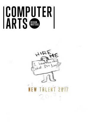
"As young, naive and often rather clueless new talent entering the world, we’re told to show only our best work to get noticed and get hired," points out the next finalist, Dev Joshi.
"My cover design is just a rough-sketched pencil drawing, and it’s not very good. A lot of the time our ideas aren’t very good, but every concept starts with a simple sketch and grows from there."
Joshi adds that his design breaks from CA's usual mould of "bright, beautiful and enticing covers", but adds that this approach can "help it become relatable to the everyman, or every creative."
04. Ingrid Tsy
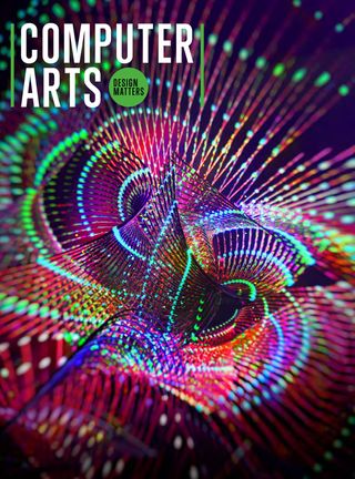
"The fluid lines and dynamic forms of my design are like fireworks, in which ‘new talents’ are the sparks that illuminate the night sky," explains Ingrid Tsy.
"The graphic is further enhanced by Mirri metallic finishes to captivate the audience with their explosive energy, just like a brilliant firework show."
05. Irinel Papuc
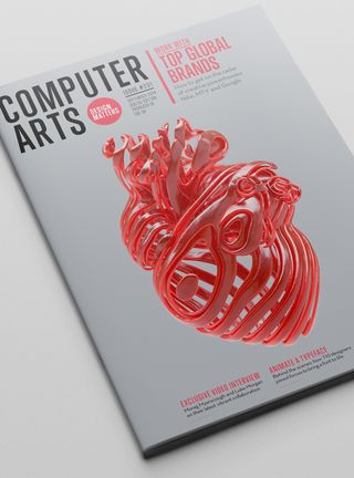
Irinel Papuc graduated from the University of Applied Sciences in Dortmund, Germany, six months ago. She chose to submit an existing piece of work that fitted the brief – new talent is the beating heart of the industry, after all.
Her goal was to find a way to show the intricacy and simplicity of a heart, without losing the aesthetic of the heart itself. "It was part of a '365' project, where I've been posting artwork every day for one year," explains Papuc.
"It's a CGI sliced heart, with a slight transparent material – done in Cinema 4D and OctaneRender."
06. Jac Harries
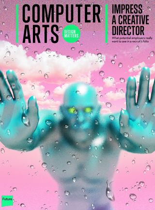
Currently in his final year at Central Saint Martins in London, Jac Harries has developed a fascination with the increasing virtuality of the modern world. "This topic is increasingly relevant in the field of graphic design, as AR and VR become more and more widely used," he explains.
"My design depicts a window into a virtual world, with a three-dimensional man on the other side touching the window. He could also be seen to be pushing through, as a symbol of the rapid speed that technology is shaping our future."
Harries first rendered the man, focusing on his hands and fingertips, and then superimposed raindrops on top to achieve depth. "I believe this effect would add an extra level of depth and intrigue to a printed publication," he says.
07. Jenny Tang
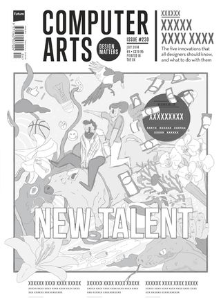
Ever since Jenny Tang graduated two years ago, she's been hearing the phrase 'the world is your oyster' – and she submitted a work-in-progress sketch to express the concept she had in mind.
"Inspired by this expression, and the iridescent nature of a pearl, I chose to celebrate that feeling of being 'fresh out of university', with all of those endless possibilities waiting," she explains.
"I wanted to create a grandiose display of life, choices and opportunities among a full shimmering 'pearl' cover to reflect this concept, and make something that will grab people's attention."
08. Jordan Pledge
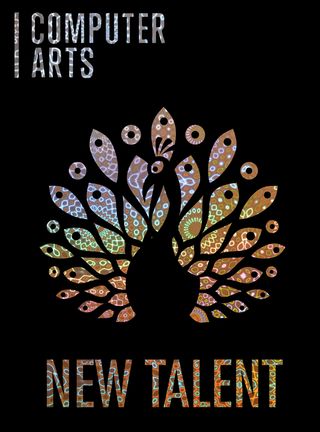
For his cover concept, UWE Bristol graduate Jordan Pledge considered the fact that new talent needs to make itself known to the world – it doesn't just emerge out of nowhere.
"My concept centres around one of nature’s biggest show-offs: the peacock," he says. "It uses the qualities of the holographic Mirri finish to represent the unique eye-catching skills and talents that we want the industry to recognise."
09. Kasia Serafin
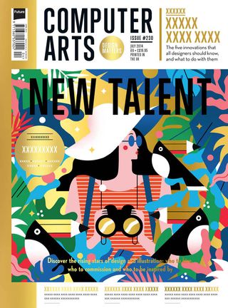
“My concept refers to the brief’s suggested theme of ‘getting noticed’. The design industry can be a jungle, an unexplored territory, where the New Blood pencil-toucans reside and wait to be spotted," says Kasia Serafin, who featured in our New talent: 7 shining stars from D&AD New Blood 2016 post.
Serafin proposes using a gold Mirri finish underneath her design, with a layer of white underpinning the colourful elements to help them pop. "It is stated in the brief that the entry only had to be a sketch or a mock-up, and there is always room for improvement, so I’d like to think of this as a first draft," she adds.
10. Robert Coker
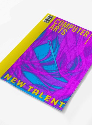
For Robert Coker, the phrase 'like finding a needle in a haystack' inspired a simple visual metaphor for seeking the brightest new talent.
"Every year, more and more creatives pour onto the scene," he points out. "Looking for the brightest new stars has become trickier because of the sheer volume of creatives, in the UK alone."
To enhance the concept, Coker suggests using a multi-level deboss on a textured soft-touch cover stock, to give the illusion of hay, or hair. "The needle in the haystack would be debossed, and finished with iridescent foil."
Winner revealed at D&AD New Blood
Computer Arts will reveal the winning cover design at D&AD New Blood Festival, which takes place at Old Truman Brewery in Shoreditch from 5-6 July. We'll share it here on Creative Bloq shortly afterwards. Good luck everyone!
Related articles:

Thank you for reading 5 articles this month* Join now for unlimited access
Enjoy your first month for just £1 / $1 / €1
*Read 5 free articles per month without a subscription

Join now for unlimited access
Try first month for just £1 / $1 / €1

Nick has worked with world-class agencies including Wolff Olins, Taxi Studio and Vault49 on brand storytelling, tone of voice and verbal strategy for global brands such as Virgin, TikTok, and Bite Back 2030. Nick launched the Brand Impact Awards in 2013 while editor of Computer Arts, and remains chair of judges. He's written for Creative Bloq on design and branding matters since the site's launch.