Colgate brushes up its logo to make us smile
Sign up to Creative Bloq's daily newsletter, which brings you the latest news and inspiration from the worlds of art, design and technology.
You are now subscribed
Your newsletter sign-up was successful
Want to add more newsletters?
Five times a week
CreativeBloq
Sign up to Creative Bloq's daily newsletter, which brings you the latest news and inspiration from the worlds of art, design and technology.
Once a week
By Design
Sign up to Creative Bloq's daily newsletter, which brings you the latest news and inspiration from the worlds of art, design and technology.
Once a week
State of the Art
Sign up to Creative Bloq's daily newsletter, which brings you the latest news and inspiration from the worlds of art, design and technology.
Seasonal (around events)
Brand Impact Awards
Sign up to Creative Bloq's daily newsletter, which brings you the latest news and inspiration from the worlds of art, design and technology.
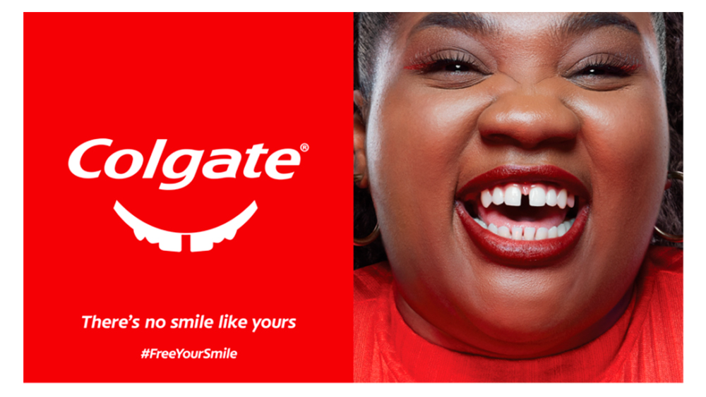
The toothpaste brand Colgate introduced a new logo a few years ago, adding a smile to its traditional wordmark. But something was missing from the design: teeth. The brand is now putting that right in a new campaign that aims to encourage people to flash their gnashers more often.
The campaign involves multiple logo variations in which the Colgate smile is given teeth in a wide array of forms, including gaps, chips, wonky angles, and braces. There's even an AI image generator that allows customers to create a design based on their own teeth (and that means more than just a subtle logo change).
A post shared by Colgate (@colgateanz)
A photo posted by on
Designed by TeamWPP@CP and launched in Australia and parts of Asia for World Smile Day on 6 October, the #FreeYourSmile campaign aims to counter so-called “smile shame". Colgate says that it carried our a 'Smile Study' in the Asia-Pacific region and found that 94 per cent of respondents had a desire to smile more freely but that many refrain from doing so because they are embarrassed by the state of their teeth.
Noting that smiling has shown to have health benefits, Colgate has also launched a Smile Generator AI tool that allow people to create their own personalised Colgate smile logo stickers. Users take or upload a photo, and the generator will create a logo based on the shape of their teeth to share on TikTok and Instagram.
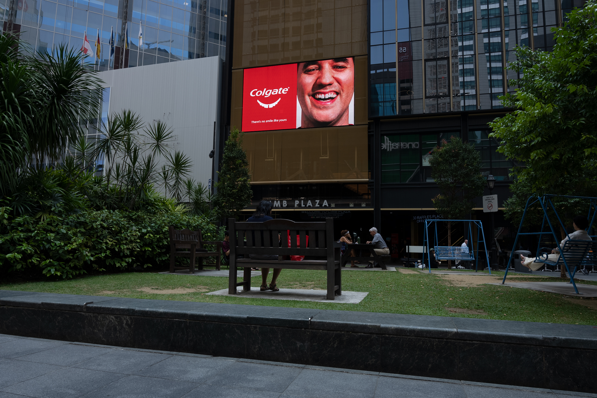
“Smile Shame is especially prevalent in Asia-Pacific and this must change,” Yves Briantais, executive vice president of marketing Asia-Pacific at Colgate-Palmolive, said. “At Colgate, we are on a mission to free people from the constraints of Smile Shame to truly embrace their own unique smiles. We believe brands have the power to challenge unrealistic beauty standards and promote authenticity. This World Smile Day, Colgate is leading the charge by celebrating all smiles.”
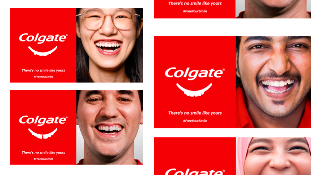
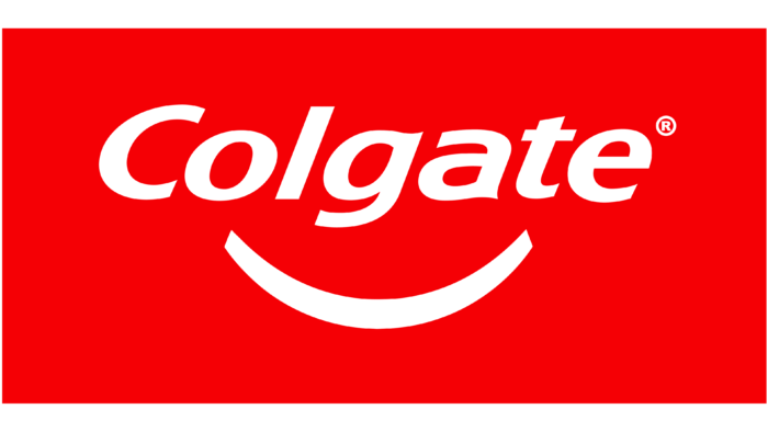
I can't say I have ever wanted to have my own personalised Colgate logo, but the campaign is a clever way to engage customers and push back against some of the expectations of what the perfect teeth should look like (which adverts for dental products may themselves have played a role in creating). Not very long ago, it would be rare to see anyone with less than perfectly symmetrical pearly whites in toothpaste advertising, so it's refreshing to see Colgate embracing more varied mouths, even in its logo.
For more logo inspiration, see our pick of the best new logos.
Sign up to Creative Bloq's daily newsletter, which brings you the latest news and inspiration from the worlds of art, design and technology.

Joe is a regular freelance journalist and editor at Creative Bloq. He writes news, features and buying guides and keeps track of the best equipment and software for creatives, from video editing programs to monitors and accessories. A veteran news writer and photographer, he now works as a project manager at the London and Buenos Aires-based design, production and branding agency Hermana Creatives. There he manages a team of designers, photographers and video editors who specialise in producing visual content and design assets for the hospitality sector. He also dances Argentine tango.
