This is the best use of negative space we’ve seen in a while
We’re obsessed with this genius movie poster.
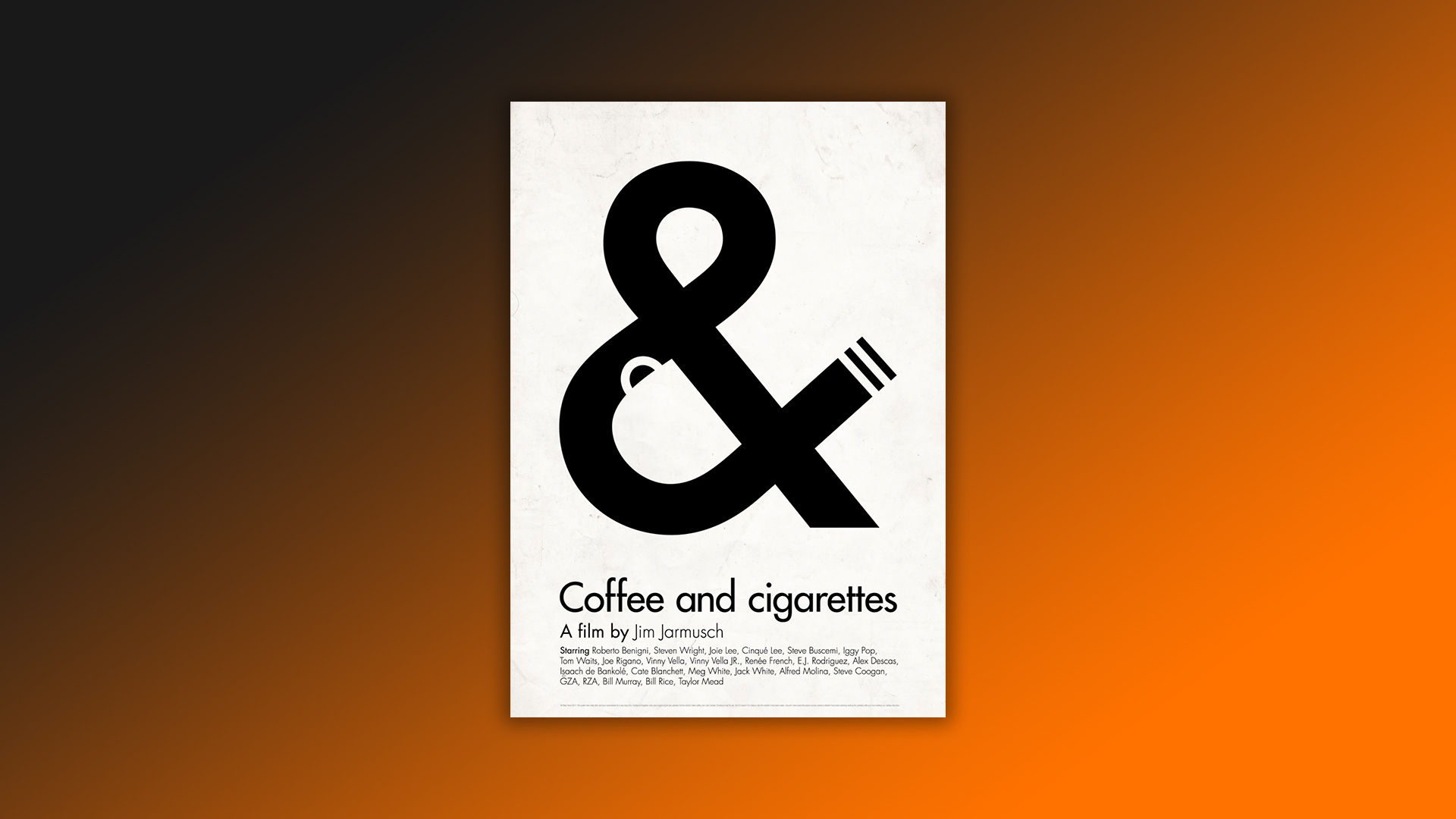
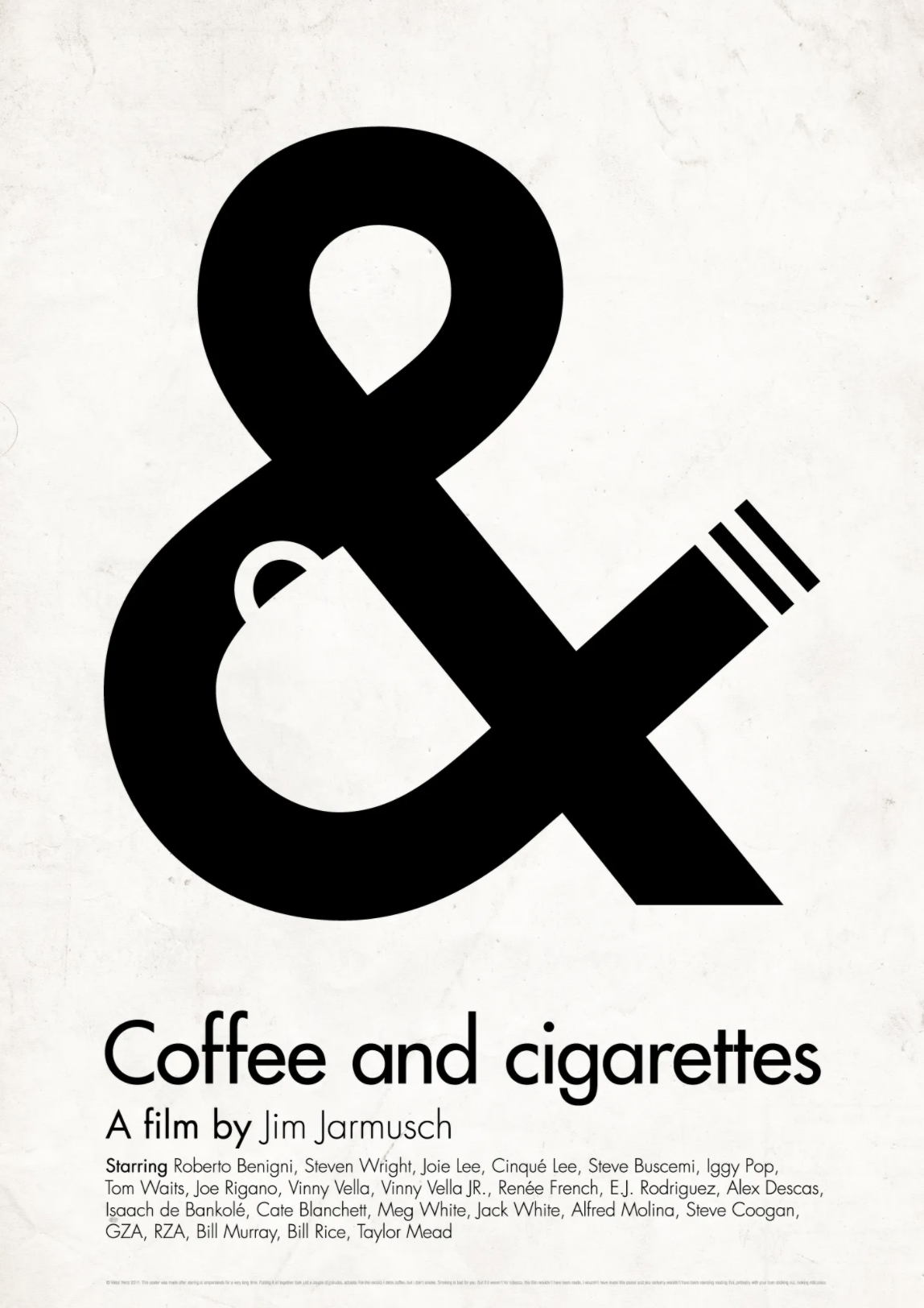
Coffee and Cigarettes was released back in 2003 and features several vignettes starring an illustrious cast including Bill Murray and Cate Blanchett. While the film is aesthetically pleasing with its black and white palette and arthouse cinema conventions, it's a fan-designed poster that's caught our eye this morning.
The poster design is currently sitting proudly at the top of the DesignPorn Reddit page, and we think it's genius. The design is minimalistic but makes brilliant use of blank space to portray coffee, cigarettes and an ampersand. Not to mention the monochrome design that fits perfectly with the black and white movie. It's a seriously satisfying design. You can get to grips with how to effectively use blank space on your designs by checking out our guide to negative space.
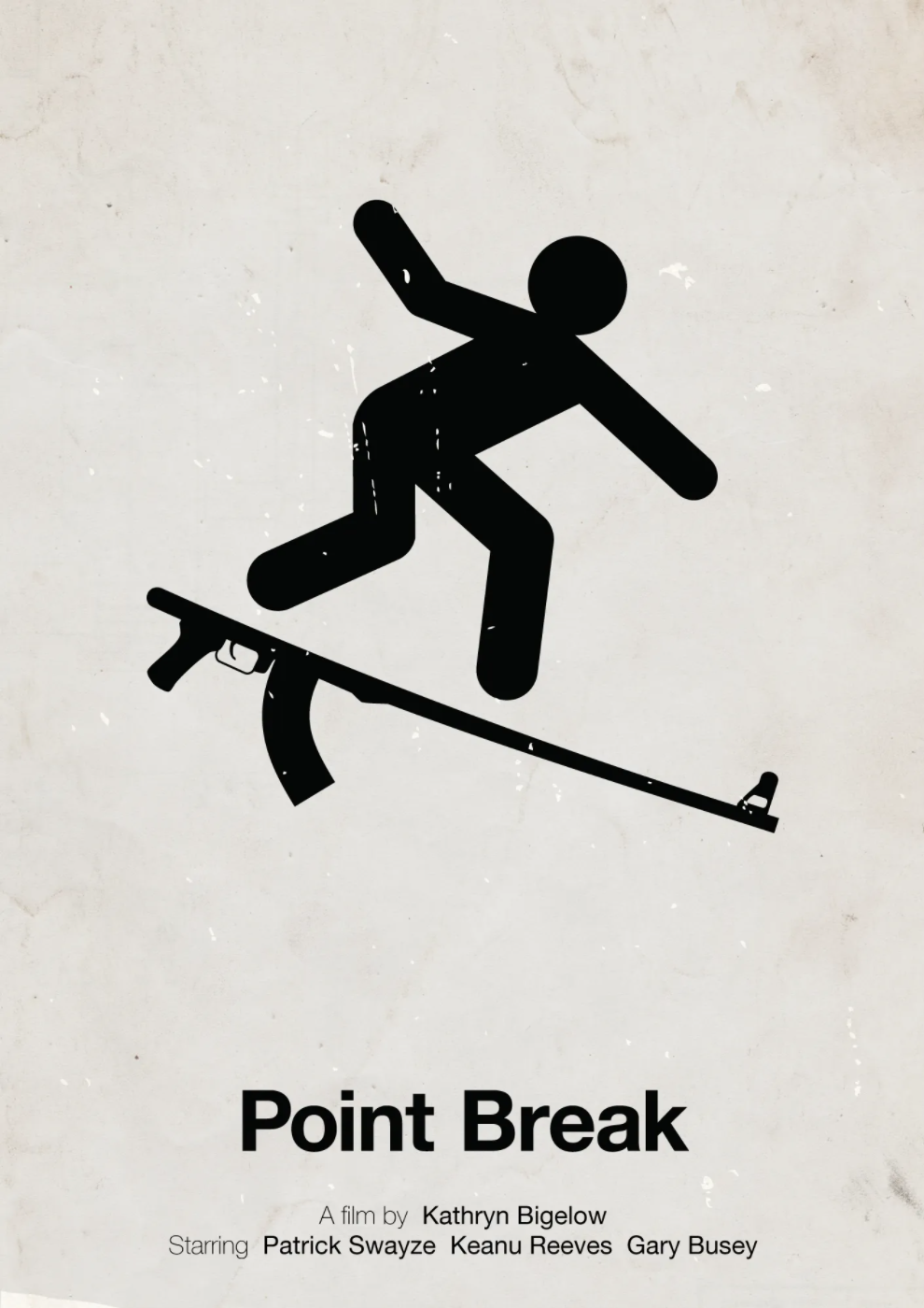
The brilliant poster was designed by illustrator Viktor Hertz. According to Hertz' website, his career took off after he started designing as a hobby and says that his work is "inspired by pop-culture, satire and humour, often using visual metaphors and focusing on strong ideas". But this isn't Hertz' first rendezvous with clever poster designs, in fact, he has designed several minimalistic posters for the likes of Point Break and Forest Gump.
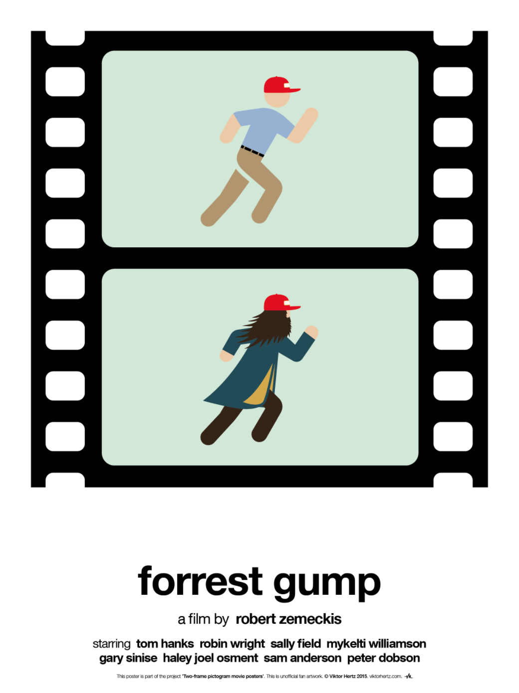
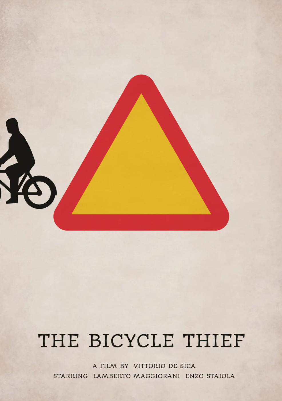
While we love the design of the poster, it seems to have left Redditors divided. One user said, "This is clever AF," whereas another user expressed his (strong) opinion that the design is "Absolutely terrible on every possible level. Bad paper texture, bad typography, pointless use of negative space, communicates nothing of the spirit or feel of the movie" – which we thought was pretty harsh. Despite the disagreements, we can safely say we are on the side of those who like the poster.
this_movie_poster_coffee_and_cigarettes from r/DesignPorn
this_movie_poster_coffee_and_cigarettes from r/DesignPorn
this_movie_poster_coffee_and_cigarettes from r/DesignPorn
We now feel compelled to go and watch the film as well. If you're feeling inspired by this design, then why not check out our guide to the best online poster maker and create your very own clever movie poster? Or perhaps you just fancied indulging in more brilliant designs, if so, you'll love our roundup of the most valuable posters of all time.
Read More:
- We now know the exact colour of Santa Claus
- We bet you can’t get 10/10 on this AI Christmas movie quiz
- 8 must-know creative trends for 2022
Get the Creative Bloq Newsletter
Daily design news, reviews, how-tos and more, as picked by the editors.

Thank you for reading 5 articles this month* Join now for unlimited access
Enjoy your first month for just £1 / $1 / €1
*Read 5 free articles per month without a subscription

Join now for unlimited access
Try first month for just £1 / $1 / €1

Amelia previously worked as Creative Bloq’s Staff Writer. After completing a degree in Popular Music and a Master’s in Song Writing, Amelia began designing posters, logos, album covers and websites for musicians. She covered a range of topics on Creative Bloq, including posters, optical illusions, logos (she's a particular fan of logo Easter eggs), gaming and illustration. In her free time, she relishes in the likes of art (especially the Pre-Raphaelites), photography and literature. Amelia prides herself on her unorthodox creative methods, her Animal Crossing island and her extensive music library.
