Coca-Cola's new packaging design is a total mess
How many colours is too many colours?
It's one of the most ubiquitous and recognisable brands on the planet, and there can't be many people who'd struggle to identify a can of Coke in a line-up of soft drinks. But The Coca-Cola Company's new packaging design almost seems designed to get lost in the crowd.
The company has revealed brand new packaging across the entire range of Coca-Cola drinks, along with a brand new flavour, Mocha (which we'll be giving a hard pass). Coke says the redesign is designed to make the flavours easier to differentiate – but judging by the reaction online, it's only making things more complicated.

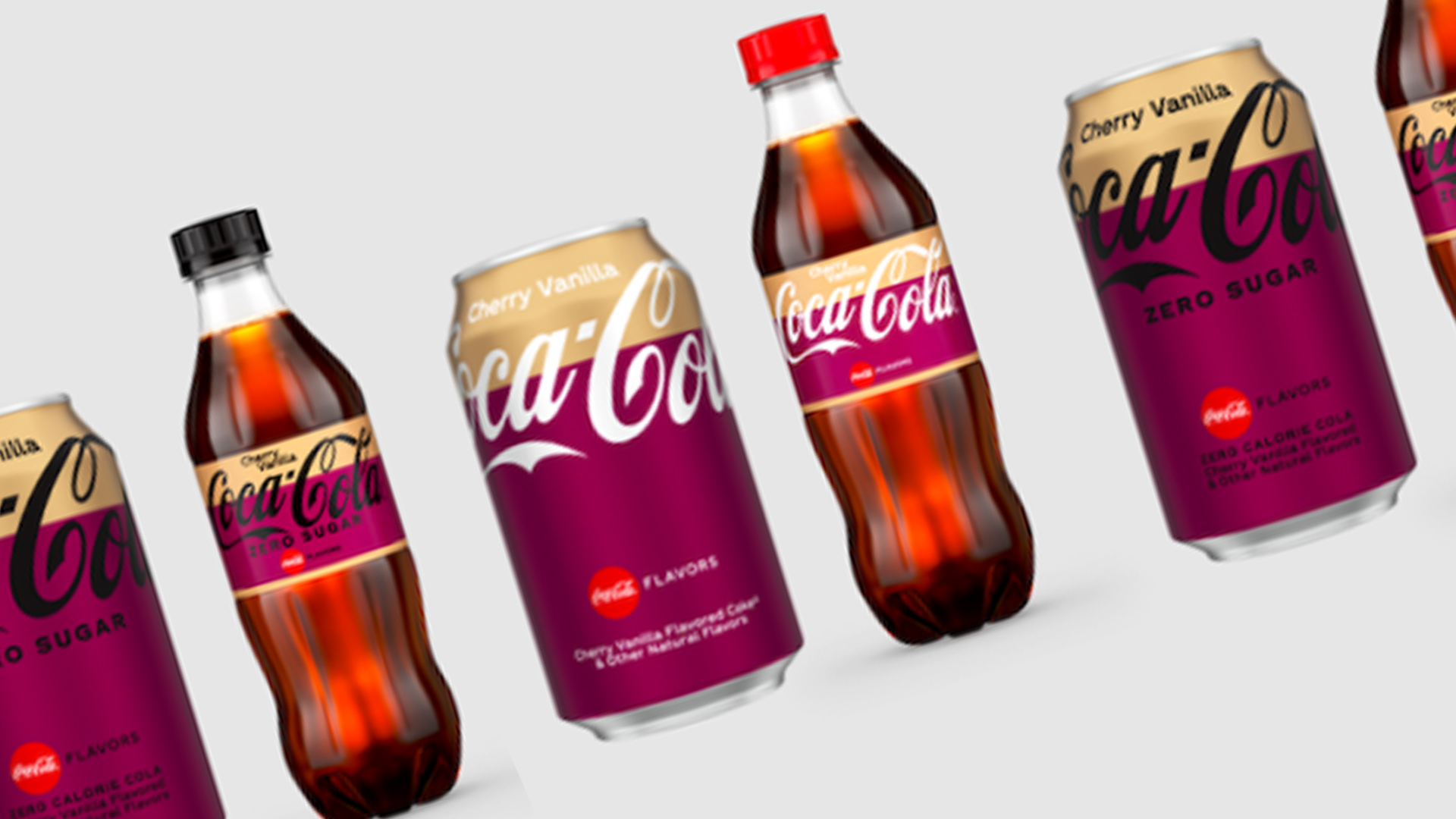
Designed to “modernise and simplify" the brand's packaging, Coca-Cola's new cans and bottles feature full colours to "designate single flavours" and stacked colours to communicate "dual flavours" such as cherry vanilla (again, hard pass). But as if throwing a bunch of colours into the mix (at the expense of that instantly recognisable red) wasn't enough, the company has also seen fit to mess with its iconic logo.
“We wanted to modernise and simplify the look of our packaging to help consumers find the flavour they’re looking for on the shelf through a colourful but clean packaging design,” said Natalia Suarez, senior brand manager of Coke Choice Portfolio, Coca‑Cola’s North America Operating Unit.

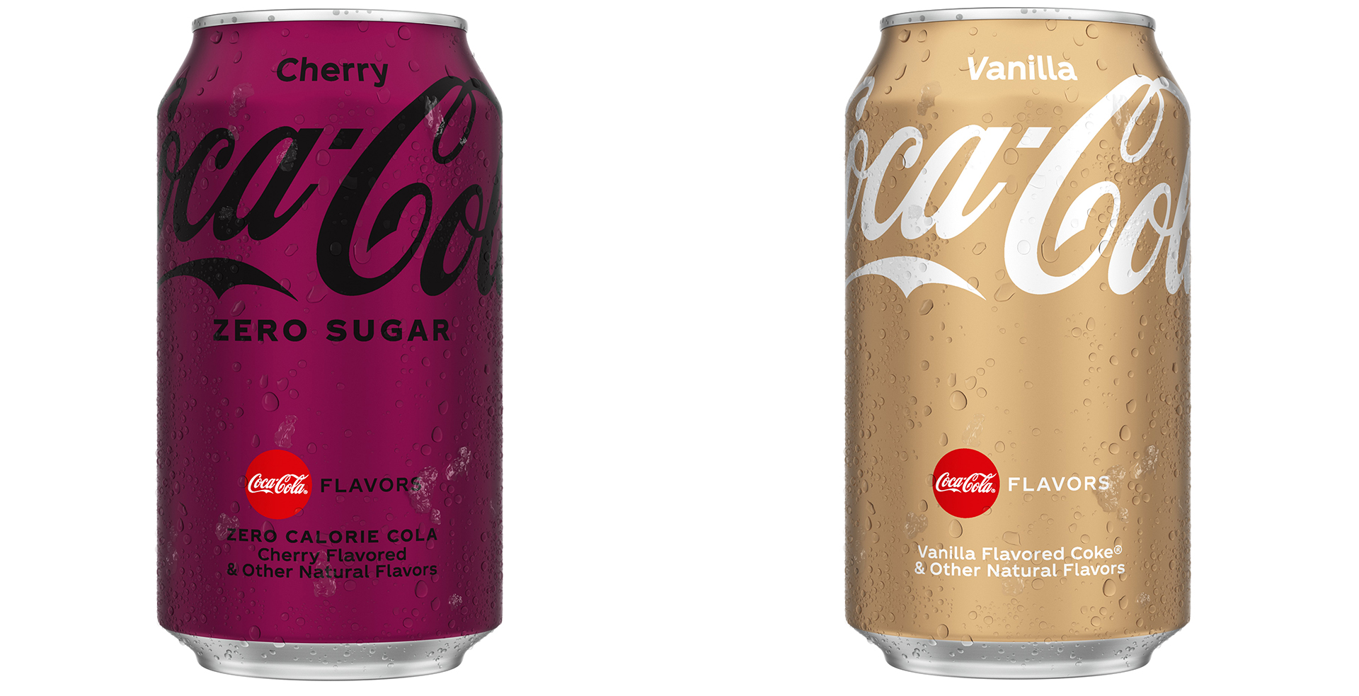
To denote either full-sugar or zero-sugar, the logo is rendered in either white or black script. That's all well and good, and indeed a pretty smart way of communicating the two variations. But as plenty of internet users have already pointed out, this blanket approach has led to some legibility issues.
Cherry Coke, for example, features a black logo on a dark purple background. And vanilla Coke is white-on-gold. It's enough to make you long for the halcyon days of simple white-on-red.
There is something that feels so so so wrong in the @cocacola logo in black over red on their new packaging language… It feels unnatural… looks dark and… bad?January 20, 2022
fantastic. you can't read this at a distance pic.twitter.com/uEUeq6FOArJanuary 19, 2022
This isn't the first time we've seen Coca-Cola update its packaging design in recent months. Just last April, it unveiled a bold and minimal new look for its core two flavours. But while this week's new designs are consistent in terms of the placement of the logo, the choice of colours is anything but minimal. Indeed, what's the use of one of the best logos of all time if you can hardly read it?
Get the Creative Bloq Newsletter
Daily design news, reviews, how-tos and more, as picked by the editors.
Read more:

Thank you for reading 5 articles this month* Join now for unlimited access
Enjoy your first month for just £1 / $1 / €1
*Read 5 free articles per month without a subscription

Join now for unlimited access
Try first month for just £1 / $1 / €1

Daniel John is Design Editor at Creative Bloq. He reports on the worlds of design, branding and lifestyle tech, and has covered several industry events including Milan Design Week, OFFF Barcelona and Adobe Max in Los Angeles. He has interviewed leaders and designers at brands including Apple, Microsoft and Adobe. Daniel's debut book of short stories and poems was published in 2018, and his comedy newsletter is a Substack Bestseller.
