Coca-Cola's logo free-for-all makes a refreshing change

Brands can very precious about their logos. The typical brand manual comes with several pages of guidelines including unlikely examples of skewed, warped and similarly distorted applications with big red crosses over them. Logo on a slant? Forbidden. Logo on a busy background? Banned under pain of death, or at least an angry email and a high-level investigation.
But how do you police that when you're a brand like Coca-Cola. You have one of the best logos of all time, but it appears in impressionistic hand-drawn signs at shops and bars all over the world. Well, in it's latest campaign, it's decided to just chill out and roll with it, and it's a winning move. As of now, 'Every Coca-Cola is Welcome' (Aww!)
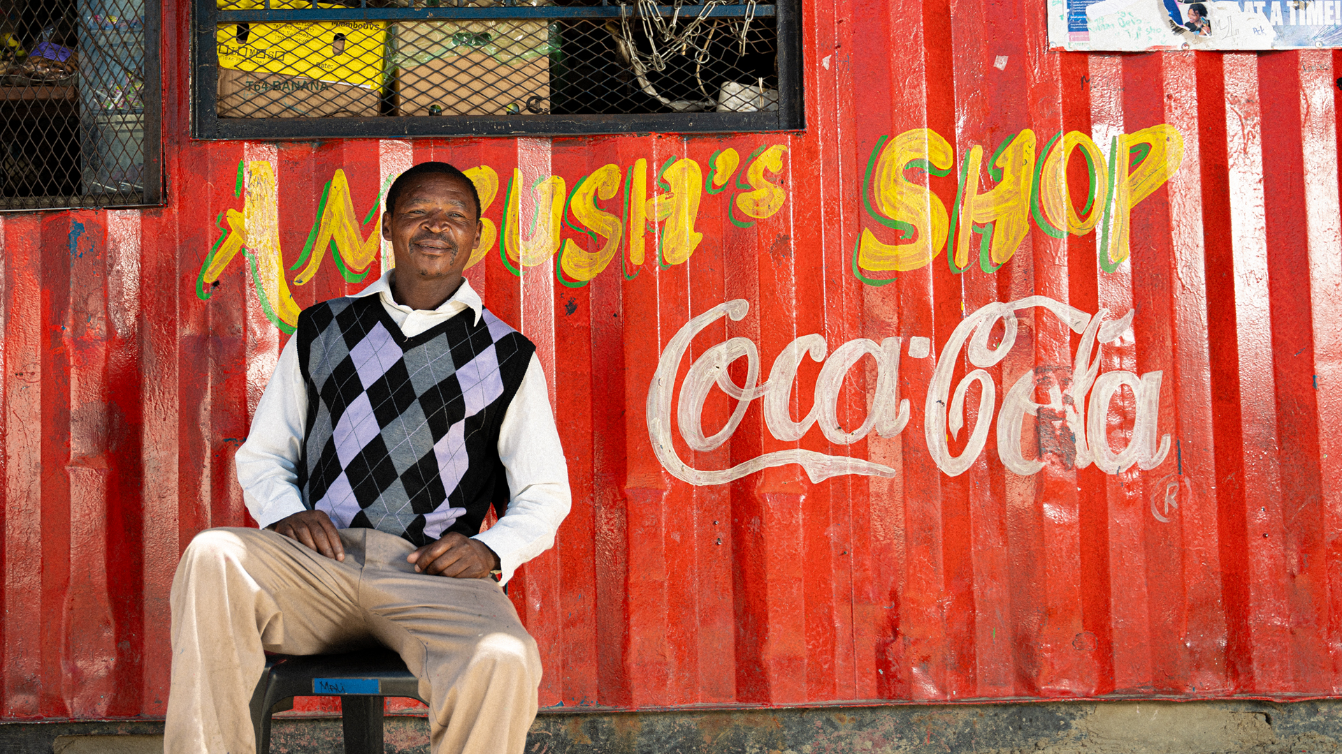
Is your Coca-Cola sign wonky, faded and peeling? Don't worry; you're welcome in the family. In a new take on brand inclusiveness, the soft drink giant's latest global campaign intends to "embrace and showcase local interpretations of its iconic logo created by bodegas, shopkeepers and local artists." "All Coke logos are the same and all coke logos are good," Andy Warhol might have said.
Article continues belowDeveloped by WPP Open X, led by VML and supported by Essence Mediacom and Ogilvy PR, the ‘Every Coca-Cola is Welcome’ campaign will showcase creative local interpretations of the Coca-Cola logo in a range of colour palettes, fonts and designs through prominent OOH and print placements in five markets: Brazil, Mexico, Indonesia, Australia, and the United States, including in the marquee placement in New York's Times Square. Unofficial Coca-Cola logos will also be used as the brand's Instagram profile image, and its YouTube channel will run films and interviews with store owners.
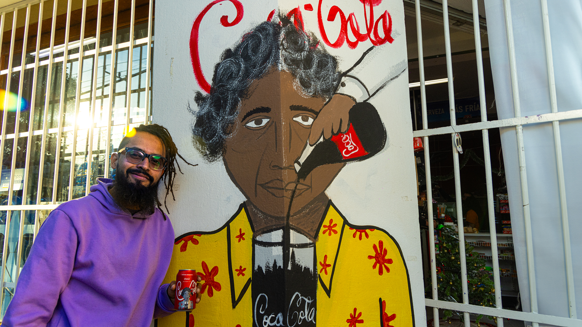
While the Coca-Cola logo history reveals several tweaks in the brand's more than 130 years of history, the Spencerian script design has changed relatively little since 1887. However, the brand points out that "for years, local artists' versions of the Coca-Cola logo have been found across countries.". It says that "designed by the individuals running the stores, the Coca-Cola logo has been re-imagined as signs, paintings, and murals."
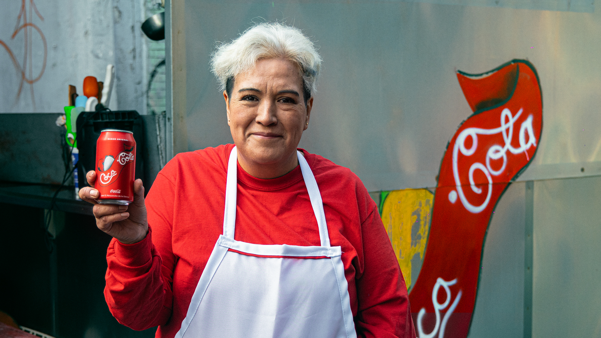
For a brand like Coca-Cola, embracing these unofficial logos makes good sense. The rationale for the strict rules in brand guidelines is usually that incorrect usage can dilute a brand identity. But, at least in a case like Coca-Cola, the opposite can be true. That fact that there are so many interpretations of the Coca-Cola logos drawn on walls and signs around the world, and the fact that they're all instantly recognisable, shows just how ubiquitous and powerful its branding is.
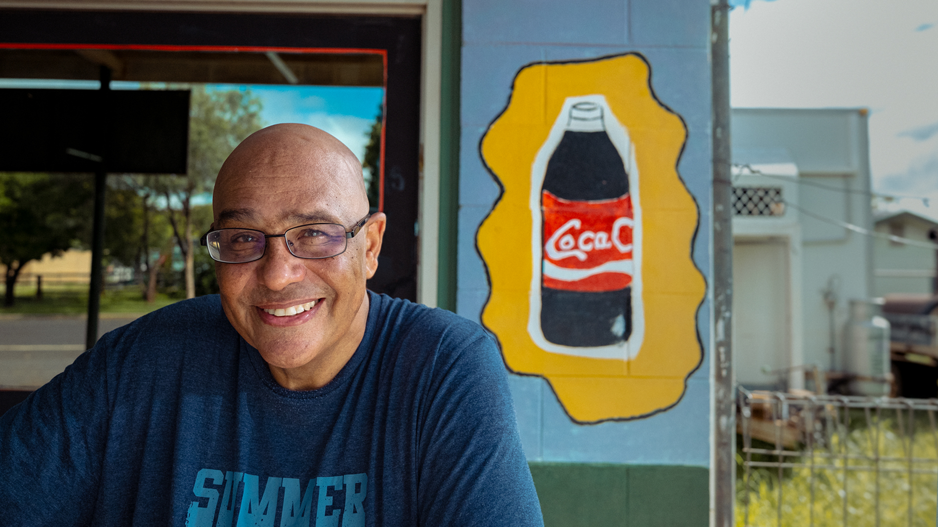
Coca-Cola's global vice president creative strategy & content Islam ElDessouky said: “It’s been incredible to see the unique and individual interpretations of the Coca-Cola logo. These visuals are so meaningful and impactful. Signs for local businesses capturing colours of cultures and personalities of communities. We’re proud to celebrate and embrace their work.”
Sign up to Creative Bloq's daily newsletter, which brings you the latest news and inspiration from the worlds of art, design and technology.
Rafael Pitanguy, deputy global chief creative officer at VML added: “What is so special about this campaign is that the Coca-Cola brand is being reinterpreted in every corner of the world through countless creative expressions. And these reinterpretations are only possible because the Coca-Cola logo is so ingrained in culture across the globe.”
For more examples of the strength of Coca-Cola's branding see the Coca-Cola optical illusion and how Pepsi recently tried to troll the brand.

Joe is a regular freelance journalist and editor at Creative Bloq. He writes news, features and buying guides and keeps track of the best equipment and software for creatives, from video editing programs to monitors and accessories. A veteran news writer and photographer, he now works as a project manager at the London and Buenos Aires-based design, production and branding agency Hermana Creatives. There he manages a team of designers, photographers and video editors who specialise in producing visual content and design assets for the hospitality sector. He also dances Argentine tango.
