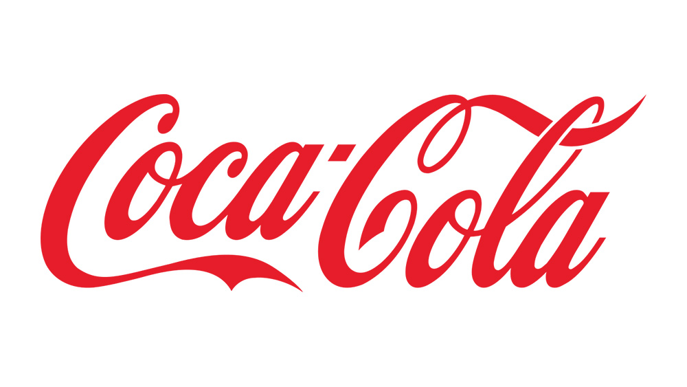
The Coca-Cola logo doesn't need much introduction. The Coca-Cola Company and its flagship fizzy beverage possess one of the best-known brand identities in the world, with its red and white colours and script font covering signage and shop shelves almost everywhere.
And what's especially remarkable about the Coca-Cola logo is its staying power. Over 130 years of history, the Coca-Cola logo really hasn't changed much at all. It was originally very much a logo of its time – look at logos from the period and you'll find plenty of flowing script designs – including the first Pepsi logo just a few years later.
But while many other enduring brands have have opted to simplify and modernise their logo designs, the Coca-Cola logo has bucked the trend. Look at the Coca-Cola logo from 1887, and although the red colour hadn't yet been introduced and Spencerian script isn't quite the same, it's as recognisable as Coca-Cola logo of today. There have been a few tweaks and temporary changes along the way, however.
Here are all the major changes that were made in the history of the Coca-Cola logo – at least those that we've found records of. For tips on making such a durable design youself, see our guide to how to design a logo.
Coca-Cola logo history: 1886
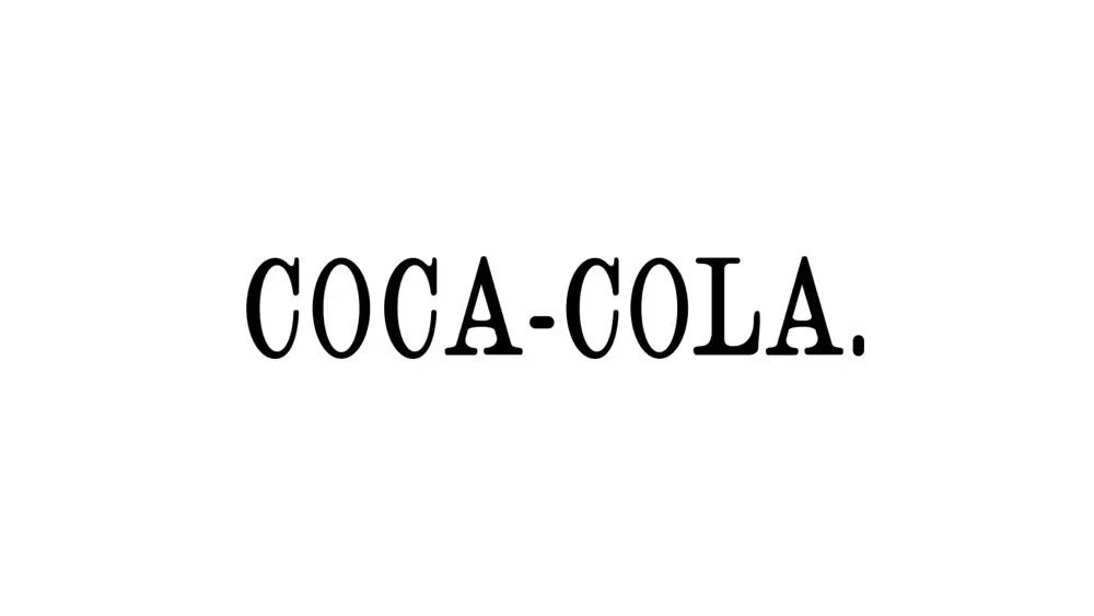
Invented in 1886 by John Pemberton, Coca-Cola began life as Pemberton's French Wine Coca. However, in response to prohibition laws, a non-alcoholic version developed and a new name was created by Pemberton's partner Frank Mason Robinson.
Robinson had the prescience to see that two C's would stand out in advertising, and so Coca-Cola was born. Early ads show the name written in a simple serif font. With a full stop.
Coca-Cola logo history: 1887
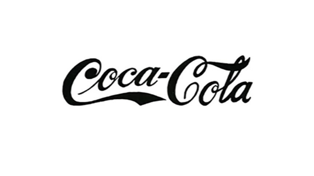
It was also Robinson who came up with the idea of creating a logo based on Spencerian script, a flowing writing style that was widely used in the US for formal correspondence before the adoption of the typewriter – right up until the early 1920s. He wanted a dramatic style, and his proposal was adopted by unanimous consent.
Get the Creative Bloq Newsletter
Daily design news, reviews, how-tos and more, as picked by the editors.
The Coca-Cola script was tweaked fairly regularly in those early years, and advertising materials show plenty of variations, but this initial version isn't so different from the Coca-Cola logo we know today, with the swash leading into the first 'o' the most obvious difference at first glance.
Coca-Cola logo history: 1889 and 1890
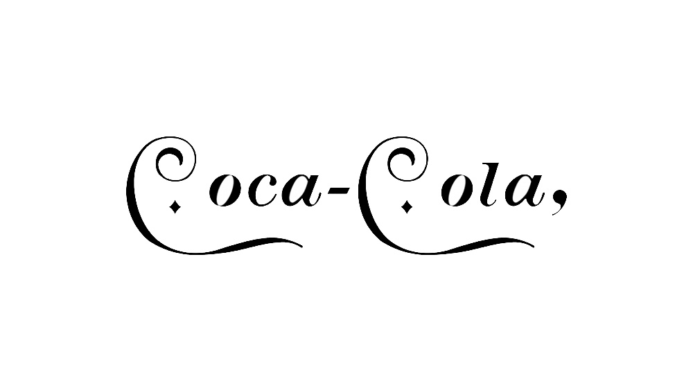
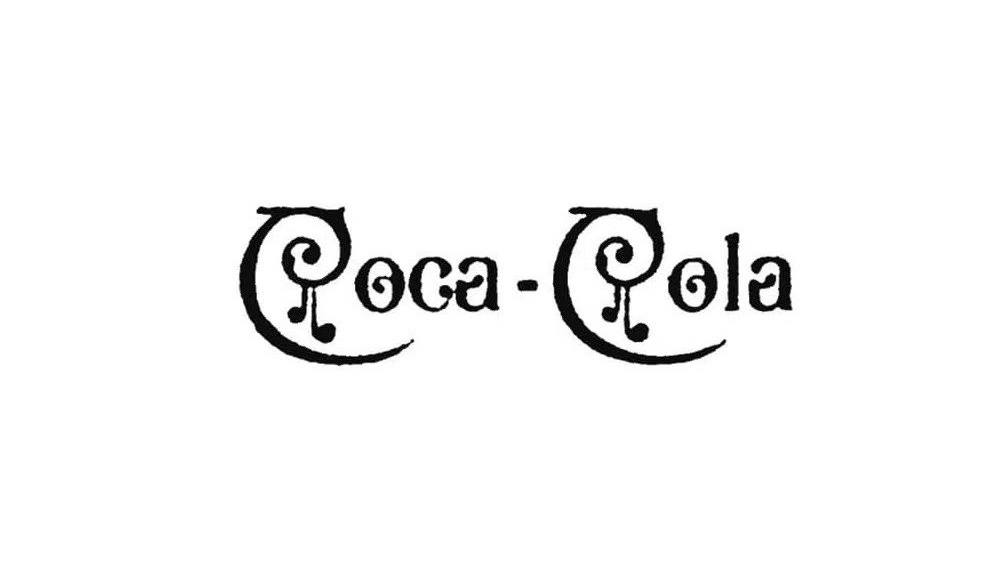
Even this early on, Coca-Cola liked to mix things up now and again with eye-catching changes. In 1889, it experimented with separated letters, diamonds and elongated tails that drew even more attention to the two Cs. And in 1890, it rode the Art Nouveau wave with the most radically different Coca-Cola logo that we've seen to this day, with elegant swirls and what looks almost like musical notation. But it seems that this design was used only once, on the company's first calendar.
Coca-Cola logo history: 1891
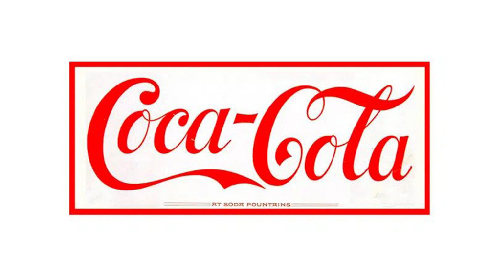
Coca-Cola's colour palette is as famous as the form of the logo itself, and it wouldn't take long for red to be introduced. Already in 1891, there are examples of the Spencerian script logo in red on a white background. The script still isn't quite the one we know today – the letters are taller and straighter, but it's already instantly recognisable.
Coca-Cola logo history: 1893
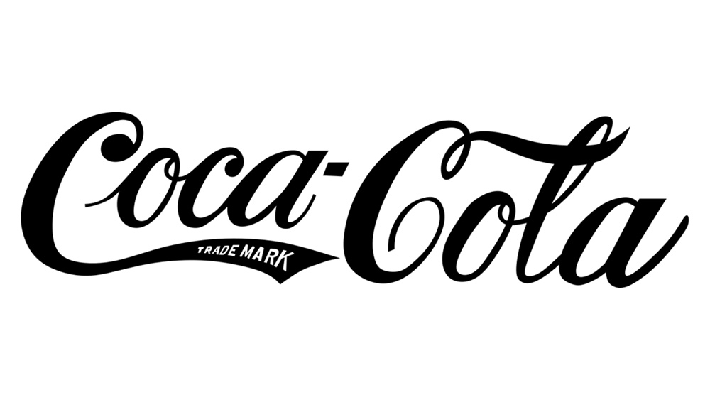
In the 1890s, the words 'trade mark' were added to the tail of the 'C' in Coca after the logo was trademarked with the US Patent Office. Notice that the script is closer to its original form – and the Coca-Cola logo that we know today.
Coca-Cola logo history: 1941 onwards
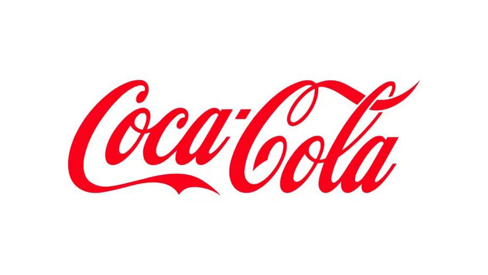
In 1941, Coca-Cola settled on what would become the definitive form of its script logo. That leading swash was removed from the 'o' in 'Coca', the letters took more of a diagonal slant and generally a more balance was achieved by honing the size and weight of each letter – dropping that oversized teardrop terminal on the initial 'C', example.
The trademark information was also taken out of the logo itself. It would instead be written underneath in the logo's various applications, and would eventually take the form of an R at the end of the logo.
Coca-Cola logo history: 1958
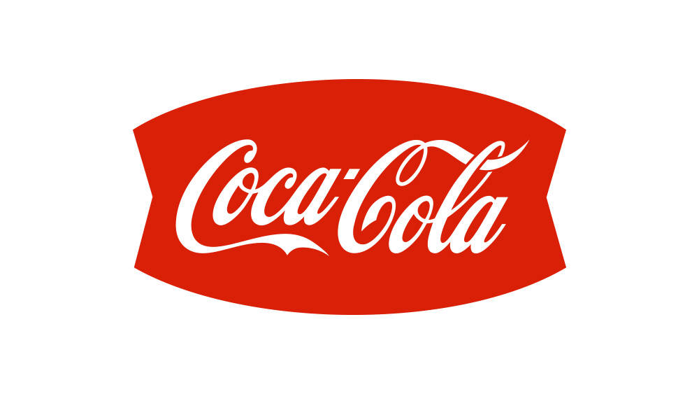
Coca-Cola soon began experimenting with different backgrounds and applications for its logo. In the 1940s, the Coca-Cola logo was often used on a red disc or button in advertising, including in outdoor signage. In the late 50s, a fishy arciform shape was used for advertising, signage and vending machines.
Coca-Cola logo history: 1969
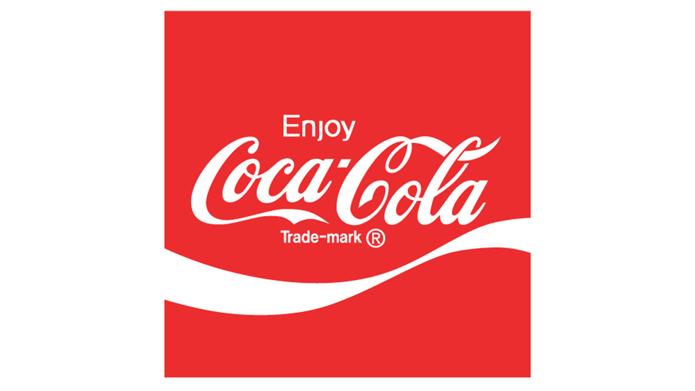
The next evolution of the Coca-Cola logo was the introduction of the white wave, technically referred to as a 'Dynamic Ribbon Device’. Still used today, the wave was introduced in what became known as the classic Arden Square after the cosmetics entrepreneur Elizabeth Arden. The square also added the word 'Enjoy', replacing the previous 'Drink' that had been used in ads. One simple word that became a recognisable part of the Coca-Cola brand for years.
Coca-Cola logo history: the 1987 refresh

That 'dynamic ribbon device' became more dynamic than was perhaps originally intended, being the source of many of most notable changes in applications of the Coca-Cola logo since its introduction. In 1987, the wave was made to flow right through the Coca-Cola script, and a grey shadow was added to give an impression of depth.
Coca-Cola logo history: 2003
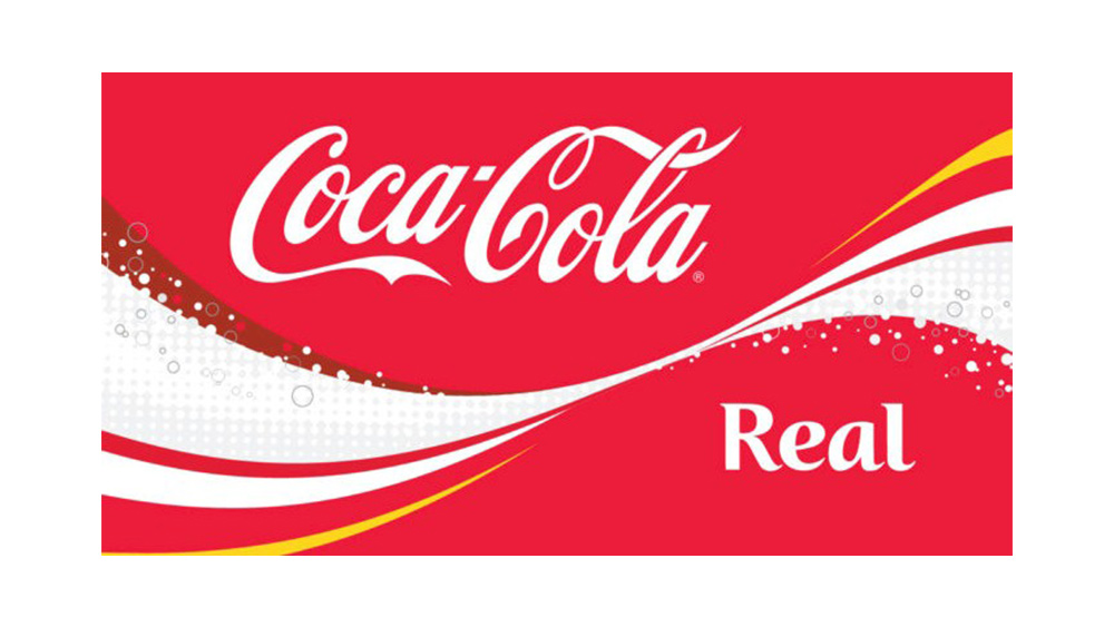
The wave became even more prominent in with the launch of the "Coca-Cola... Real" campaign in 2023. This time the ribbon went for a positively maximalist look, adding more lines, dark red, a shock of yellow and some bubbles.
Coca-Cola logo history: the Coca-Cola hug logo
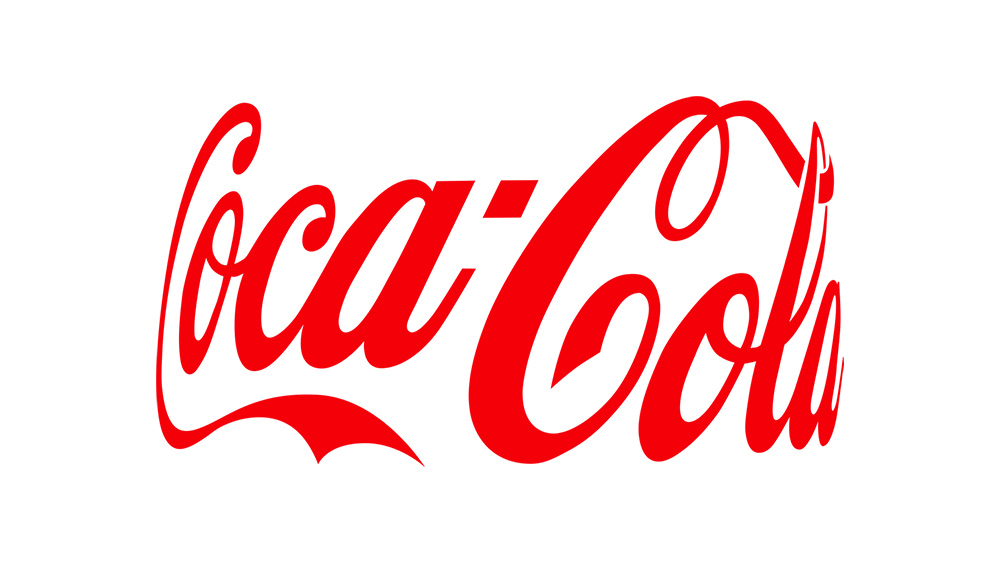
Another novel variation of the Coca-Cola logo was launched in 2021 for the 'Real Magic', campaign. Inspired by how to Coca-Cola logo appears on bottles, and on the shape of people hugging, the Coca-Cola hug was intended to embrace genuine "moments of magic" across Coca-Cola’s communications. Aww.
The Coca-Cola logo today
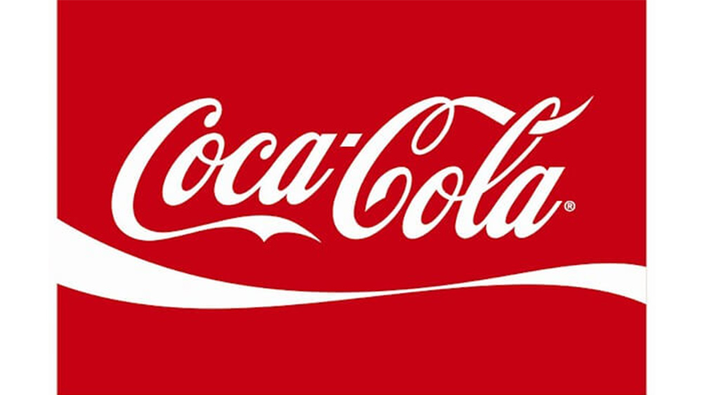
The Coca-Cola logo used today doesn't so different from the logo introduced all the way back in 1887. The script, which saw regular tweaks in the early days has now been the same for decades, and the white wave introduced in 1969 has also endured – again with its form changing slightly. After experiments with colour, it's now a more simple single white ribbon.
The Coca-Cola logo is an incredible example of how a logo can endure against changes in fashion and requirements over the years. There are many much young brands that have changed their logos more radically in a much shorter space of time. For examples of the logo evolutions of today's tech giants, see our features on the YouTube logo history and the Google logo history.
Read more:

Thank you for reading 5 articles this month* Join now for unlimited access
Enjoy your first month for just £1 / $1 / €1
*Read 5 free articles per month without a subscription

Join now for unlimited access
Try first month for just £1 / $1 / €1

Joe is a regular freelance journalist and editor at Creative Bloq. He writes news, features and buying guides and keeps track of the best equipment and software for creatives, from video editing programs to monitors and accessories. A veteran news writer and photographer, he now works as a project manager at the London and Buenos Aires-based design, production and branding agency Hermana Creatives. There he manages a team of designers, photographers and video editors who specialise in producing visual content and design assets for the hospitality sector. He also dances Argentine tango.
