Why Coca-Cola's bold new logo campaign was both uncomfortable and rewarding for the brand
"Loose, twisted, audacious, unofficial."

The Coca-Cola logo is one of the most recognisable designs in the world, but it certainly isn't one of the simplest. While many of the best logos are clean, minimal affairs, the Coca-Cola wordmark is a flowing, cursive delight. Which means it isn't the easiest design to replicate.
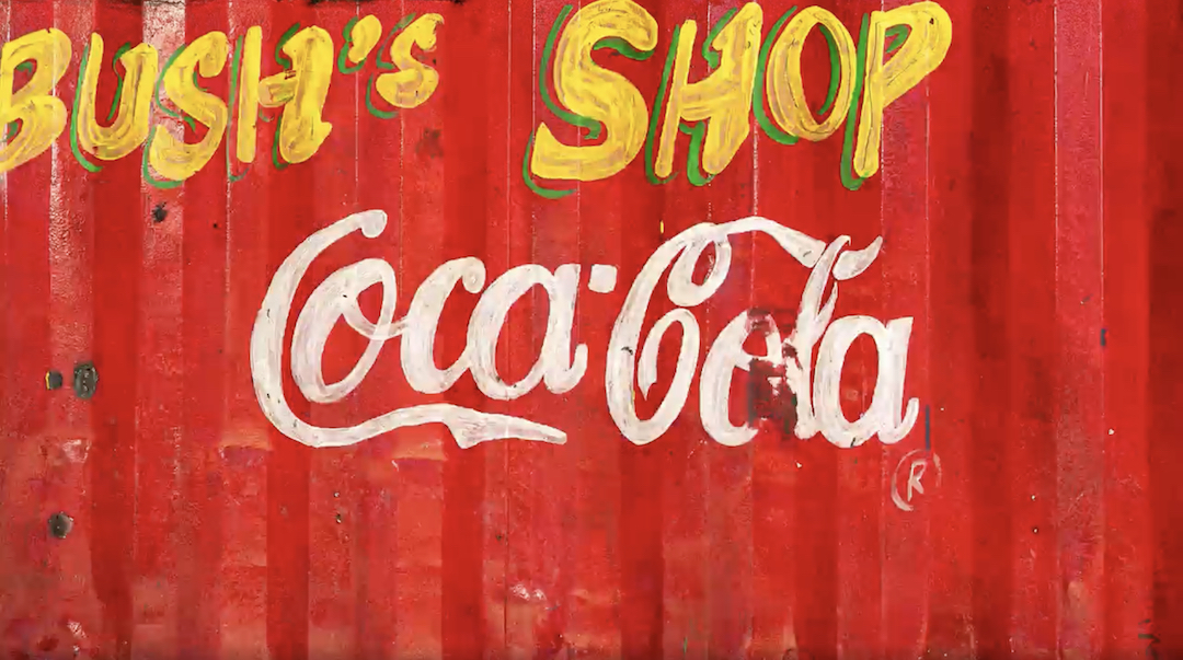
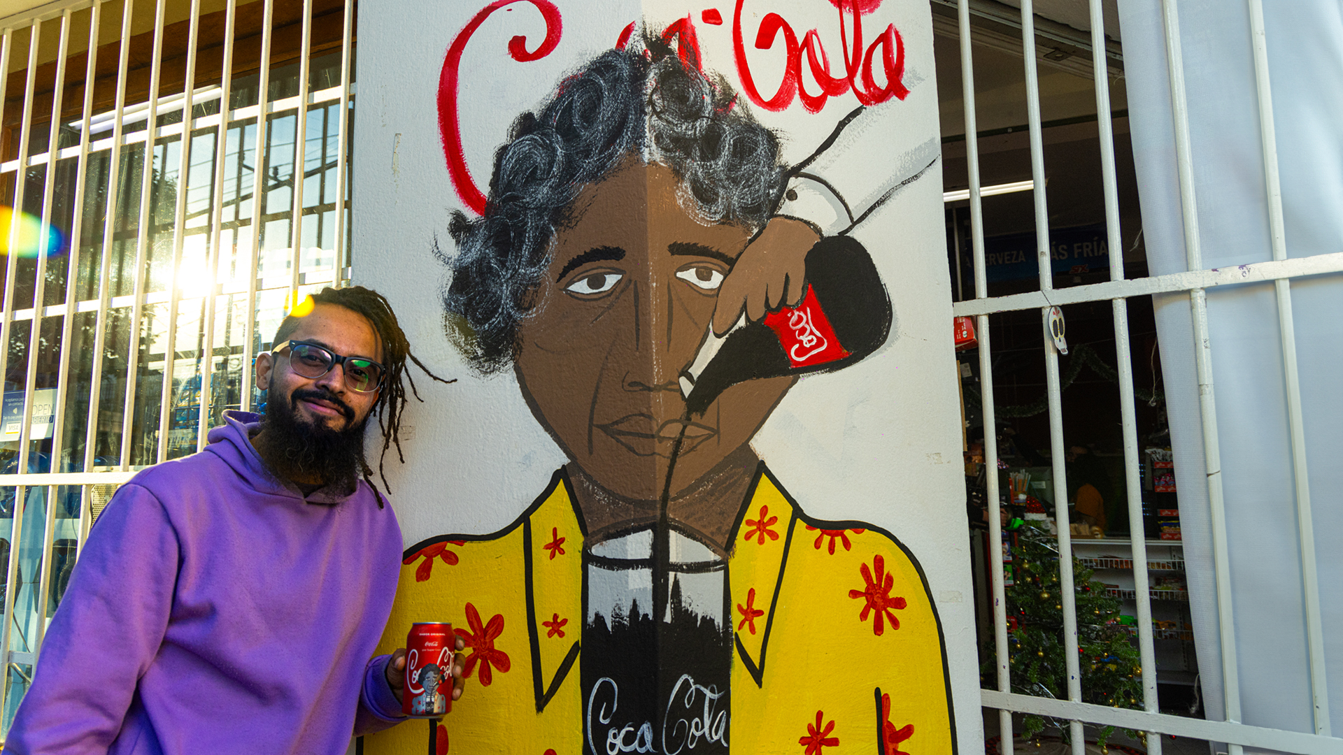
In a wholesome new campaign, Coca-Cola is embracing the imperfection of recreated Coca-Cola logos from across the world – and it's even slapping some of the dupes on the cans themselves. (If you're looking for more design inspiration, check out the best cursive fonts.)

Created with ad agency VML, the "Every Coca-Cola is welcome" campaign has seen the brand adopt impressionistic hand-drawn signs at shops and bars all over the world as its own.
In an interview with Little Black Book, Coca-Cola's global vice president Islam ElDessouky, a self-proclaimed "‘hardcore guideline person", explained how the campaign was both occasionally uncomfortable and ultimately rewarding. "There are two values that are super solid in the brand foundation," he told the publication. "One is inclusion - I think Coca-Cola prides itself on being for everyone... the second value is authenticity."

But the campaign doesn't mark a total throwing out of the rulebook. "To be very honest, brands are built on standards, guidelines and consistency.... So yes, we’re very positive and feeling super human and embracing all of those versions that are out there. But at the same time it doesn’t mean that we’re saying ‘bye guidelines, bye consistency, just do as you please, guys’. No, that’s not the case at all. We’ve still got to push for our guidelines, we’ve still got to push for our red colour, for our spencerian, because that’s what defines us. But, at the same time, from a human perspective, we just wanted to embrace those mom-and-pops out there.”
But perhaps the most notable thing is that, while certainly amateur in appearance, these handmade Coca-Cola logos are instantly recognisable. Because as history has proven, even the most iconic logos can be difficult to draw from memory.
Get the Creative Bloq Newsletter
Daily design news, reviews, how-tos and more, as picked by the editors.

Thank you for reading 5 articles this month* Join now for unlimited access
Enjoy your first month for just £1 / $1 / €1
*Read 5 free articles per month without a subscription

Join now for unlimited access
Try first month for just £1 / $1 / €1

Daniel John is Design Editor at Creative Bloq. He reports on the worlds of design, branding and lifestyle tech, and has covered several industry events including Milan Design Week, OFFF Barcelona and Adobe Max in Los Angeles. He has interviewed leaders and designers at brands including Apple, Microsoft and Adobe. Daniel's debut book of short stories and poems was published in 2018, and his comedy newsletter is a Substack Bestseller.
