Coca-Cola celebrates heritage with bespoke typeface
The famous soft-drink's new typeface follows the likes of YouTube and IBM.

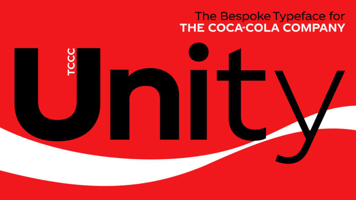
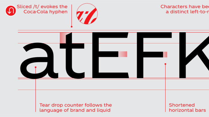
Coca-Cola has unveiled a new bespoke typeface for the first time in its corporate history. The geometric design is built for both physical and digital platforms, and contains a nod to Coca-Cola's design heritage – namely its famous cursive font logo.
Revealed on 5 January by Coca-Cola's vice president of global design, James Sommerville, the new font is known as TCCC Unity, which takes its initials from The Coca-Cola Company.
A photo posted by @jamessommerville on Jan 6, 2018 at 8:44am PST
Eagle-eyed font fans may have noticed that Coca-Cola registered TCCC Unity as a trademark in July 2017. The bespoke font is the latest in a wave of big companies tailoring their own typography, with Coca-Cola following the likes of IBM and YouTube.
Over on his Instagram account, Sommerville said TCCC Unity has a: "Geometric flair and circularity drawn from the archive form the basis of the Latin script", while "a large x height ensures it works in physical and digital environments."

TCCC Unity was designed by the renowned and innovative typographic design agency Brody Associates, the digital type specialists behind the latest Channel 4 rebrand.
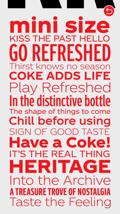
Speaking at the Museum of Design Atlanta, Sommerville added that TCCC Unity "encapsulates elements from Coca-Cola’s past and its American Modernist heritage." Meanwhile on his Instagram page, Sommerville shared different versions of the new font, including bold weights and italicised alternatives.

Accompanying the launch of TCCC Unity is a new app which explains the ethos behind the bespoke typeface. Available on the App Store for iOS devices, the free TCCC Unity app is a place where users can hear from the font's creators about how they designed the typeface.
Get the Creative Bloq Newsletter
Daily design news, reviews, how-tos and more, as picked by the editors.
The TCCC Unity app promises to be a treasure trove of typographic design content thanks to its selection of archival material and interviews with the team at Brody Associates, as well as a look at all the styles, weights and specimens included in the new font.
Related articles:

Thank you for reading 5 articles this month* Join now for unlimited access
Enjoy your first month for just £1 / $1 / €1
*Read 5 free articles per month without a subscription

Join now for unlimited access
Try first month for just £1 / $1 / €1

Dom Carter is a freelance writer who specialises in art and design. Formerly a staff writer for Creative Bloq, his work has also appeared on Creative Boom and in the pages of ImagineFX, Computer Arts, 3D World, and .net. He has been a D&AD New Blood judge, and has a particular interest in picture books.
