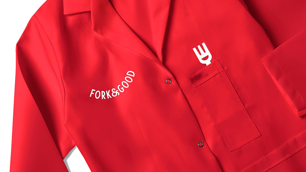
Lab-grown meat has some stigmas to overcome if it's to cross into the mainstream. It might be more ethical – maybe – but it's expensive, and the sci-fi-ness of the whole concept puts a lot of people off. Mother Design took on the tall task of trying to break through that squeamishness and make cultured meat more palatable.
The branding studio was tasked with creating the new logo and branding for the cultivated meat startup Fork & Good, and it's come up trumps with a bold but approachable identity that draws on tradition. Take a butcher's at this (and see our pick of the best branding books if you're looking for inspiration)
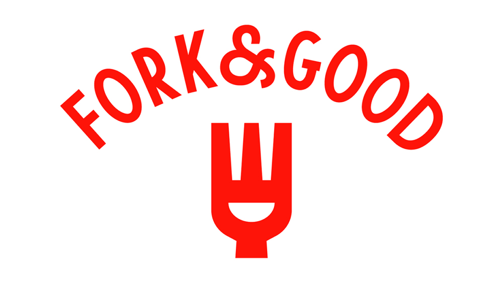
Mother Design's branding for Fork & Good includes a smiley fork. The smile cleverly also depicts a bowl, and the curved shape is echoed in the wordmark, which draws on butcher's shop signage creating a painterly feel despite the clean lines (the typeface is a modification of Yeah Right Type's School No. 9, which was inspired by building signage).
The colour palette, meanwhile, is a classic meaty red and white combo, with a handful of secondary hues inspired by foods. Mother also convinced the brand to ditch the false surname it had going on in its brand name (it was previously Fork & Goode), making the name simpler and more memorable.
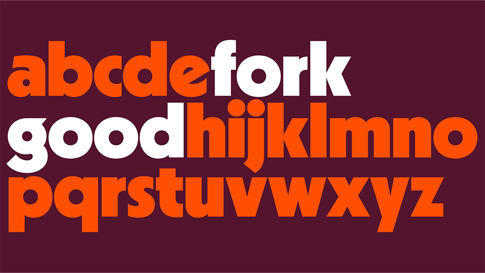
It can be hard to set the right tone for a brand in a whole new industry, especially one that might make some people feel a little queasy. Mother's sought to overcome by seeking that feels familiar and friendly; unique but completely at home with the traditional food industry.
The curves in the chosen typeface nicely match the smiley fork/bowl logo for a coherent personality that feels warm, inviting, optimistic and perhaps most importantly, trustworthy.
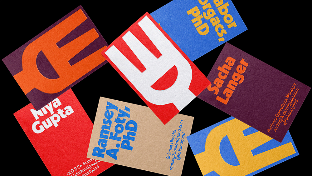
Fork & Good was founded by scientist Gabor Forgacs and farmer Niya Gupta in 2011 and produces tacos, dumplings and meatballs from cultivated ground pork made using a patented hydroponic system. The new branding will appear in packaging, uniforms and digital use.
Get the Creative Bloq Newsletter
Daily design news, reviews, how-tos and more, as picked by the editors.
For more cleaver-sharp branding and advertising, see the brave Ikea adverts that break the rulebook and how a design agency fixed the Warner Bros logo. Meanwhile, the new LeShuttle logo has certainly got people talking.

Thank you for reading 5 articles this month* Join now for unlimited access
Enjoy your first month for just £1 / $1 / €1
*Read 5 free articles per month without a subscription

Join now for unlimited access
Try first month for just £1 / $1 / €1

Joe is a regular freelance journalist and editor at Creative Bloq. He writes news, features and buying guides and keeps track of the best equipment and software for creatives, from video editing programs to monitors and accessories. A veteran news writer and photographer, he now works as a project manager at the London and Buenos Aires-based design, production and branding agency Hermana Creatives. There he manages a team of designers, photographers and video editors who specialise in producing visual content and design assets for the hospitality sector. He also dances Argentine tango.
