Is this band logo as ingenious as Reddit seems to think?
A successful logo design can sometimes hinge on a stroke of ingenuity followed by the discipline to see through dozens and dozens of iterations to get the right execution. A California band's logo is picking up a lot of acclaim on Reddit for acing at least part of that equation with a clever visual pun.
Band logos come in many forms, but it's always fund to see a logo design that plays a visual game or communicates something more than what might initially appear to the eye. And that's the case of this logo for The Makepeace Brothers, a Californian country pop quartet that exudes positive vibes (if you're looking to design a logo for your own band, don't miss our guide to how to design a logo).

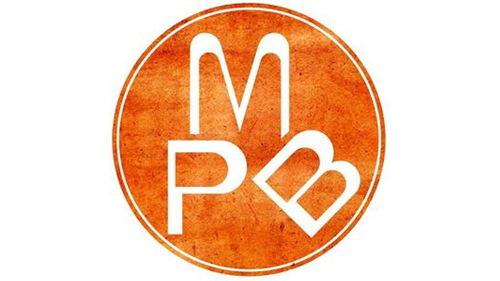
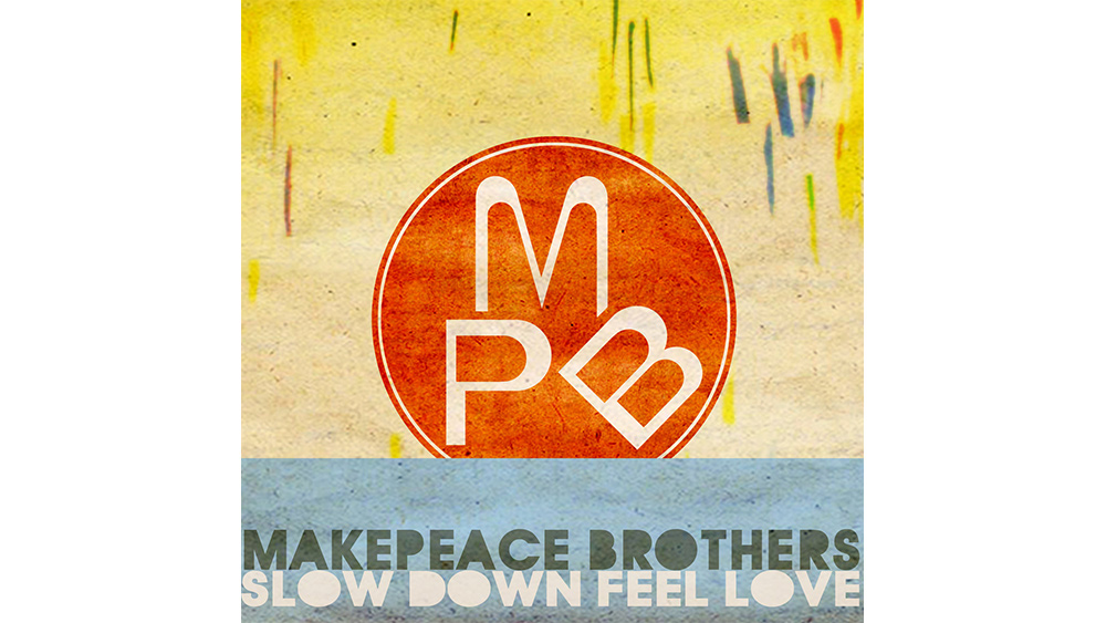
We've been listening to The Makepeace Brothers' syrupy harmonies all morning after this logo design was posted to Reddit's r/DesignPorn channel to much acclaim. The four-piece band it represents has apparently been described “The Everly Brothers squared”, and they have a mission to spread "a sincere message" promoting peace. That extends to their logo, which ingeniously arranges the band's initials MPB to resemble a hand making a 'peace' gesture – Churchill's 'V for victory'.
Reddit's loving the logo design, giving it thousands of likes and over 90% upvotes. "I always thought it was so clever," the original poster u/pertnear wrote. A lot of people agree, but some are questioning the execution, if not the concept, and we can see their point. It takes a moment to "get" the logo, and we sometimes have to remember that a logo isn't meant to be a puzzle or an optical illusion to be solved.

There's something about the arrangement, and particularly the angle of the B that makes us unsure at first whether it's supposed to be a letter or not. Some people seem to see the initials but not the hand and others the hand not the 'B' of the initials. It's also possible to interpret the fingers as ears. It could perhaps be easier to interpret at a smaller size, and on a solid background.
"The difference in line thickness, the colors, the circle, the white border are all really irritating elements," wrote one unconvinced Redditor. "They had an idea that could've been interesting but haven't figured out how to isolate what works from what doesn't." "I read it as 'make peanut butter'," another person added, swayed by the colour of the background. "If it were on a 50mm sticker somewhere 'in the wild', I think it would register much sooner," one contributor suggested.
We don't think this one will be making it to our list of the best logos of all time, but we can't deny that the concept is very clever, and it does communicate the band's message. And it's a much better job than the new NFL logo for National Hispanic Heritage Month.
Daily design news, reviews, how-tos and more, as picked by the editors.
Read more:

Joe is a regular freelance journalist and editor at Creative Bloq. He writes news, features and buying guides and keeps track of the best equipment and software for creatives, from video editing programs to monitors and accessories. A veteran news writer and photographer, he now works as a project manager at the London and Buenos Aires-based design, production and branding agency Hermana Creatives. There he manages a team of designers, photographers and video editors who specialise in producing visual content and design assets for the hospitality sector. He also dances Argentine tango.
