The 2020 calendar everyone will want on their wall
How do you visualise the year?

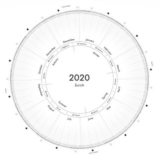
How do you visualise the year in your mind's eye? For some it might stretch ahead in a straight line, for others it's a straightforward calendar grid. But for those who see it as a circle, a serious 'wow' moment is coming your way. A circular calendar design has been shared on Reddit, and it's a revelation.
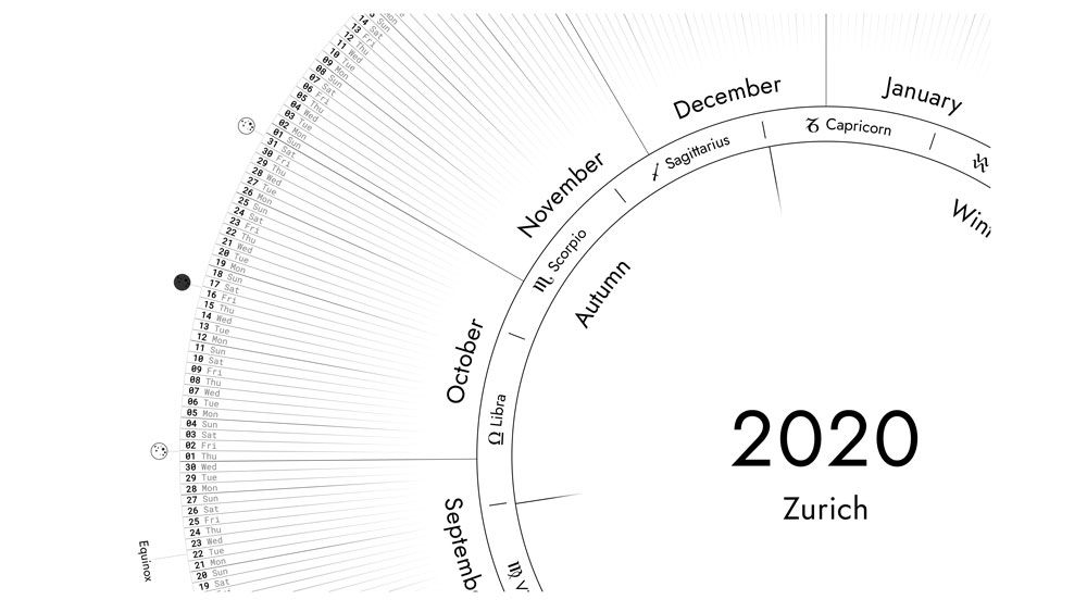
The calendar works in a similar way to a clock, with January situated at the top of the circle (where the 12 would be on a conventional clock), and other months following the circle clockwise incrementally. Much like a clock, the longest unit of time is towards the centre of the circle, with the smallest out at the edge, so the year is at the middle, followed by the seasons, the signs of the zodiac, the months and finally the day and date (the moon cycles are also found around the edge).
We're so taken by this calendar that we're already busy replacing our current, more traditional design. But if it doesn't float your boat, don't miss our best calendar 2021 round up for options to suit all tastes.
I designed a circular annual calendar from r/Design
The way we view the year and how vividly our brains visualise the way the months are laid out can vary wildly from person to person. Even the creator, alexbonair, has a totally different concept of the direction the months should run in, "mine goes counterclockwise as well, but as most people prefer clockwise."
If you disagree with alexbonair on direction (we do not), you can always adjust it, as he suggests: "I wrote a VanillaJS script that draws the calendar, based on some input param[e]ters. Year, language, direction and much more is easy changeable."

Just how differently we all see the year is abundantly clear from reading the Reddit comments, which contain a lot of enthusiasm and some wildly different opinions. Livingchair, for example, sees the year as an oval, "Haha it's always fun to see how people imagine the concept of year in their heads. My year is oval shaped, but it goes counterclockwise and summer is on the top-side."
However the year might appear in your head, this design concept is a winner. It's clean and functional (and actually presents what has been inside our heads all this time). It's a game-changer, just like this cascading ruler shared on Reddit not long ago. You can't ask for more than that. Except for spaces to write down important dates, but maybe we just need a more traditional calendar to go alongside it.
Get the Creative Bloq Newsletter
Daily design news, reviews, how-tos and more, as picked by the editors.
Read more:

Thank you for reading 5 articles this month* Join now for unlimited access
Enjoy your first month for just £1 / $1 / €1
*Read 5 free articles per month without a subscription

Join now for unlimited access
Try first month for just £1 / $1 / €1
Georgia is lucky enough to be Creative Bloq's Editor. She has been working for Creative Bloq since 2018, starting out as a freelancer writing about all things branding, design, art, tech and creativity – as well as sniffing out genuinely good deals on creative technology. Since becoming Editor, she has been managing the site and its long term strategy, helping to shape the diverse content streams CB is known for and leading the team in their own creativity.
