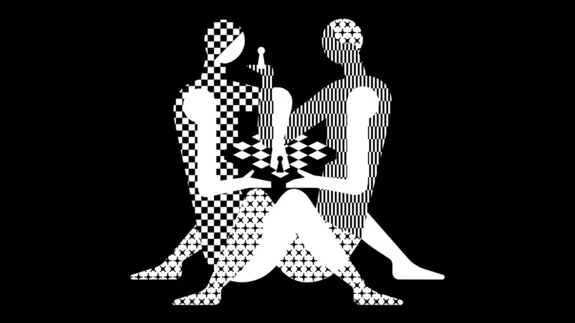
Back in 2018 the World Chess Championship caused a stir and set the internet aflame with its stylised logo inspired by the Kama Sutra. You read that right, professional chess got sexy. But the initial complaints overlooked one huge error, can you spot it?
To recap, the World Chess Championship rebrand was for the 2018 competition being held in London and was created by studio, Shuka Design. We've had some terrible logo redesigns recently, including the new Kia logo that commits the ultimate design crime, but is this raunchy chess logo worse? Clearly, no one is reading our 20 top tips for great logo design.
Back in 2018 there was genuine outrage for WCC's new sexy logo, The Times called it 'pawnographic' and many took to social media to vent anger and poke fun at the WCC logo's new direction. Some remarked it's a literal image of people 'check-mating'. Below are just some of the remarks from 2018.
Wow. This was the World Chess Championship logo? What the actual fork. pic.twitter.com/WLCe6Ey6l4December 4, 2018
See more
Uh... this 2018 World Chess Championship logo doesn't quite evoke chess so much as ... the ... uh ... kama sutra? pic.twitter.com/OLXsYOeYhuOctober 20, 2018
See more
At the time the head of World, ChessIlya Merenzon, backtracked a little and told Chess.comthis logo rebrand was actually one of many and not meant to be taken too seriously. It was a stunt. This came at a time when chess generally was trying to find a new younger image – two years later The Queen's Gambit broke records on Netflix.
Behind the sexualised look of the logo many chess fans were just as offended, and indeed more so, but one glaring error. Have you spotted it yet? The 2018 logo has a chessboard with 6x6 squares instead of 8x8 – they got the chessboard size wrong.
This wasn't the first time the WCC tried something new. In 2012 design studio Pentagram was hired to create a new logo, one with a graphic approach and a subtle optical illusion. The black and white chessboard becomes an isometric design that "belies the intelligence and complexity of the game," according to Pentagram's website. Scroll down below and see this logo 'move'.
(Image credit: WCC / Pentagram)
In 2023 the Shuka Design logo has been dropped but the bold Pentagram optical illusion design continues to be used by the World Chess Championship (now simply World Chess) and has informed much of the current branding, including new simplified versions of the hexagon board as well as brash pixel art logos that evoke video gaming.
Get the Creative Bloq Newsletter
Daily design news, reviews, how-tos and more, as picked by the editors.
The lesson here is to not be afraid to take risks and try new things, so to speak. We have a wealth of logo design tutorials to read if you're interested in taking your brand in a new direction. Take a look at our guides to the five logo design apps for beginners and this advice for how to craft a powerful logo shape.
Ian Dean is Editor, Digital Arts & 3D at Creative Bloq, and the former editor of many leading magazines. These titles included ImagineFX, 3D World and video game titles Play and Official PlayStation Magazine. Ian launched Xbox magazine X360 and edited PlayStation World. For Creative Bloq, Ian combines his experiences to bring the latest news on digital art, VFX and video games and tech, and in his spare time he doodles in Procreate, ArtRage, and Rebelle while finding time to play Xbox and PS5.