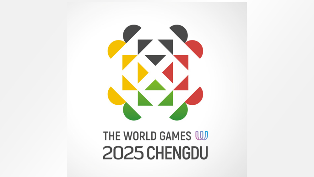
A new logo with an optical illusion? We'll have some of that! The World Games aren't as famous as the Olympics, but they're gaining traction, and the new logo design may just win over some more interest in time for the Chengdu 2025 event.
At first glance, it's a symmetrical geometric design that recalls the colours of the Olympic games logo minus the blue. But there's actually a whole bunch of hidden symbolism in the design. Can you see what it is yet?

The logo design for the 12th edition of The World Games was chosen from 3,562 proposals submitted to the Chengdu 2025 Local Organising Committee's (LOC) logo design contest. The body also received 1,924 mascot proposals and 3,749 suggestions for slogans.
The Chengdu 2025 mascot and slogan won't be unveiled until the ‘One Year to Go’ event in August (I hope the former is as good as the Paris Olympic mascots), but the organising committee has given us some insights into its chosen logo design. It says the design was inspired by iconic Chinese symbols including the giant panda, the hibiscus flower, and the Chinese knot. If you're struggling to see them, the post below helps make the panda's face clearer.
Introducing the new logo for The World Games 2025!The logo design is inspired by iconic Chinese symbols such as the giant panda 🐼, the hibiscus flower, and the Chinese knot 😊Read more: https://t.co/02b3nBLZiq#RoadtoChengdu #TWG2025 #WeareTheWorldGames @twg2025 pic.twitter.com/MbRShK4dbpMay 17, 2024
The top part of the logo (in black in the full colour version) is intended to represent the face of a giant panda, a species that Chengdu and the wider Sichuan Province is famous for. Less obvious are the other hidden symbols. The centre of the logo is said to represent a Chinese knot symbolising unity, prosperity, and luck. Meanwhile, the overall design is inspired by the shape of the hibiscus flower. The LOC says the whole emblem was designed to achieve balance and harmony by using cool colours vertically and warm colours horizontally.
The logo was created by the British designer John Fairley. "The arrangement of these geometric elements not only signifies the interconnected fate of humanity but also underscores respect for cultural diversity across nations," Fairley said. "This balance between individuality and mutual respect finds its purest expression in the sporting arena."
The World Games are an international multi-sport event featuring disciplines that aren't part of the Olympic Games. They're held every four years, usually a year after the Summer Olympic Games (let's take this opportunity to enjoy the unusual Paris 2024 Olympic Games logo again).
Get the Creative Bloq Newsletter
Daily design news, reviews, how-tos and more, as picked by the editors.

Thank you for reading 5 articles this month* Join now for unlimited access
Enjoy your first month for just £1 / $1 / €1
*Read 5 free articles per month without a subscription

Join now for unlimited access
Try first month for just £1 / $1 / €1

Joe is a regular freelance journalist and editor at Creative Bloq. He writes news, features and buying guides and keeps track of the best equipment and software for creatives, from video editing programs to monitors and accessories. A veteran news writer and photographer, he now works as a project manager at the London and Buenos Aires-based design, production and branding agency Hermana Creatives. There he manages a team of designers, photographers and video editors who specialise in producing visual content and design assets for the hospitality sector. He also dances Argentine tango.
