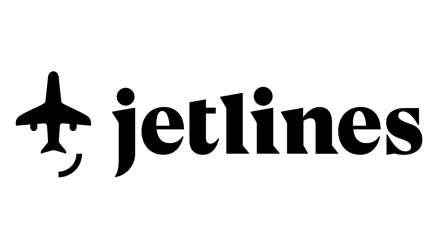
Can you spot the hidden symbol in this airline logo?
There's a great Easter egg in this new Canada Jetlines logo.

To celebrate becoming Canada's "first true Ultra-Low Cost Carrier" (ULCC), Canada Jetlines has recently worked with Cossette to create a playful new brand identity. This includes a new logo (above) that contains a hidden surprise.
Our guide to logo design includes a look at how symbolism can work in a brand's favour, and it looks like Canada Jetlines has taken this approach on board. Its new identity aims to be playfully provocative, and reflect Canada Jetlines' promise to offer the lowest airfares in the Canada. With the help of this cheeky, happy logo, it's done a good job of communicating that.
So what exactly is the hidden symbol? Take a close look, because once we tell you it'll be all you can see. That's right, the logo has a smiley face in it. The jet engines are eyes, the plane's tail fin makes a nose, and, well, a curved line forms the mouth.
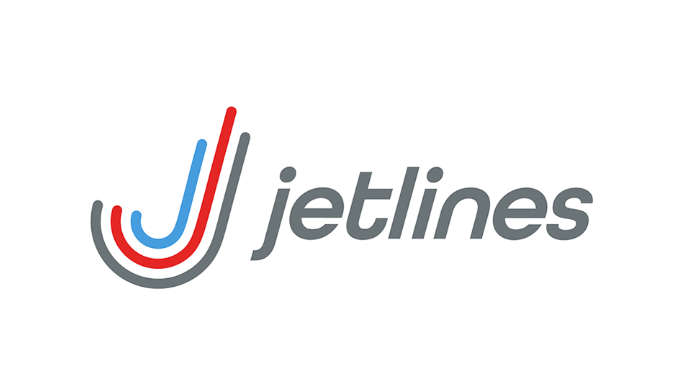
We've already seen logos with Easter eggs you might have missed, and this brand identity sits up there with the best of them. It replaces the old logo, below, which featured multicoloured stripes swooshing up into the air. This logo was in place when Canada Jetlines operated as a private company, but now it's an ULCC, a new identity was called for.

"Our new brand promise and design reflect our core philosophy of pushing back against the status quo and giving Canadian travellers a brand that empowers them to make their own decisions," said CEO of Canada Jetlines, Javier Suarez, in a press release.
He added: "I would like to thank the entire Jetlines commercial team for building such a strong brand identity that reflects our passion and values, as well as extend my most sincere gratitude to our partner, Cossette, for all of their hard work and raw talent that has brought us here today."
As well as this smirking plane logo, the statement also suggests that there will be "an additional suite of expressive faces to capture every emotion of travel". Does this mean there will be a turbulence anxiety face? Or how about a 'thank God we've landed safely' face?
Get the Creative Bloq Newsletter
Daily design news, reviews, how-tos and more, as picked by the editors.
Regardless, travellers will see the new identity across every touchpoint of the brand experience, including humorous airsickness bags, when the airline launches it in mid-December.
Related articles:

Thank you for reading 5 articles this month* Join now for unlimited access
Enjoy your first month for just £1 / $1 / €1
*Read 5 free articles per month without a subscription

Join now for unlimited access
Try first month for just £1 / $1 / €1

Dom Carter is a freelance writer who specialises in art and design. Formerly a staff writer for Creative Bloq, his work has also appeared on Creative Boom and in the pages of ImagineFX, Computer Arts, 3D World, and .net. He has been a D&AD New Blood judge, and has a particular interest in picture books.
