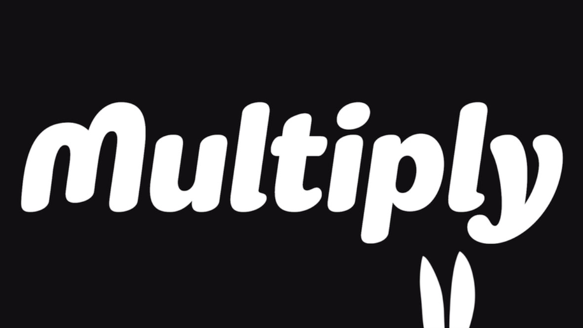
Can you spot the hidden trick in the new Multiply logo?
There's more to this financial app rebrand than you think.

Multiply is the financial app you've never heard of. And Ragged Edge is here to change all that, as it has recently rebranded the UK's first FCA-approved AI app. The service provides free, automated financial advice, and its new tongue-in-cheek visual identity promises to propel it to new heights.
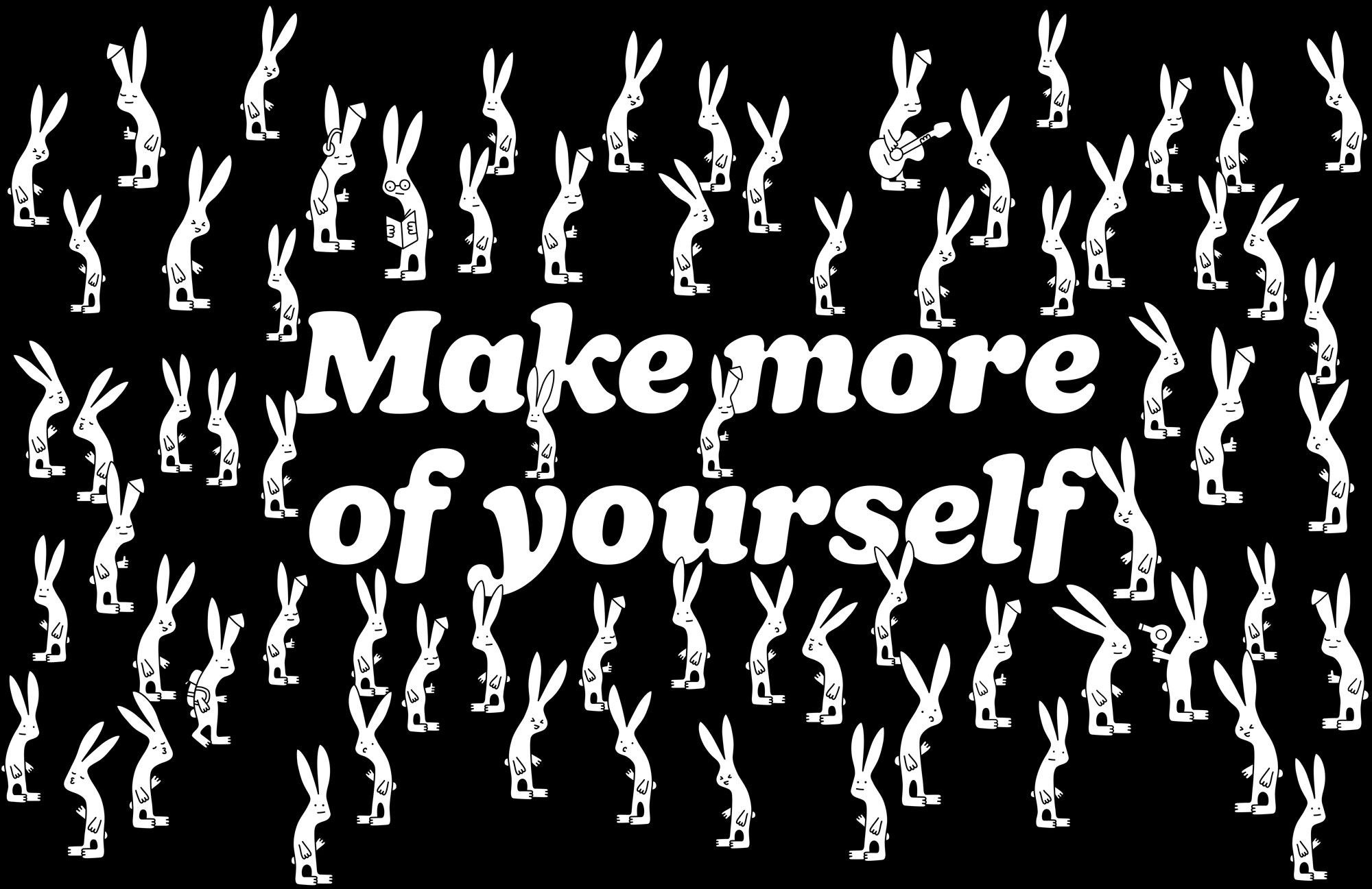
The concept is pretty simple, the app is called Multiple and so Ragged Edge went for rabbits, because erm... rabbits multiply. But simplicity is memorable (as our logo design guide shows), and we think this works. The refreshed logo also includes some neat little details, like the rabbit ears formed in the negative space of the 'M'. It's perhaps a slight stretch, but we like it.

The wordmark uses Sharp Type’s Doyle Black Italic, a modern take on Cooper Black, which was used on the likes of The Beach Boys' album, Pet Sounds. This choice of typeface conveys a sense of fun and familiarity.
Elsewhere, playful animations of the rabbits and engaging copy help draw people in. Overall, this doesn't look like it should be the identity for a finance app, and that is kind of the point.

"Rabbits. Multiply. When you see it, you get it. The visual identity is all about that confidence," says the Ragged Edge project page. "In a category of look-a-likes and sound-a-likes, it all comes together in a stupidly simple but surprisingly deep brand. A brand that can both educate and motivate."
We're inclined to agree. Engaging people to care about their finances can be tricky, and we think Ragged Edge has done a good job of helping Multiply to stand out in this sector.
We also love the little rabbit ears that pop up around the identity. They give a little nod to the rabbit theme, without taking it too far (they could've really gone for it with rabbit puns, for example). Overall, we think this is a very effective visual identity.
Get the Creative Bloq Newsletter
Daily design news, reviews, how-tos and more, as picked by the editors.
Read more:

Thank you for reading 5 articles this month* Join now for unlimited access
Enjoy your first month for just £1 / $1 / €1
*Read 5 free articles per month without a subscription

Join now for unlimited access
Try first month for just £1 / $1 / €1

Rosie Hilder is Creative Bloq's Deputy Editor. After beginning her career in journalism in Argentina – where she worked as Deputy Editor of Time Out Buenos Aires – she moved back to the UK and joined Future Plc in 2016. Since then, she's worked as Operations Editor on magazines including Computer Arts, 3D World and Paint & Draw and Mac|Life. In 2018, she joined Creative Bloq, where she now assists with the daily management of the site, including growing the site's reach, getting involved in events, such as judging the Brand Impact Awards, and helping make sure our content serves the reader as best it can.
