The Calvin Klein logo as you've never seen it before
This is what happened when the brand let four artists loose on its famous CK icon.
Brands can often be pretty precious about their logos, enforcing strict rules about how they can be used and displayed, so it’s nice to see a big brand willing to do something different. Calvin Klein recently let its iconic ‘CK’ monogram logo completely out of its own hands, passing it to four artists for reinterpretation – with intriguing results.
As the CK logo is well-known for its simplicity, the artists had a great deal of latitude for ways to reimagine it, and they each injected a good deal of personality into their take on the classic design (side note: if this gets you in the mood to do some logo creation of your own, check out our guide to the best graphic design software).
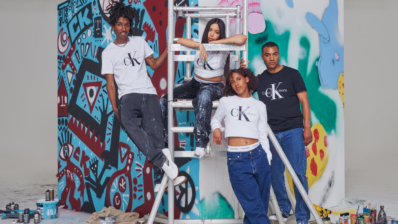
The four artists who got to take their hands to the CK logo were Rediet Longo (a.k.a. RED), who was born in Ethiopia and raised in Milan; Rafaella Braga, based in New York City and Berlin; Parisian graphic designer Maïte Marque; and painter Alfie Kungu, who lives in Hebden Bridge in West Yorkshire.
In a project arranged with Hypebeast, the quartet was presented with a giant cube of white canvas in a warehouse in the UK. each of them had a side upon which to enact their radical reimagining of the iconic CK. It’s really interesting to see the different ways they tackled the task, and the logos that resulted.
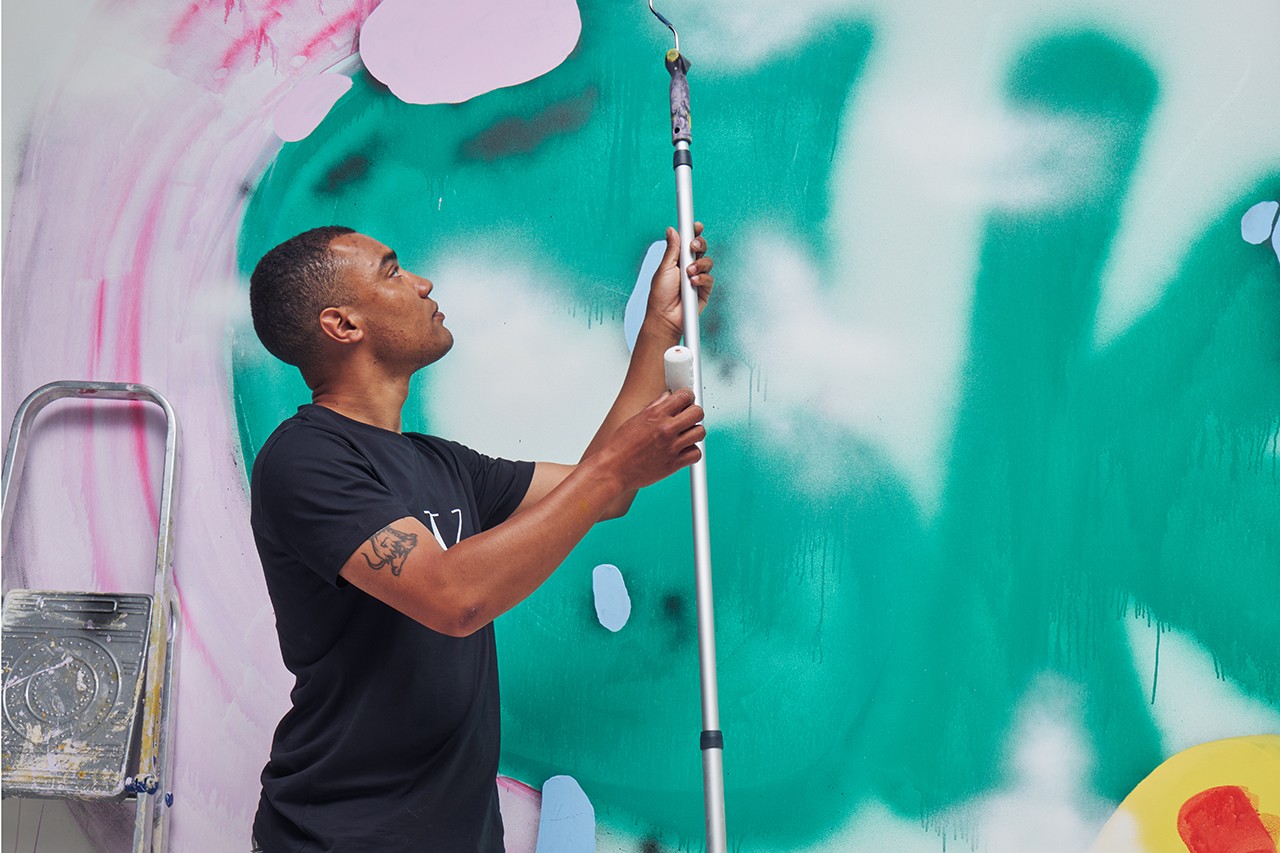
Painter Kungu, for instance, picked up his roller and paints and got to work creating a bright and playful redesign. He cites the Saturday-morning cartoons of his youth as an influence on his art style, and you can definitely see that in his redesign. Marque, meanwhile, had her graphic design head on and projected her vibrant redesign onto the canvas from her laptop.

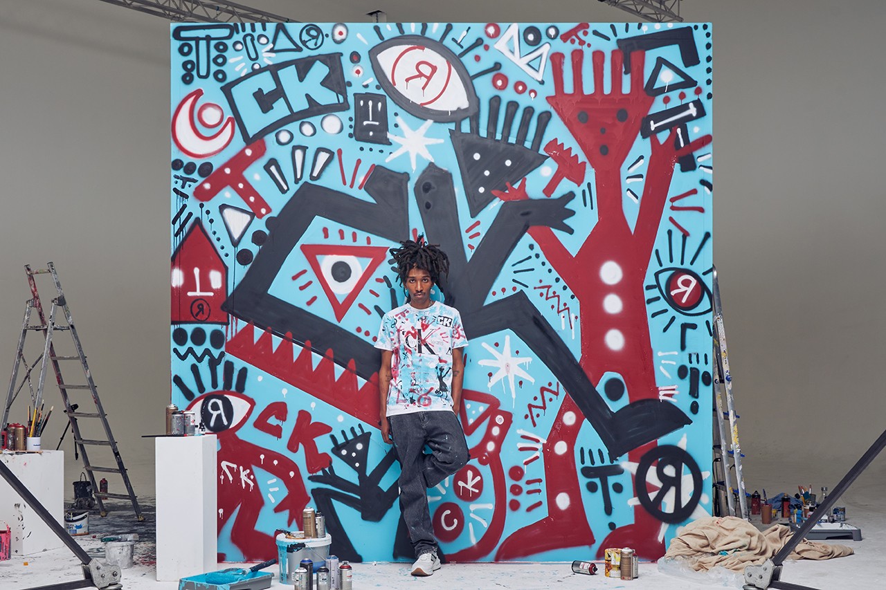
RED infused his redesign with graffiti iconography, while Braga was also influenced by the street art culture from her roots in South America. You can see all the creations over at Hypebeast, where there’s also a video that shows off the finished four-sided canvas.
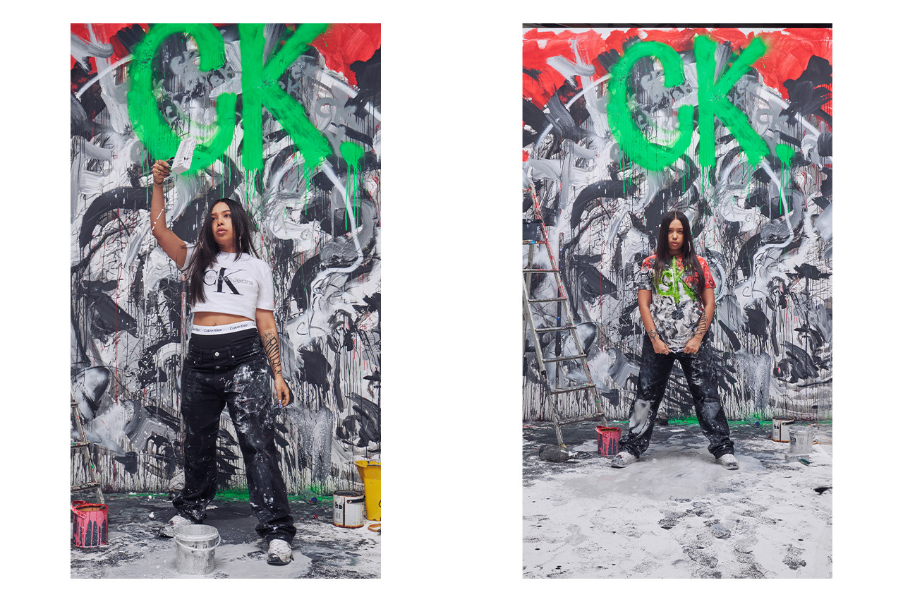
As we mentioned at the start, it’s really cool to see such a big brand being less precious with its logo and letting young artists from diverse backgrounds play around with its iconography. Hopefully, we’ll see some more reimaginings like this in the future. If you can’t get enough cool logos, check out our round-up of the 10 best logos of all time, and our top tips on how to design a logo.
Get the Creative Bloq Newsletter
Daily design news, reviews, how-tos and more, as picked by the editors.
Read more:

Thank you for reading 5 articles this month* Join now for unlimited access
Enjoy your first month for just £1 / $1 / €1
*Read 5 free articles per month without a subscription

Join now for unlimited access
Try first month for just £1 / $1 / €1

Jon is a freelance writer and journalist who covers photography, art, technology, and the intersection of all three. When he's not scouting out news on the latest gadgets, he likes to play around with film cameras that were manufactured before he was born. To that end, he never goes anywhere without his Olympus XA2, loaded with a fresh roll of Kodak (Gold 200 is the best, since you asked). Jon is a regular contributor to Creative Bloq, and has also written for in Digital Camera World, Black + White Photography Magazine, Photomonitor, Outdoor Photography, Shortlist and probably a few others he's forgetting.
