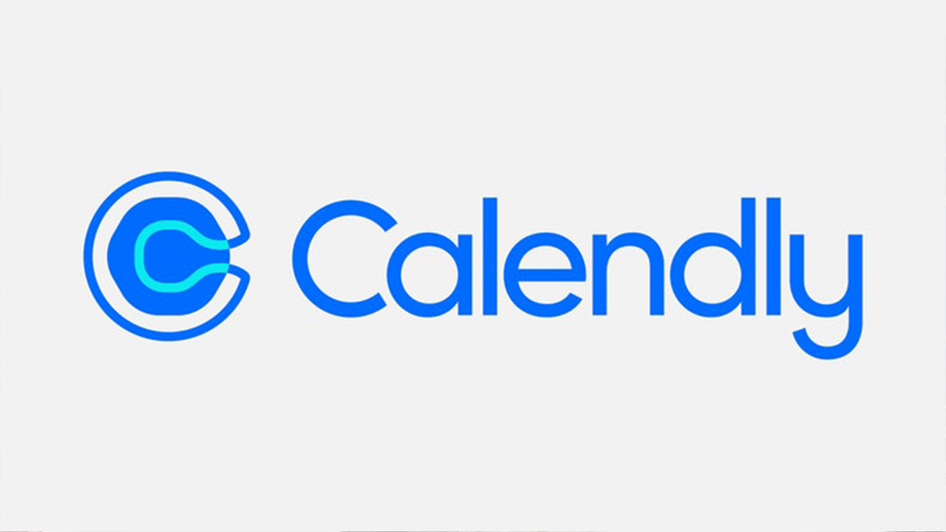
New Calendly logo brutally mocked for unfortunate resemblance
You'll be bowled over by this one.

Look, rebrands ain't cheap. Companies will often drop thousands (nay, millions) on a new logo – but no matter how flush a brand might be, there's no guarantee that a new design will hit the bullseye. And speaking of flush, one thing you probably don't want your new logo to resemble is a toilet.
Enter Calendly. The calendar and scheduling tool has revealed a new logo, which was allegedly designed to the tune of $1.5M. The only problem is that, as several Twitter users have pointed out, it looks rather like a bird's eye view of a loo. Not ideal – the best logos of all time could never be described as bog-standard.

Created by Pentagram, the new Calendly logo features a rounded hexagon inside a hollow letter 'C'. The studio says the new logo was designed to be “engaging, expressive and versatile,” and to reflect the platform's "intelligent design, improved workflows and incredible ease of use.”
But for many, the design has hit rather a bum note. Indeed, once you spot the toilet bowl resemblance, it's impossible to unsee – and it seems plenty of Twitter users have been bowled over.
Calendly's new logo cost $1.5m pic.twitter.com/Dja2RzA3pcJune 14, 2021
hold on.. calendly spent $1.5M on a new logo that looks like a bird’s-eye view of a toilet?lmao, fire whoever made that decision yesterday. pic.twitter.com/lYjW5o9c5JJune 14, 2021
Many have compared the design to Airbnb's controversial rebrand of 2014 (although let's be honest, nobody's complaining about that one now). Perhaps the toilet association will eventually fade – but judging by the response online, it certainly doesn't look like it's going anywhere soon.
But even without said resemblance, we wouldn't say this is a classic logo redesign. The combination of the smooth, curved 'C' and the rounded hexagon is a little jarring, and even messy. From the new San Diego Zoo logo to Rolls-Royce's luxurious new identity, we've seen plenty of killer rebrands from Pentagram lately. But Calendly's new look is more loo-dicrous than luxurious.
Read more:
Get the Creative Bloq Newsletter
Daily design news, reviews, how-tos and more, as picked by the editors.

Thank you for reading 5 articles this month* Join now for unlimited access
Enjoy your first month for just £1 / $1 / €1
*Read 5 free articles per month without a subscription

Join now for unlimited access
Try first month for just £1 / $1 / €1

Daniel John is Design Editor at Creative Bloq. He reports on the worlds of design, branding and lifestyle tech, and has covered several industry events including Milan Design Week, OFFF Barcelona and Adobe Max in Los Angeles. He has interviewed leaders and designers at brands including Apple, Microsoft and Adobe. Daniel's debut book of short stories and poems was published in 2018, and his comedy newsletter is a Substack Bestseller.
